
01 / Client context
Brief
A call with the client set the scope for the fitness concept and funding pitch.
Client request
/Work/Toneflix
Toneflix
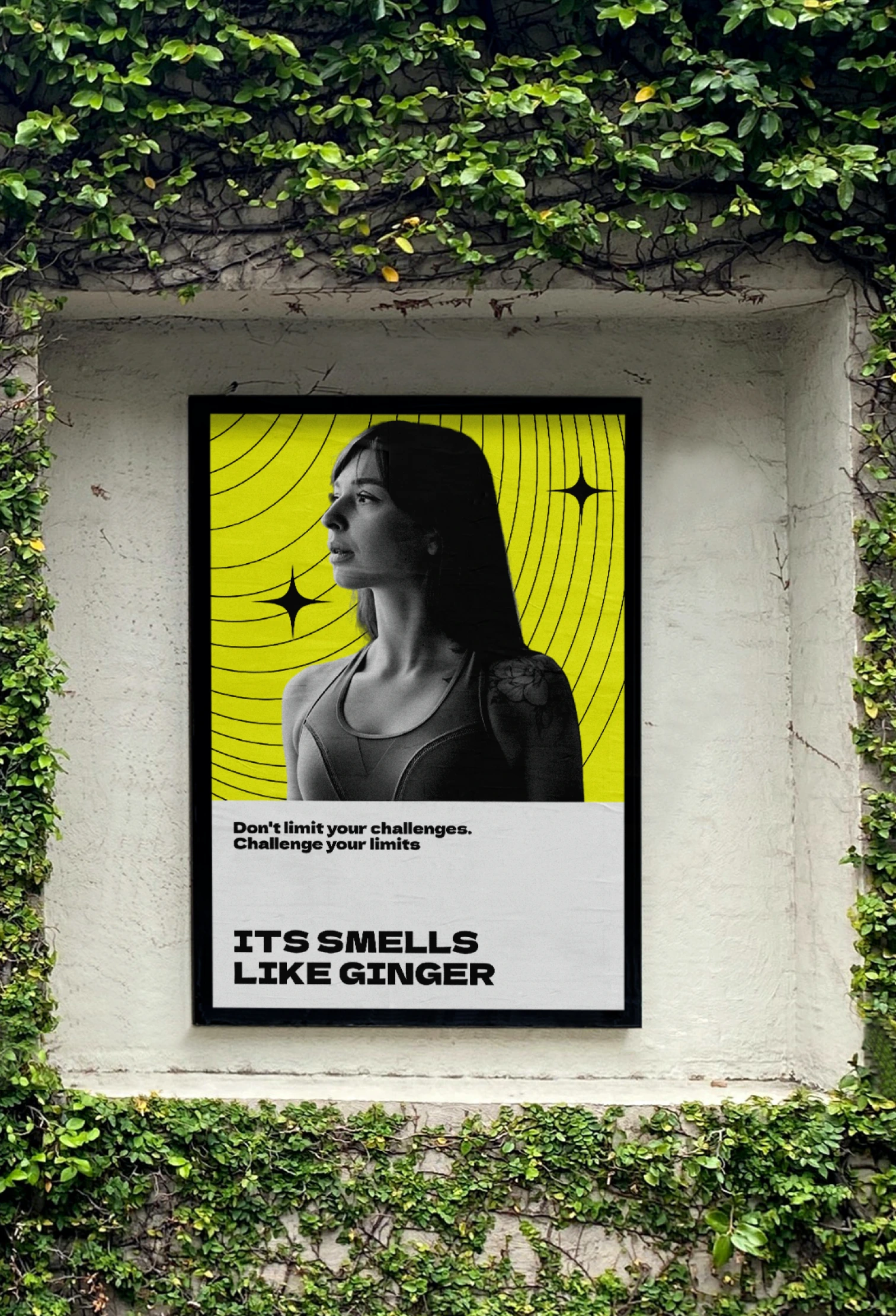
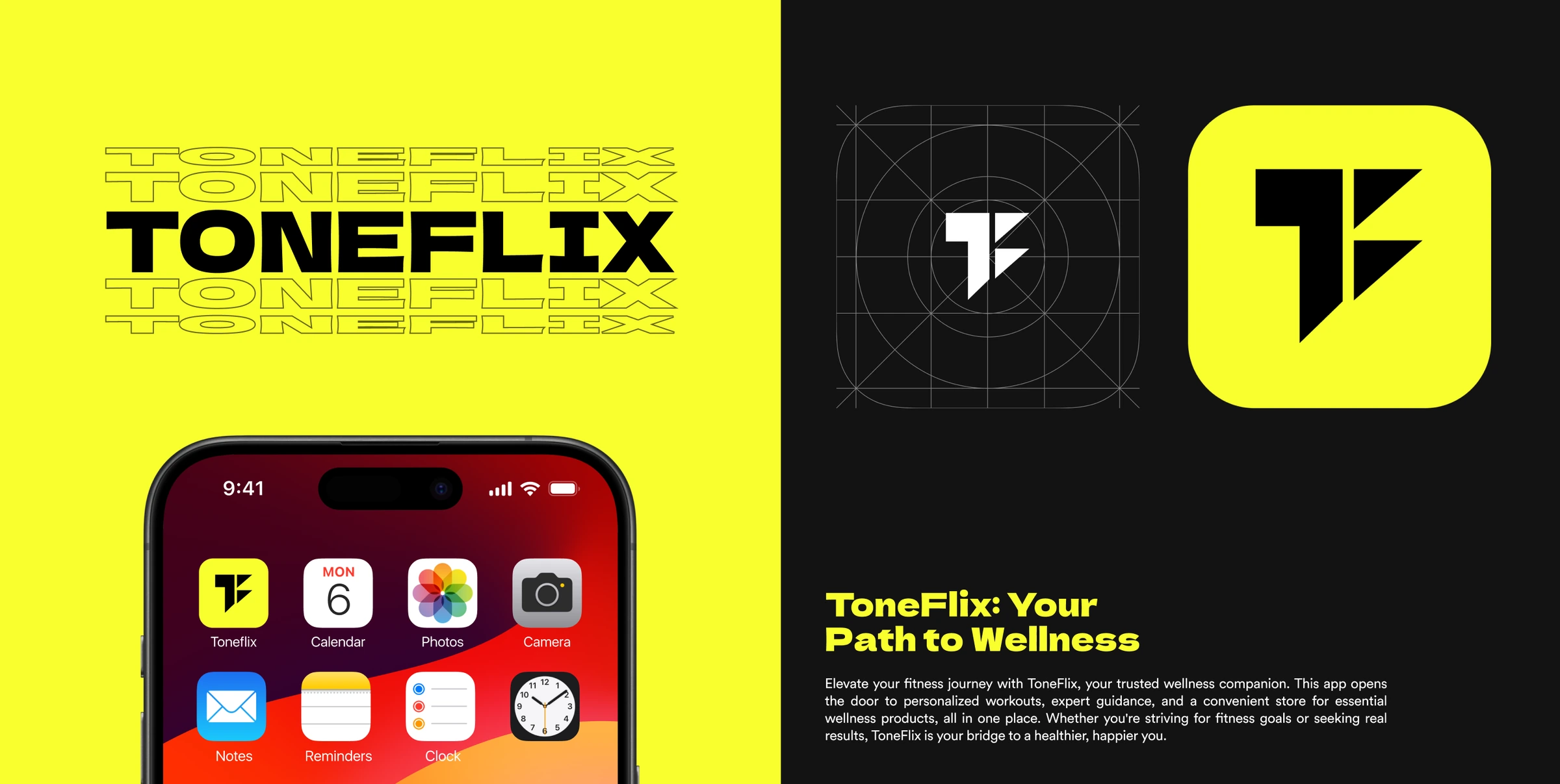
Workouts, meals and progress in one place. A fitness app concept exploring how they connect.
01 / The problem
Illustrative fitness tools and services
The brief
The client brief came over a call: design a fitness app for a 2024 venture-capital pitch. It was a broad request. Along with training, nutrition and activity tracking, the app needed to include shopping and help people find a gym.
Some basic research took place within the gym community. I can no longer confirm the methods, how many people took part or the specific findings. The design reasoning below therefore describes my choices, without presenting them as conclusions from that research.
I handled all the design work and research planning across six modules. My design question was how someone’s goals and progress could carry through the app, from choosing a workout to reviewing their day. Toneflix remained a concept and was never shipped.
02 / Category context
11.5M
UK health and fitness club members during 2024
ukactive UK Health & Fitness Market Report 2025, reporting 2024 data
£5.7B
UK health and fitness club-sector revenue during 2024
ukactive UK Health & Fitness Market Report 2025, reporting 2024 data
29.5M
adults in England meeting 150+ minutes of activity per week
Sport England, Active Lives Adult Survey, November 2022 to 2023
Interpretation
These figures help put the project in context today. The ukactive report came out in 2025, after the pitch; neither source proves demand for Toneflix or describes our research participants. What I would need to find out is whether people struggle to make sense of their records across tools, even when those tools already share data.
03 / Existing options
| Model | Illustrative examples | Toneflix concept |
|---|---|---|
| Workout apps | Nike Training Club, Peloton | Browse programmes and review training alongside daily activity. |
| Nutrition trackers | MyFitnessPal | See meals and nutrition beside the day’s training. |
| Fitness commerce | Gymshark, MyProtein | Browse fitness products, with suggestions that could use someone’s goals. |
| Gym discovery | Google Maps | Find nearby gyms, read professional profiles and explore booking. |
04 / How it works
Connecting the app
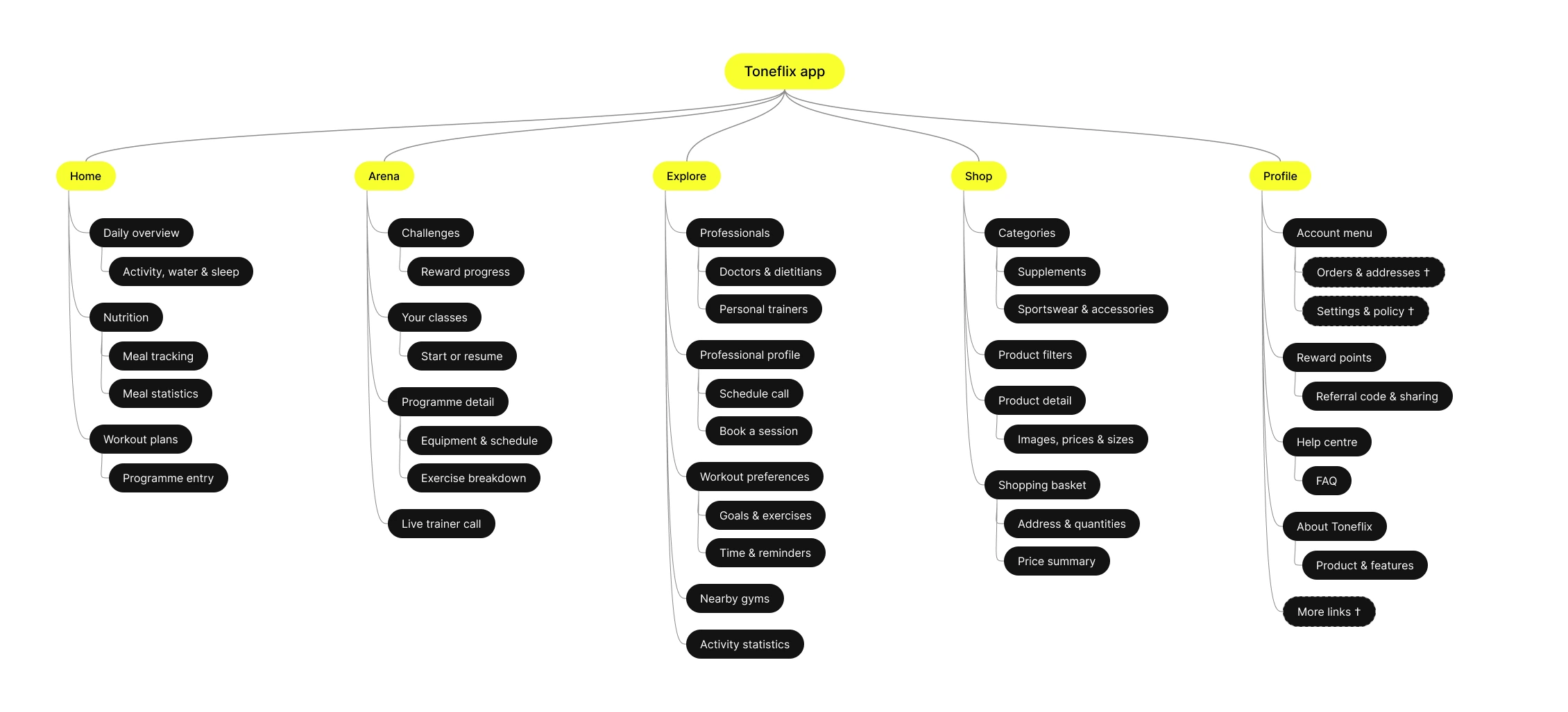
I used a shared profile to connect onboarding, training, tracking and shopping. The idea was that a goal entered at the start could guide programme suggestions, while logged activity would appear in the dashboard. These connections describe how I intended the app to work; the backend needed to support them has not been built.
The problem
When training and food records are separate, you have to do the comparison yourself.
The solution
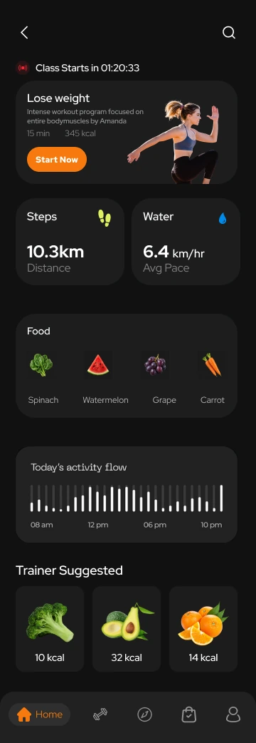
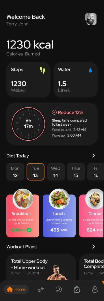
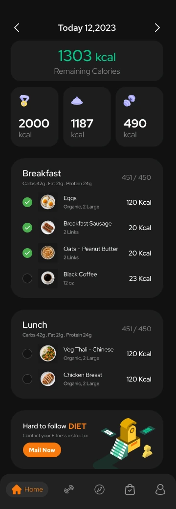
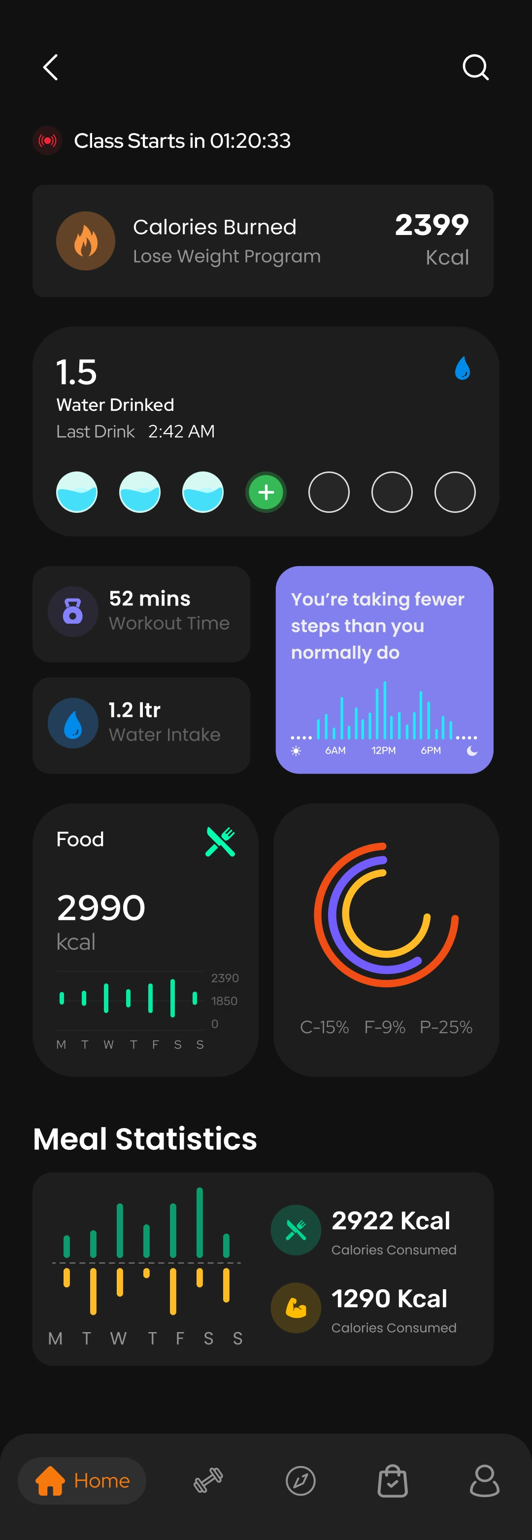
I brought workouts, nutrition and activity into the same dashboard and explored different ways to arrange them. The meal screen adds detail behind the daily totals. These alternatives are a way to test whether seeing the records together actually makes them easier to understand.
Home and nutrition · Dashboard alternatives
The problem
A headline number gives a quick update, but leaves out the changes behind it.
The solution
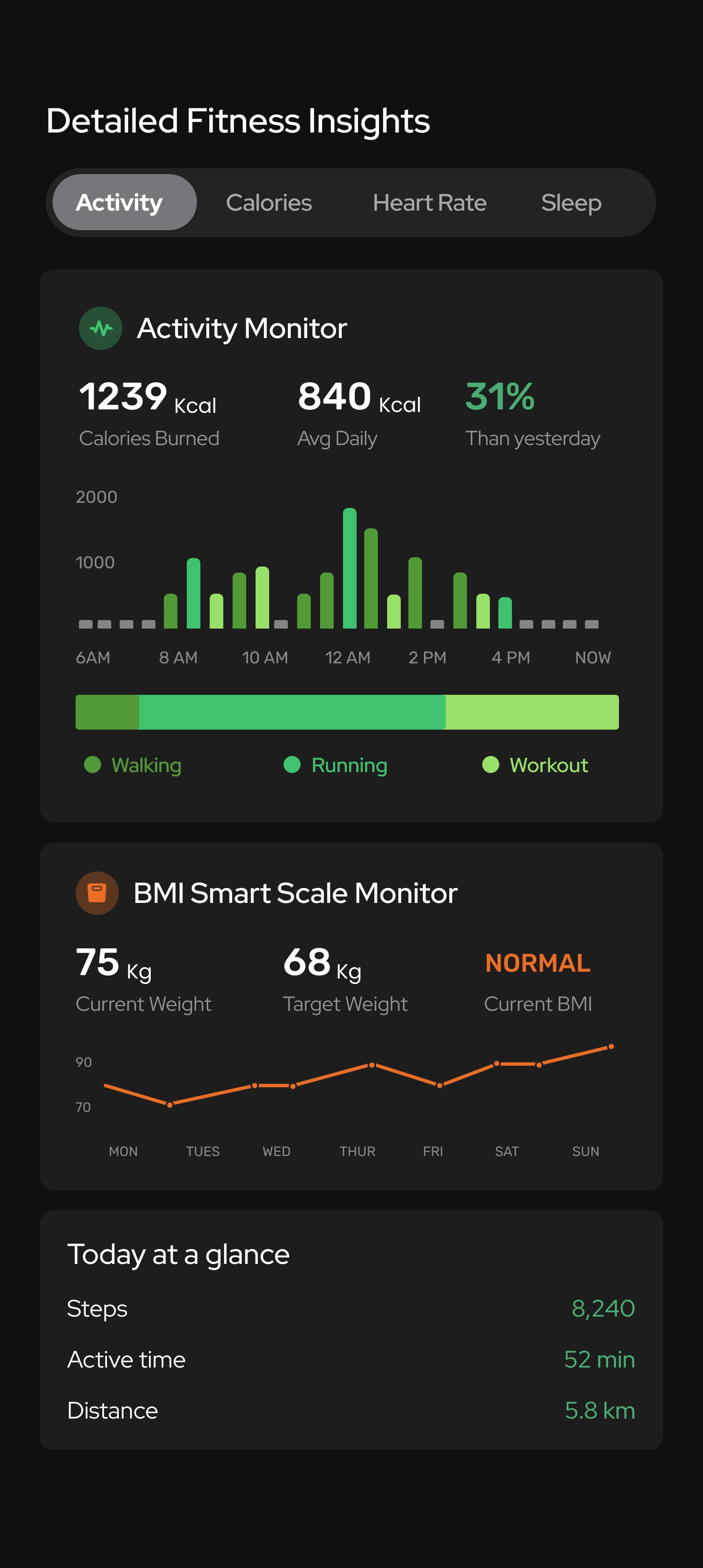
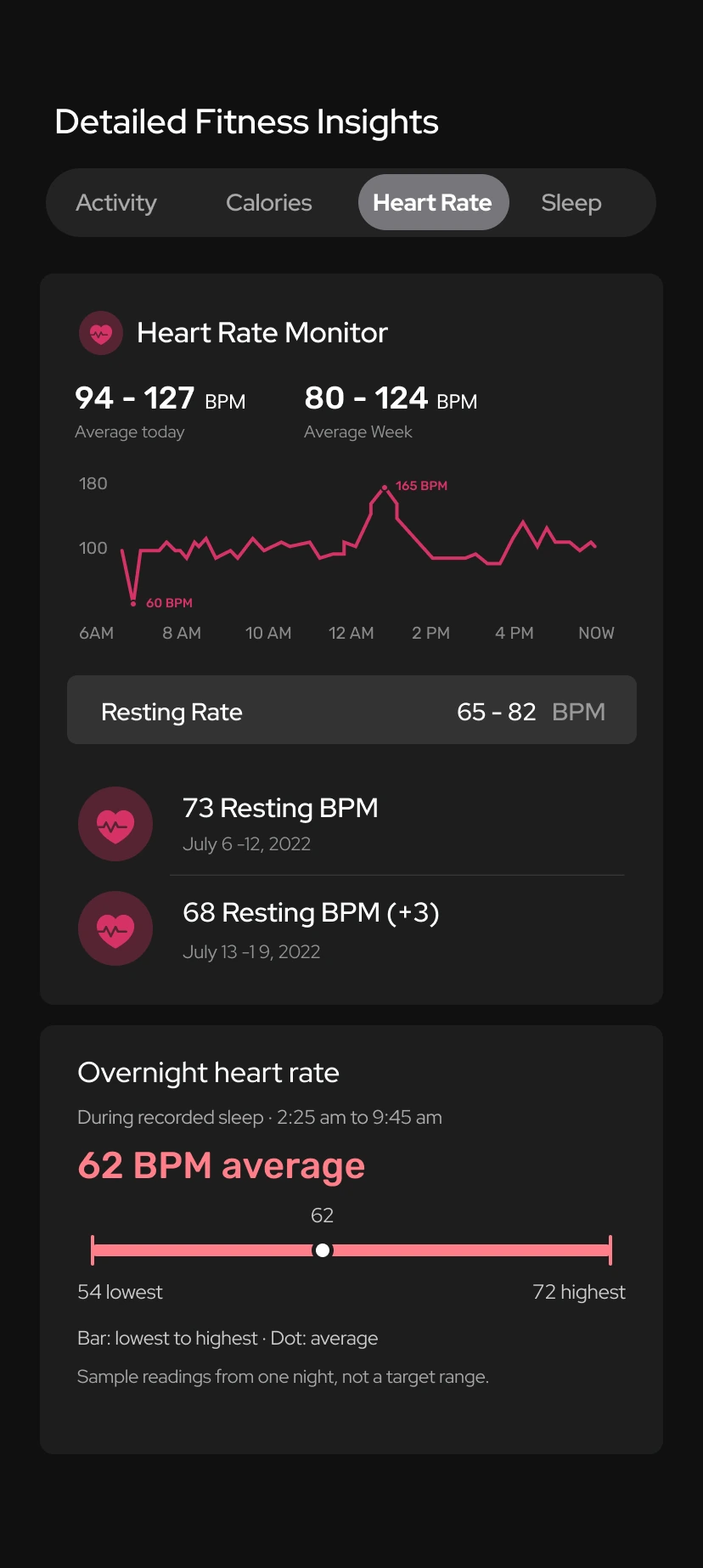
In these later designs, I paired activity, heart-rate and sleep totals with charts and supporting summaries. The calorie tracker brings the daily balance, macros, meal log and weekly view together, while keeping activity calories separate. All four screens use sample data; live tracking is not connected.
Activity · Heart rate · Sleep · Calories
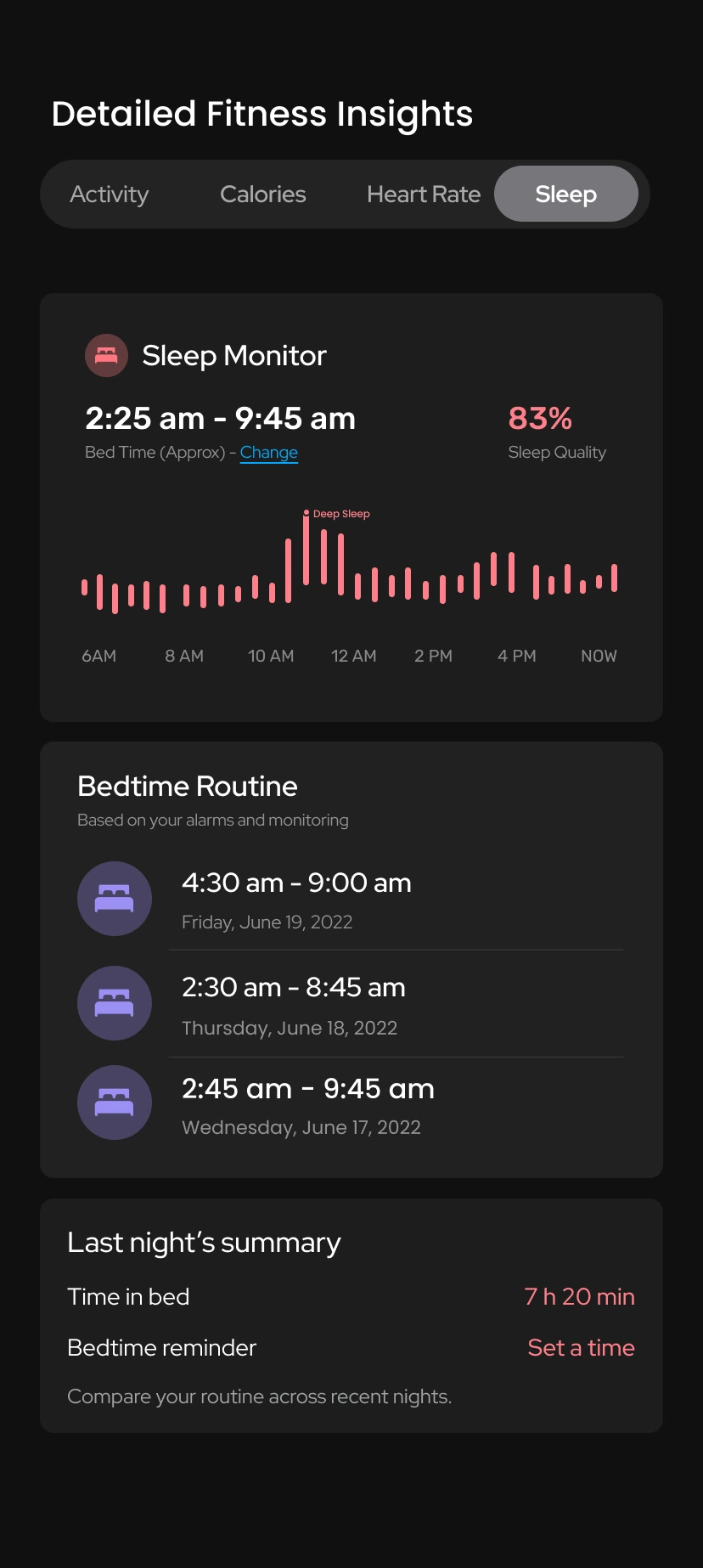
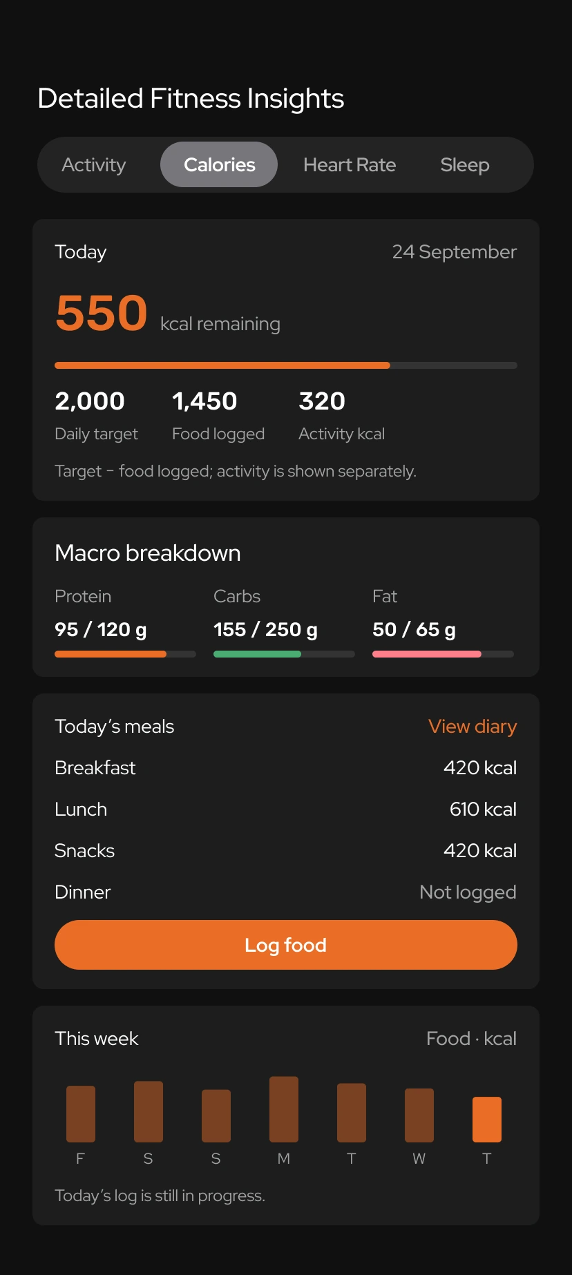
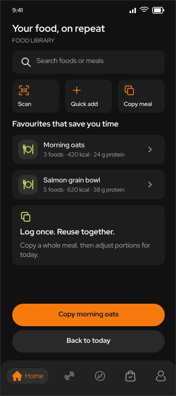
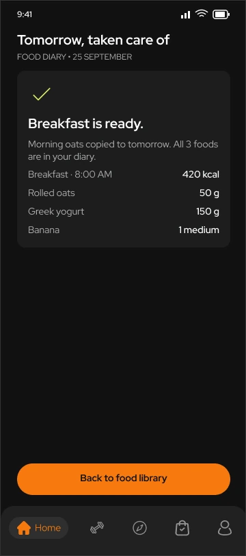
The problem
Eating the same meals can make a routine easier. Entering every ingredient again adds work without telling you anything new. And once the food is logged, a calorie total alone offers little help with deciding what to change.
The solution
I paired an optional coaching introduction with a daily view of calories, macros and meals. A weekly check-in gives guidance a place without taking choices away. The food library lets someone reuse a saved meal; the final screen confirms the foods and portions copied to tomorrow’s breakfast. These four screens show the concept using sample data, with guidance and meal copying still to be implemented.
Choose support · Review today · Reuse a meal · Confirm
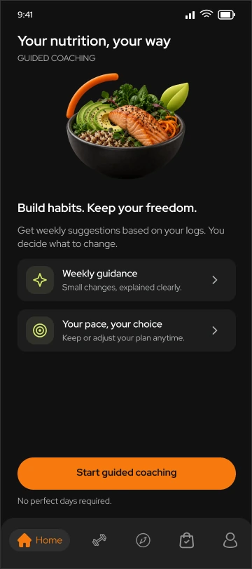
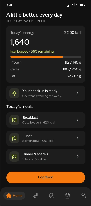
The problem
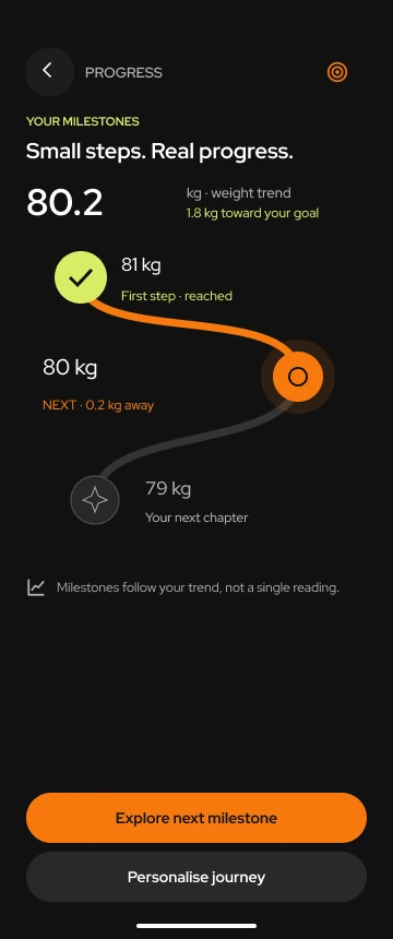
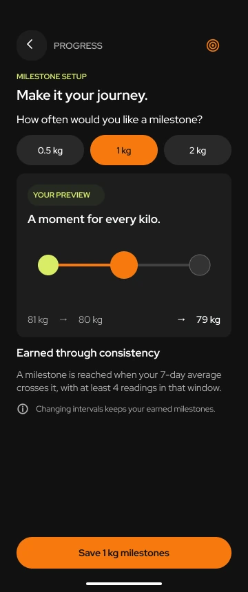
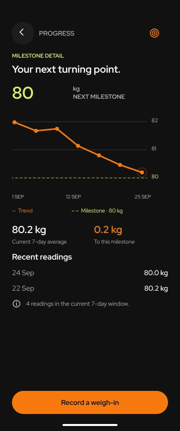
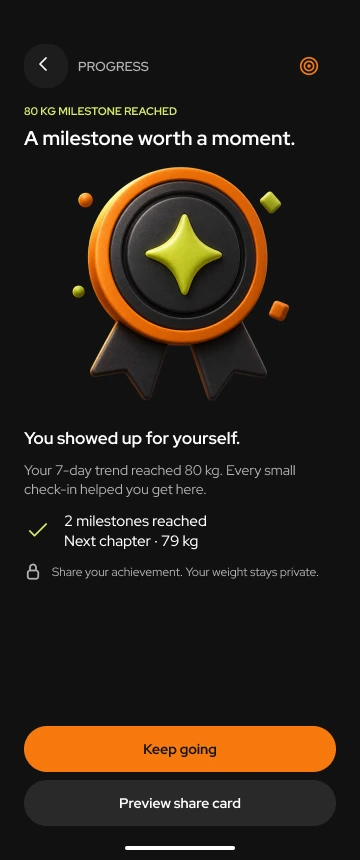
If the app only shows your final weight target, steady progress can still look like a long way to go. A single weigh-in gives little reassurance either. I wanted to give smaller steps a place in the experience, so there is something closer to work towards.
The solution
I broke the journey into milestones that people can space to suit themselves. The journey screen shows the next step; the detail screen shows the weight trend behind it. Reaching a milestone gets its own moment, with a choice to share it. The four screens cover setting up, following and recognising progress.
Journey · Personalise · Understand · Celebrate
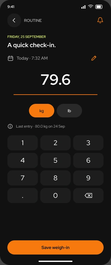
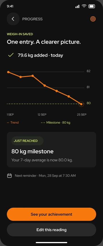
The problem
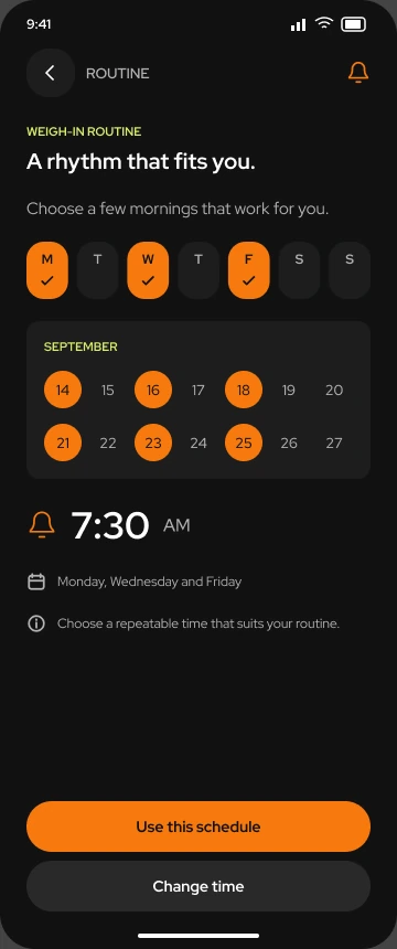
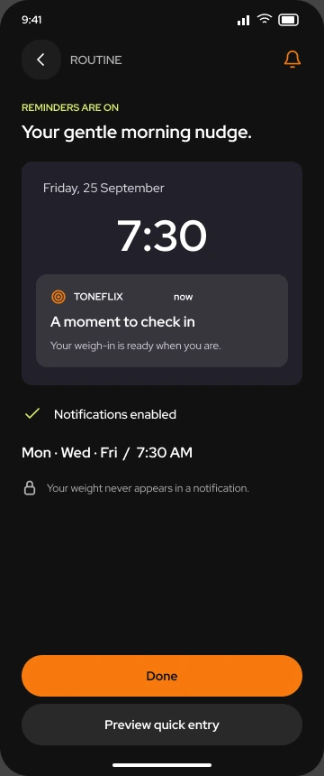
Even when someone wants to keep a weight record, remembering to weigh in and then logging it are two more things to do. Missed entries leave gaps, and a lengthy form makes catching up less appealing. The check-in needed to fit around someone’s day and remain their choice.
The solution
People choose the days and time that work for them, then see confirmation that the reminder is on. I kept weight entry focused on the reading. Once saved, it appears in the trend alongside milestone progress, with an edit option if the number is wrong. The saved screen shows where the reading went, without making someone find it elsewhere.
Choose a routine · Confirm · Record · Review
Concept refinement · 2026
I revisited the progress screen to explore how it could explain recorded values, calculations and missing entries. This demonstration uses fictional data.
Choose a day to inspect its reading.
The average is the sum of recorded weights divided by the number of readings in this selected week. Missing days are excluded. It is a simple average, not a prediction or a validated weight-trend algorithm.
The latest entry stays visible beside the calculated average. Both have explicit labels, so the app’s calculation doesn’t replace what someone recorded.
The dates and unit stay beside the chart. A dashed line represents the average; dots show individual readings.
Select a day, change its value and save. The chart and average update together. Choose Wednesday to try adding a missing entry.
The explanation names which readings are included and how gaps are handled. It makes no claim about health or future progress.
No value plotted. No zero added.
When a reading is missing
In the starting sample, Wednesday has no entry. The chart leaves that day blank and calculates the average from the six available readings. The saved records remain available to inspect.
This example doesn’t infer a reading or treat a missing day as a failed goal.
Interactive concept · Fictional readings · No live health integration. Changes stay on this page and reset when you reload.
The problem
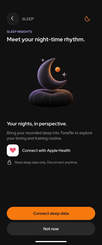
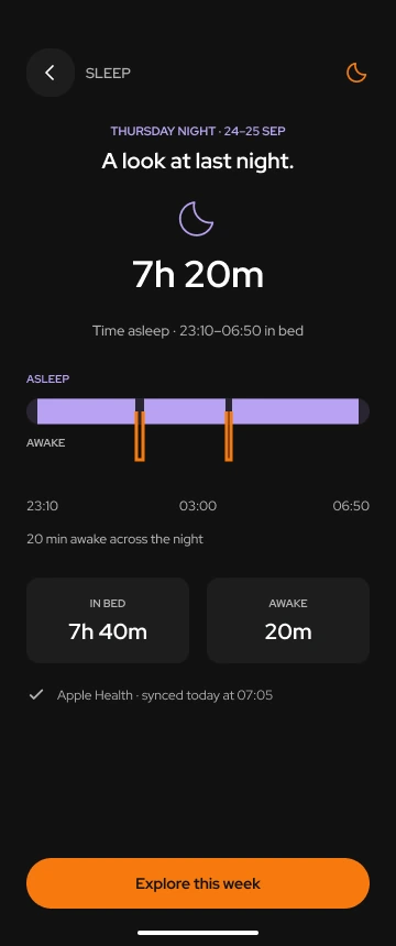
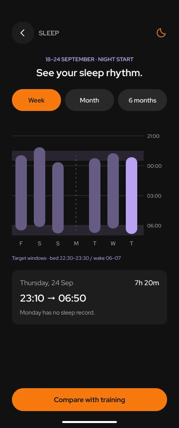
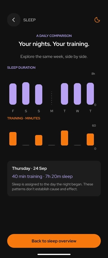
A sleep total tells you how long you slept, but says less about when you went to bed or how consistent the week was. When workouts sit in another log, comparing the two means checking dates and piecing together the week yourself.
The solution
The four screens show connecting a sleep source, reviewing last night, checking the week and comparing sleep with training on matching dates. I used timelines to show bedtime and wake time, and left missing nights visible. The comparison helps someone inspect a pattern; it does not say that a workout caused a change in sleep.
Connect · Review · Find a rhythm · Compare
The problem
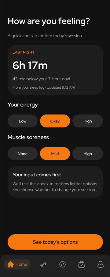
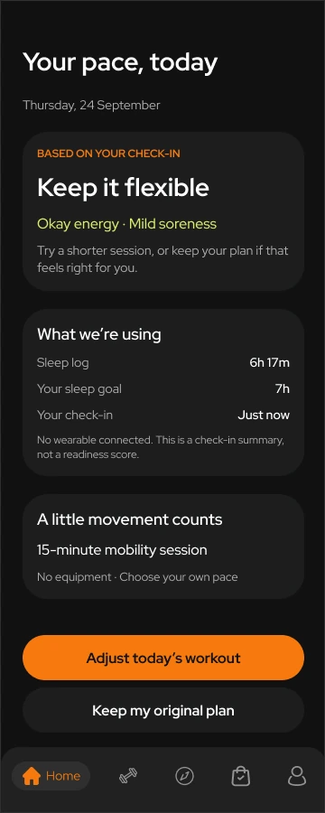
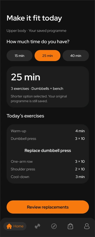
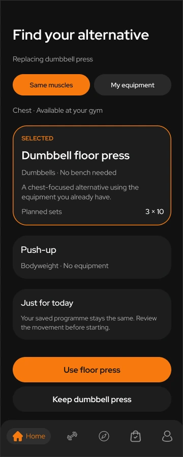
A saved workout can make sense when you plan it, then feel hard to fit into the day. Your energy may be lower, time may be short, or the equipment you need may be taken.
The solution
The flow starts with a quick check-in and shows the inputs behind the summary. People can keep their plan, choose a shorter session or replace an exercise using the equipment available. Changes apply to today’s session, while the saved programme stays intact. These concept screens use sample data; the check-in is not a measured readiness score.
Check in → Review options → Adjust → Replace
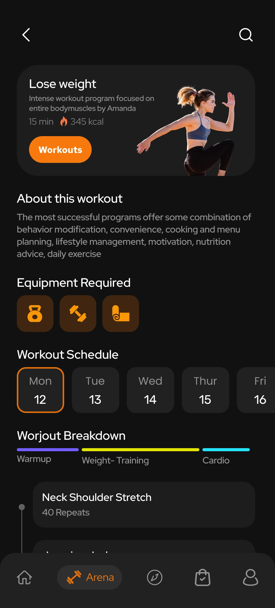
The problem
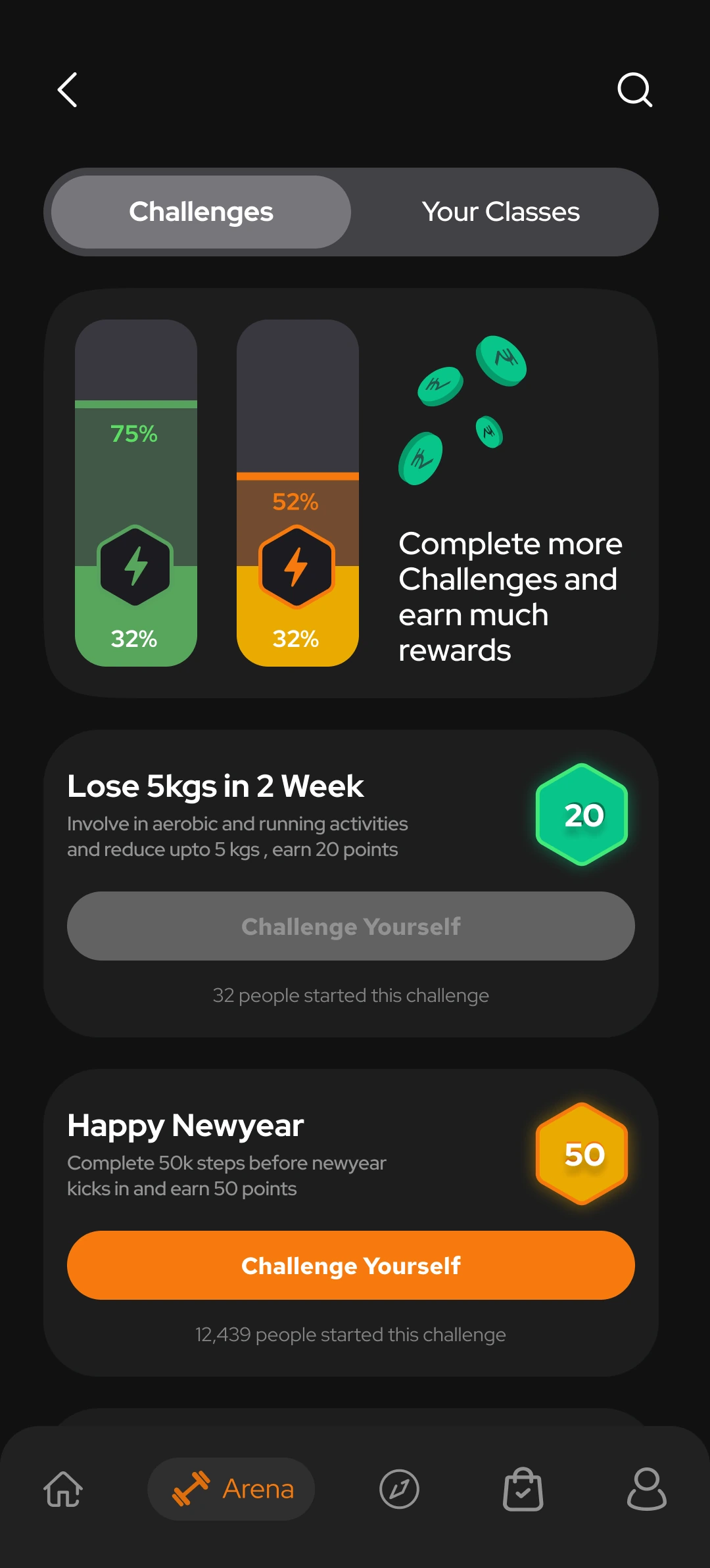
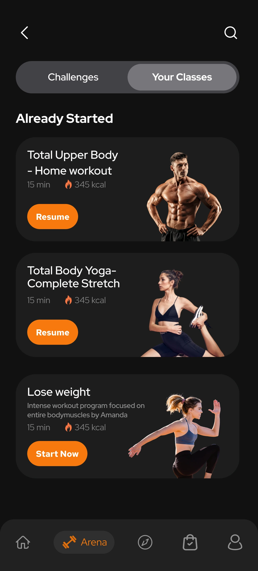
A challenge, a programme and a live class each ask for a different commitment.
The solution
I used progress cards to show where someone stands in a challenge, session breakdowns to explain a programme, and schedules for live classes. The aim is to make the commitment clear before someone chooses what to join.
Challenges → Classes → Programme detail → Live call
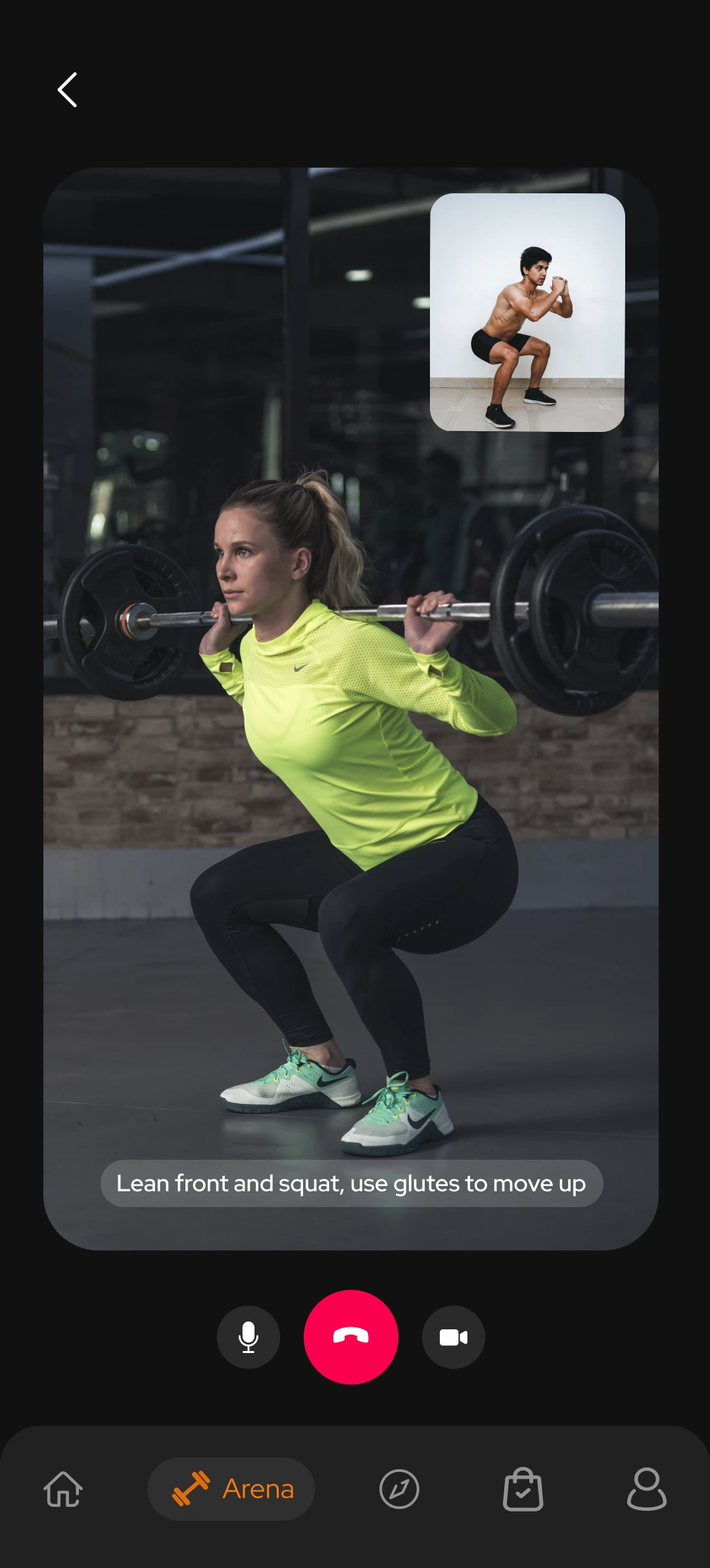
Joining a live session
I also designed group and one-to-one call screens to show what joining a session could look like. Video calling and booking are not available in the coded prototype.
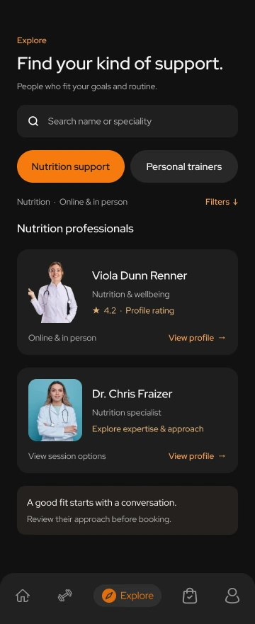
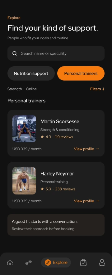
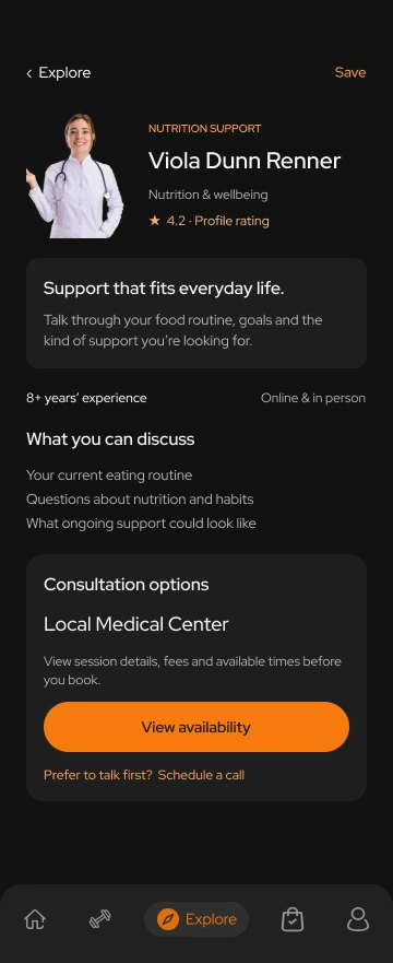
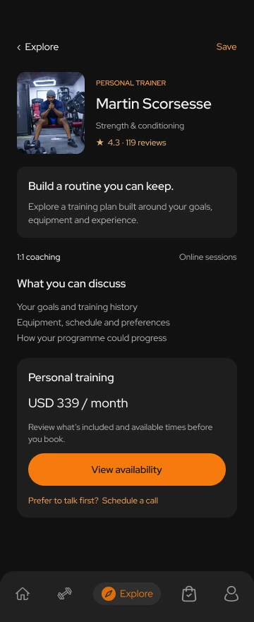
The problem
Choosing a trainer or doctor means looking beyond a name and photo.
The solution
I focused discovery on finding support, with search, speciality filters and consistent cards for comparing professionals. Profiles bring their approach, session information and the next step together. Availability is the primary action, with a call offered as a quieter alternative. These revised screens use illustrative profile details; search and booking are design concepts.
Find support → Compare professionals → Review a profile
The problem
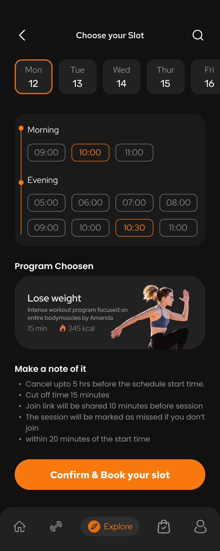
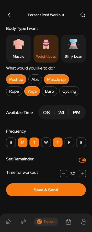
A plan is hard to follow if it ignores your available time, preferred exercises or where you can train.
The solution
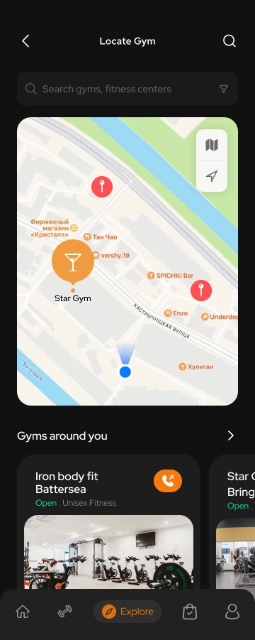
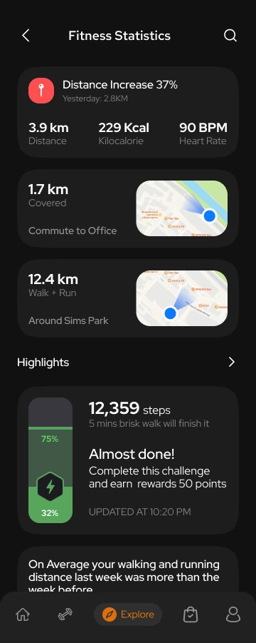
These screens let someone choose a session slot, set a goal and record exercise preferences, timing, frequency and reminders. Nearby gym discovery helps with where to train. The activity screen then shows distance, calories, heart rate, routes and challenge progress. The designs capture those preferences; generating a personalised plan from them still needs to be built.
Session booking · Workout preferences · Gym discovery · Activity feedback
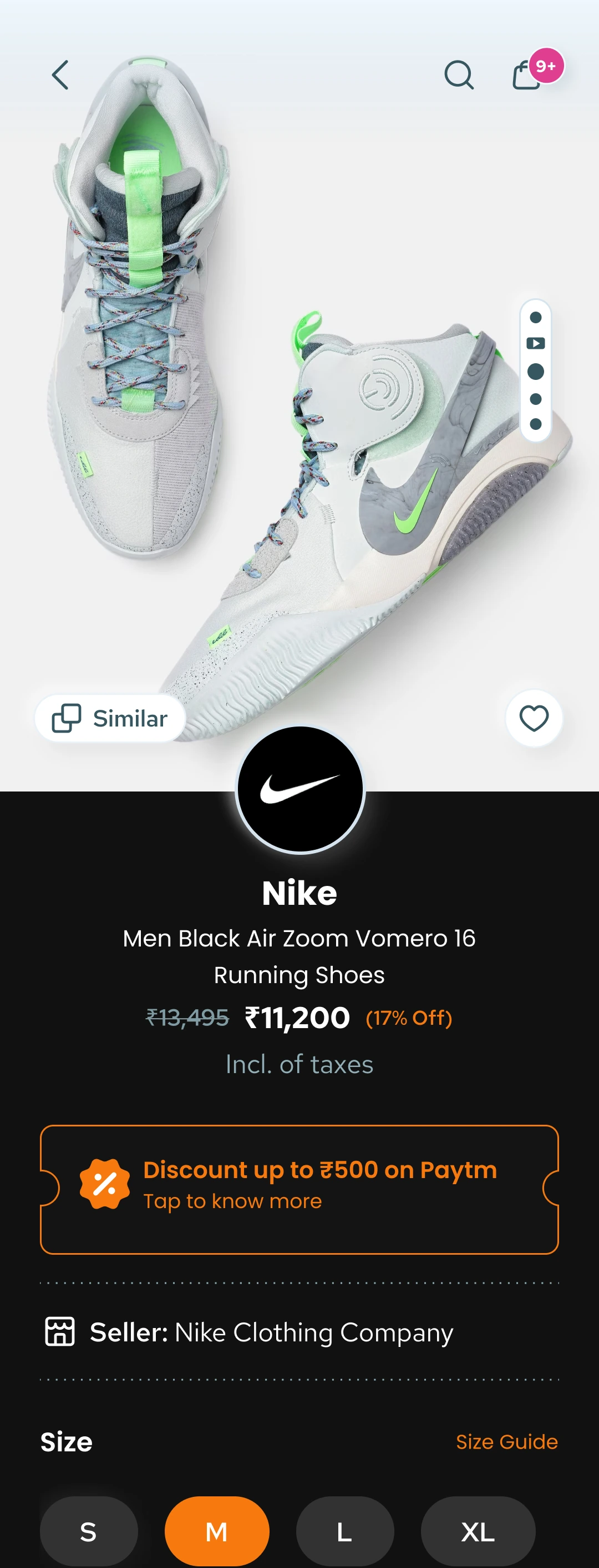
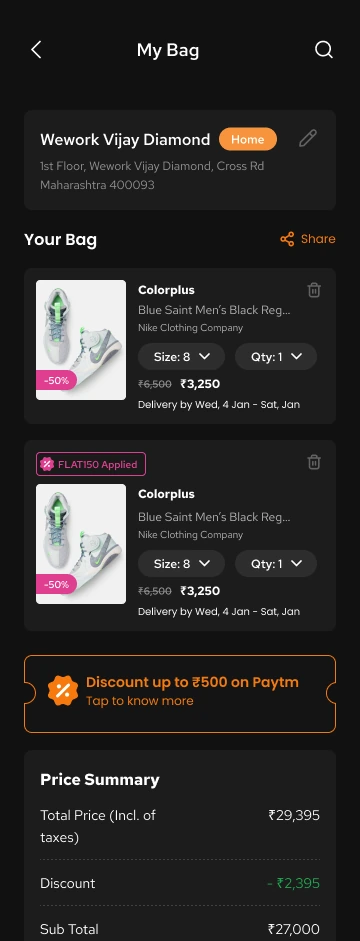
The problem
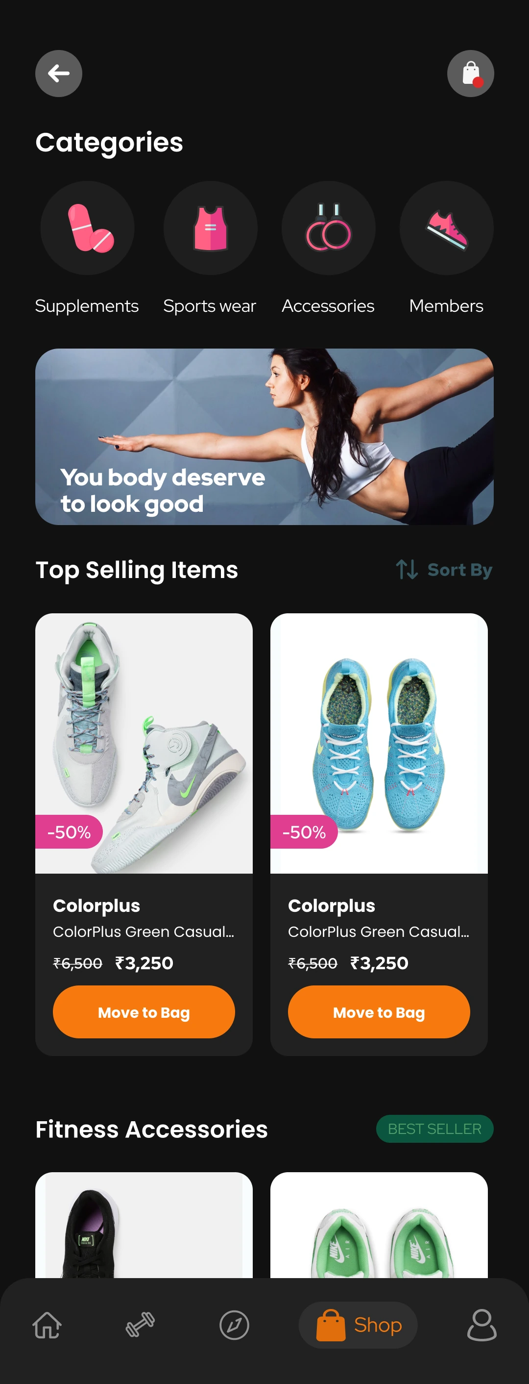
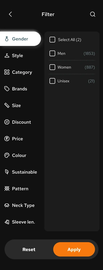
A product photo alone cannot tell someone whether an item is available in their size or fits their budget. Shopping was part of the client’s brief, so these decisions needed a place in the app.
The solution
I designed a path from categories and filters to footwear details and basket review. Shoppers can narrow the choice, check the size and price, then review their basket before checkout. The screens cover those decisions; the coded prototype does not process purchases.
Browse → Filter → Product detail → Basket
Coded prototype
I built the coded research prototype with AI assistance to make parts of the design interactive. It includes onboarding, three dashboard layouts, missing-data states and simulated permission controls, all using fictional data.
You can explore those interactions, but the prototype has no backend, sign-in system or live integrations. I also cannot confirm whether it was built before or after the 2024 pitch.
Consent boundaries
Trust and recommendations
I kept the intended scope to fitness guidance. Any feature dealing with health risks would need specialist review before deciding what it could responsibly offer; the app is not a diagnostic tool.
Before anyone could offer professional guidance through Toneflix, their credentials would need to be checked.
Sponsored recommendations would need a clear label. When an app gives fitness guidance and sells products, people should be able to tell whether a suggestion is paid for.
A recommendation should also show which goals or entries it uses. If those inputs are wrong or out of date, someone needs a way to change them.
These are requirements I would carry into development. They are not safeguards implemented in the prototype.
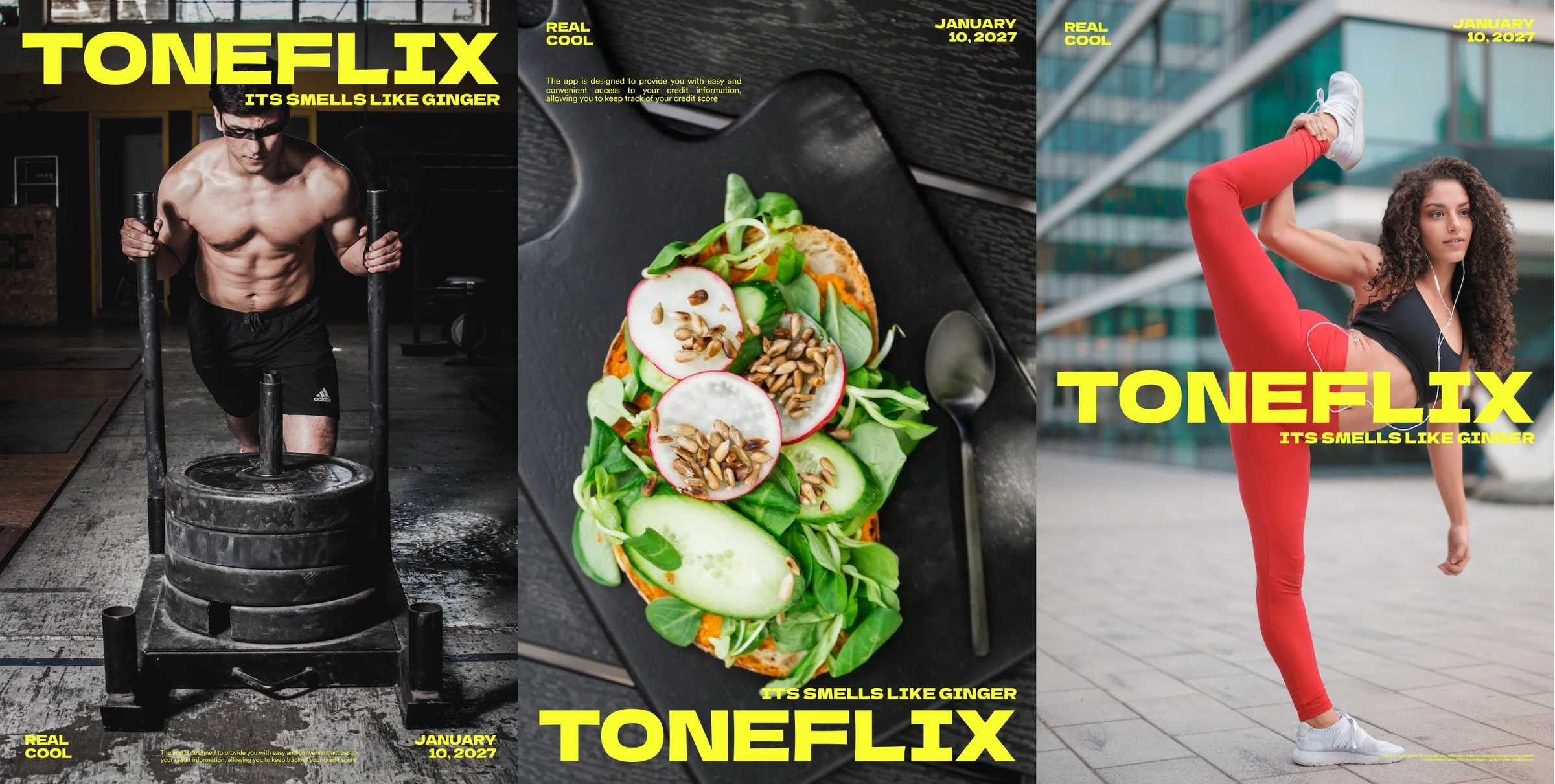
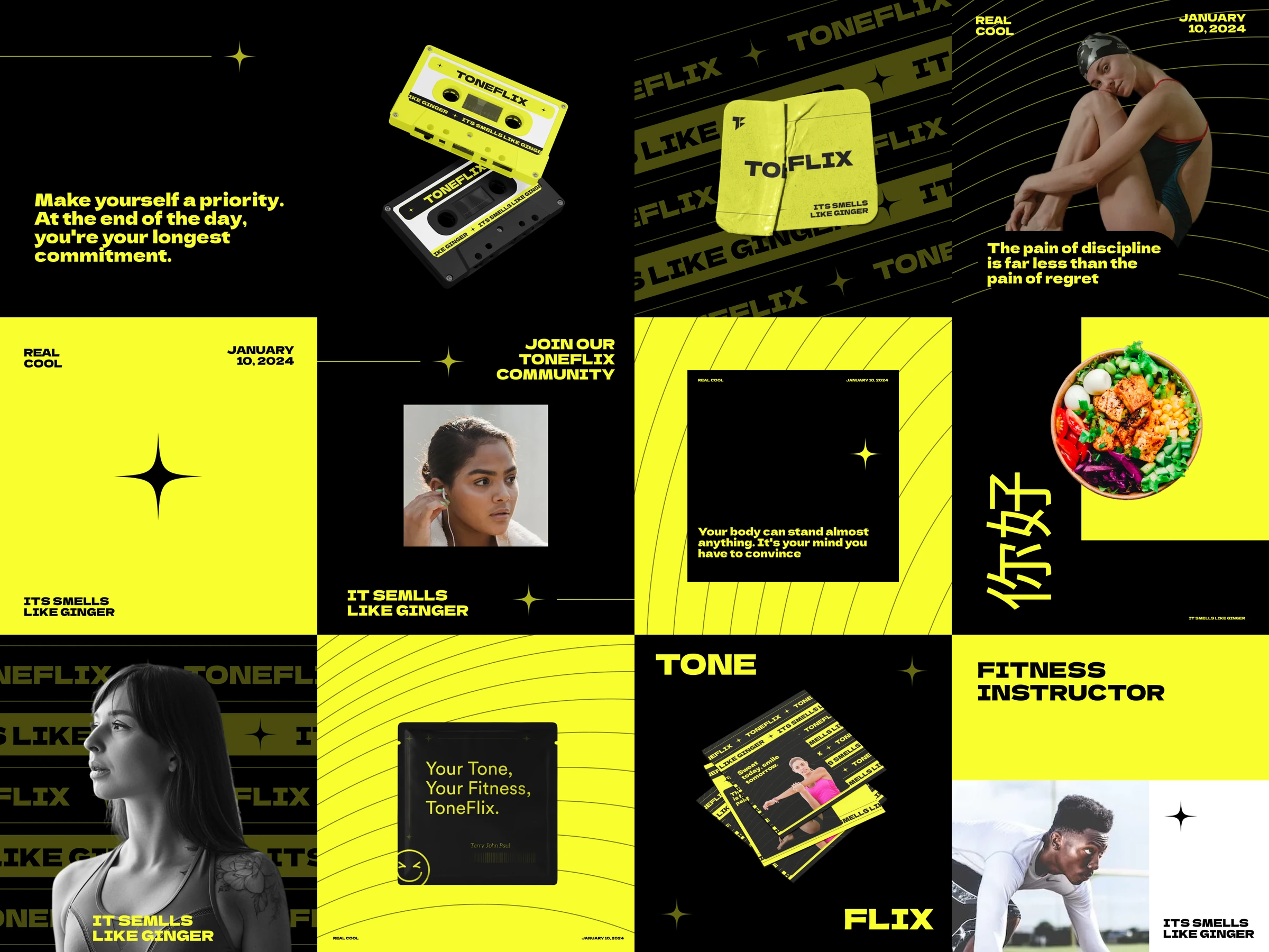
Design language
A workout, a meal log and a product page need different information, but moving between them should feel familiar. I used the same visual language across all six modules.
Near-black surfaces give the screens a consistent base. White text carries the content, with orange accents drawing attention to actions and selected details.
I kept to one sans-serif family and varied the weight to separate headings, important readings and supporting information.
Cards, spacing and navigation repeat across modules, so the layout stays familiar even when the content changes.
Process & requirements / Toneflix
This roadmap is an illustration of the work involved. September to December 2024 is a placeholder range. The order, overlaps and bar lengths are examples, not a record of when the work happened or how long it took. I cannot confirm the prototype’s timing relative to the pitch, and the evaluation shown here has not been carried out.
01 / Client context
A call with the client set the scope for the fitness concept and funding pitch.
Client request
02 / Research planning
Basic gym-community research took place. The detailed methods and findings remain unconfirmed.
Methods unconfirmed
03 / Product structure
Organise six modules around a shared profile, including shopping and gym discovery.
Scope exploration
04 / Interaction & UI
Design onboarding, the dashboard and training, alongside Explore, Shop and Profile.
Product screen designs
05 / Coded exploration
Build with AI assistance to try dashboard layouts and permission states using fictional data.
Timing unconfirmed
06 / Proposed next step
Compare the views through tasks, review missing data and check accessibility.
Proposed, not completed
Judgement
Client brief: The client asked for shopping and gym discovery alongside tracking. Technical constraints changed the Tracker scope as well, with some features removed and others added.
Two years later, I cannot reliably say which changes happened in what order, or exactly which technical constraints caused them.
If I picked this up today, I would start with tracking and people who already compare records across fitness tools. They have a routine to compare it with, and could tell me whether this view helps enough to make changing that routine worthwhile.
That is where I would focus now. I cannot reliably reconstruct the original strategy from 2024.
The breadth of the app would also need support beyond design and engineering: people to manage training content, check professional credentials and run the shop.
Proposed participants: I would recruit 5 to 7 people who use at least two fitness or activity services and regularly check their progress. This is the size of the study I would run next, not the number who took part in the original gym-community research.
I would watch whether people can understand the combined view, explain a recommendation and revoke access without help. If they get stuck, I would revisit those interactions before adding more to the app.
I would also compare what people understand from each version. If combining the records tells them nothing useful beyond the separate views, I would rethink which information belongs together.
Whether people return, keep logging, book sessions or buy products would take longer to learn. Those questions need a working product and observation over time; one prototype session cannot establish retention or conversion.
Reflection
My contribution: I designed all six modules, handled the research planning and built a coded prototype with AI assistance. That made parts of the concept possible to try, though it remained a prototype rather than a production app.
Still unconfirmed: I do not know why the 2024 pitch did not secure investment. I also cannot confirm the detailed Tracker changes, research methods and findings, or when the prototype was built relative to the pitch.
Concept work. Toneflix was never shipped. Some basic gym-community research took place, but the final concept has not been shown to work for users. The proposed usability study is still the next step; the funding outcome alone cannot answer that question.
I’m Terry, a senior product designer working across AI, commerce and fintech. If you’re hiring for a permanent product design role in the UK, I’d like to hear about the work. I would need Skilled Worker sponsorship to relocate.
Open to permanent UK opportunities
Get in touch