/work/mita
MITA™
MITA.
The Music Investment App
Services provided:
Brand Evolution
Web Design + Development
Asset Creation
Launch the live site:
joinmita.comMade in Barcelona, SPain
2023
/work/mita
Services provided:
Launch the live site:
joinmita.comMade in Barcelona, SPain
2023
/Work/Settle-Club
Settle Club
Usability participant, 23, Pune
1. Understanding
Most users don't understand what they're agreeing to. In India's BNPL market, 60% of target users have never had formal credit. They think BNPL works like UPI, free and instant. The gap between that expectation and an actual credit obligation is the core design problem.
2. Regulation
RBI's Digital Lending Directions 2025 mandate a Key Fact Statement showing APR, total cost, and cooling-off period before checkout consent. Every additional screen before payment reduces completion by about 12%. The design has to make that mandatory disclosure feel useful, not like a speed bump.
3. Revenue
Revenue comes from merchant MDR (2-4%). The product has to work for borrowers and merchants while keeping three lending partners happy: CASHe, LiquiLoans, and U GRO, each with different risk appetites. It routes each transaction to the best available lender, but the user should never feel auctioned.
LazyPay, Simpl, and UPI Credit Line all compete for this same user. Settle Club's bet is that showing the true cost upfront wins more of them long-term.
We had a hunch. If someone sees the full cost and still goes ahead, they're probably going to pay it back. Fewer defaults means we can offer merchants a lower MDR. So the design argument doubles as a business argument.
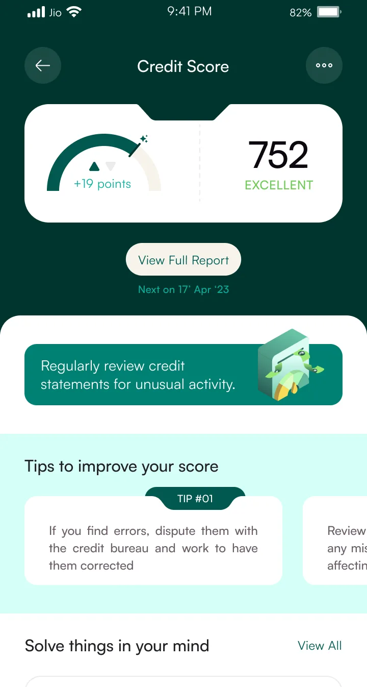
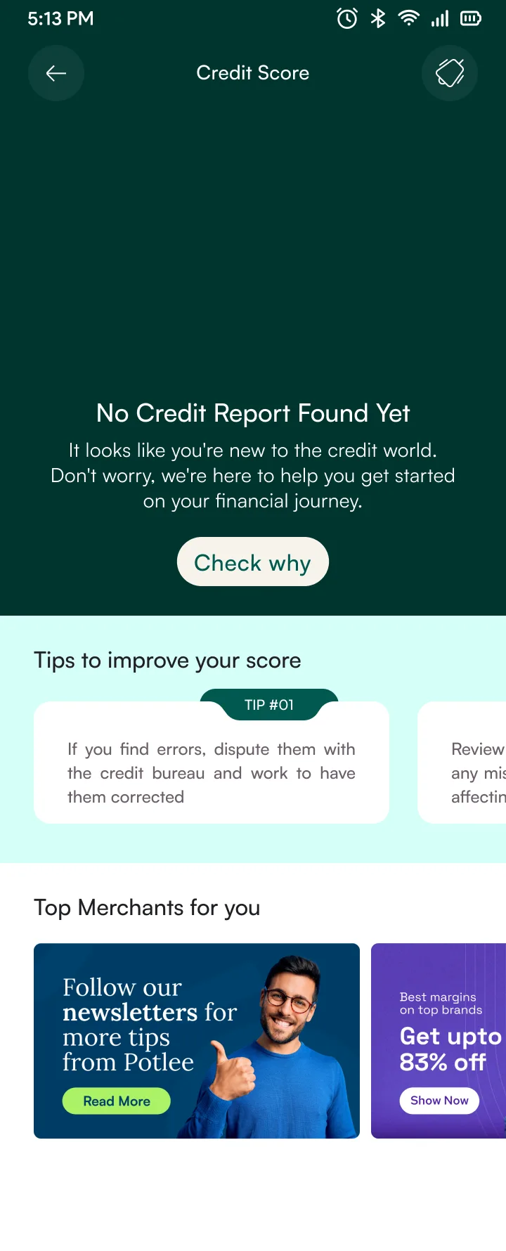
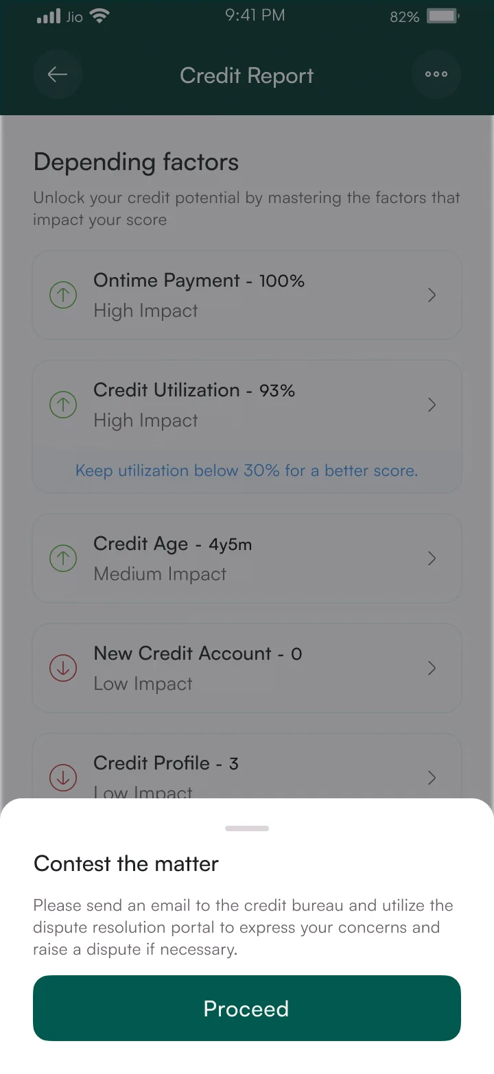
Credit Score: Factor Breakdown
Free bureau pull · Score history · Factor breakdown
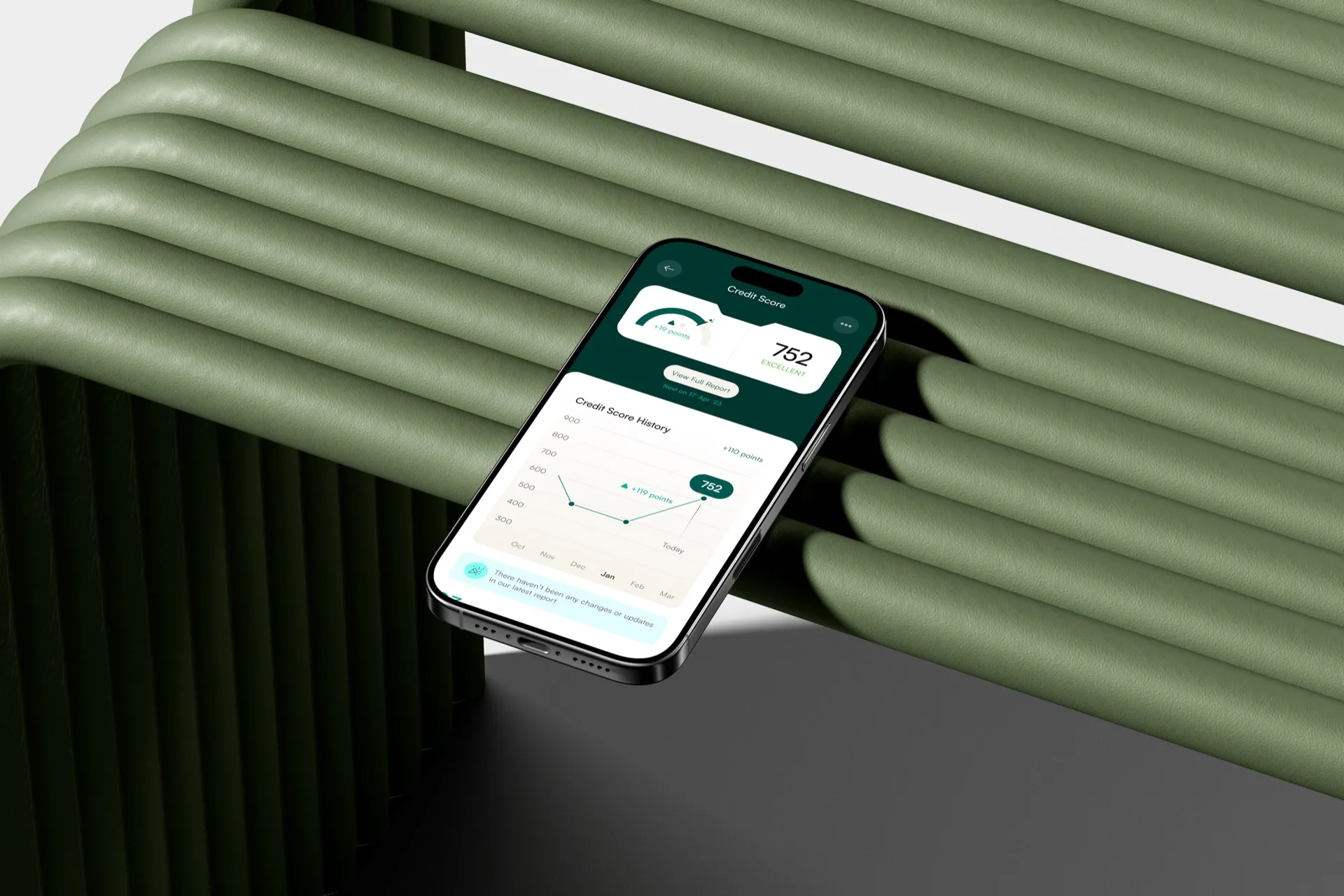
Free CIBIL pull shows the score, a history graph, and the factors behind it: payment history, credit utilisation, account age. Everything is written so users actually read it. If something looks wrong, the contest flow lets users dispute errors without leaving the app. Average score of active users: 752.
24 · Content creator · Bangalore
No credit history and no CIBIL record. Complete blank slate.
Got burned by a hidden subscription fee once. Now reads every line before tapping "confirm."
Mental model: “BNPL = free like UPI”
Checks her CRED score weekly but doesn't actually know what APR means.
What this meant for the design
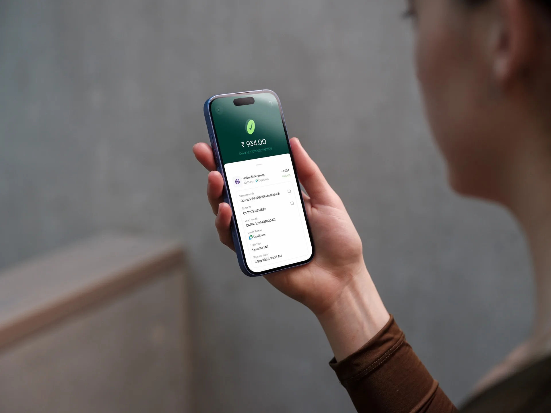
Show total cost in rupees before consent. If the user can't see exactly what they'll pay in one glance, the screen has failed.
36 · Kirana shop owner · Nagpur
Runs on informal credit (udhar khata). Trusts the shopkeeper down the road, not an app.
Associates formal debt with harassment. His neighbour got collection calls at 6am and he still talks about it.
Mental model: “Credit = relationship with a person I trust”
Design Implication
Named lender contacts, visible grievance paths, language that never sounds like a threat.
Synthesized from 14 user interviews · 8 first-time credit, 6 small business owners · Tier 1–3 cities
Comprehension First
Users see the total cost before they commit
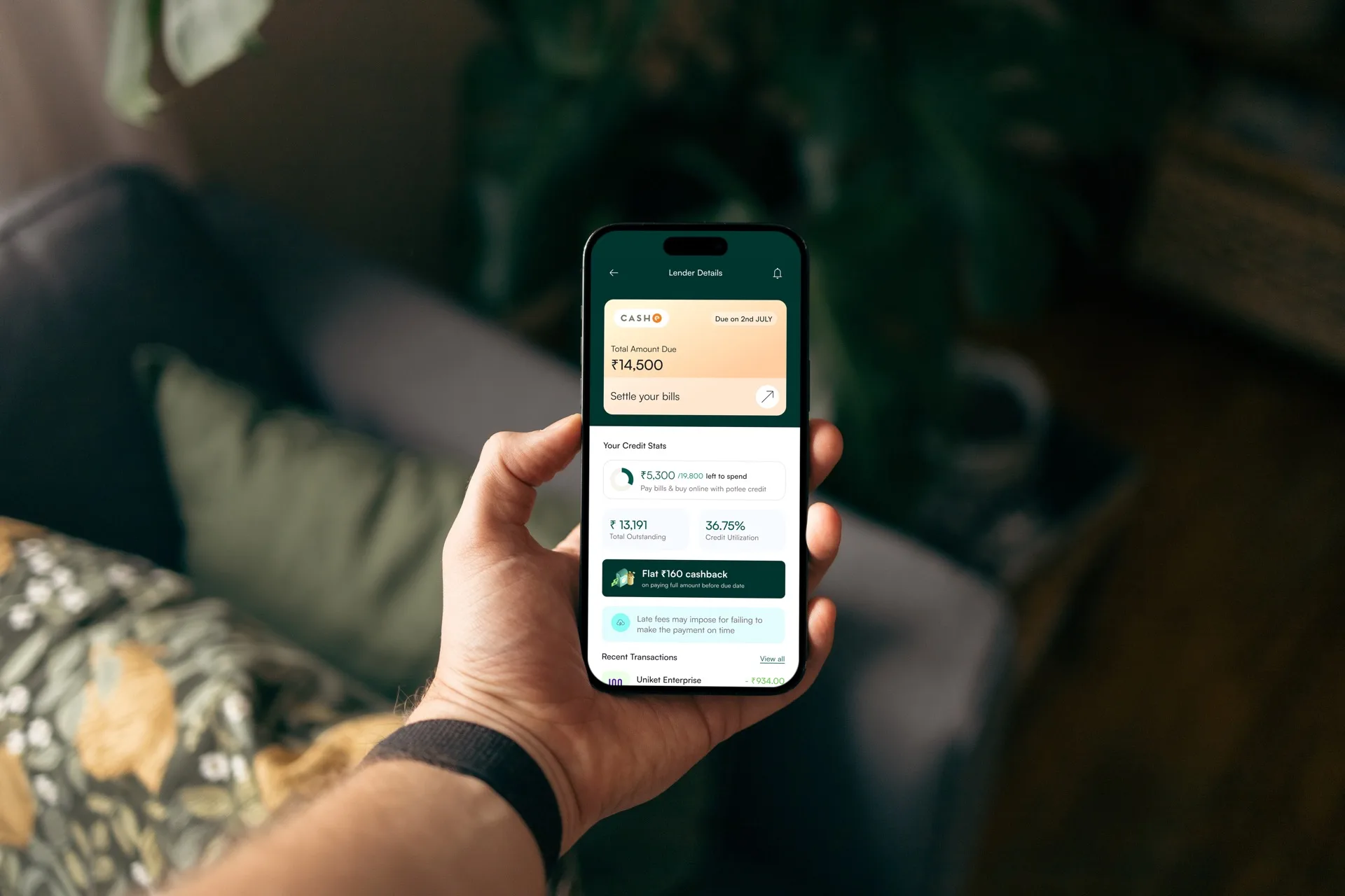
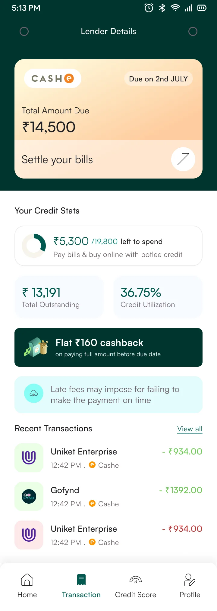
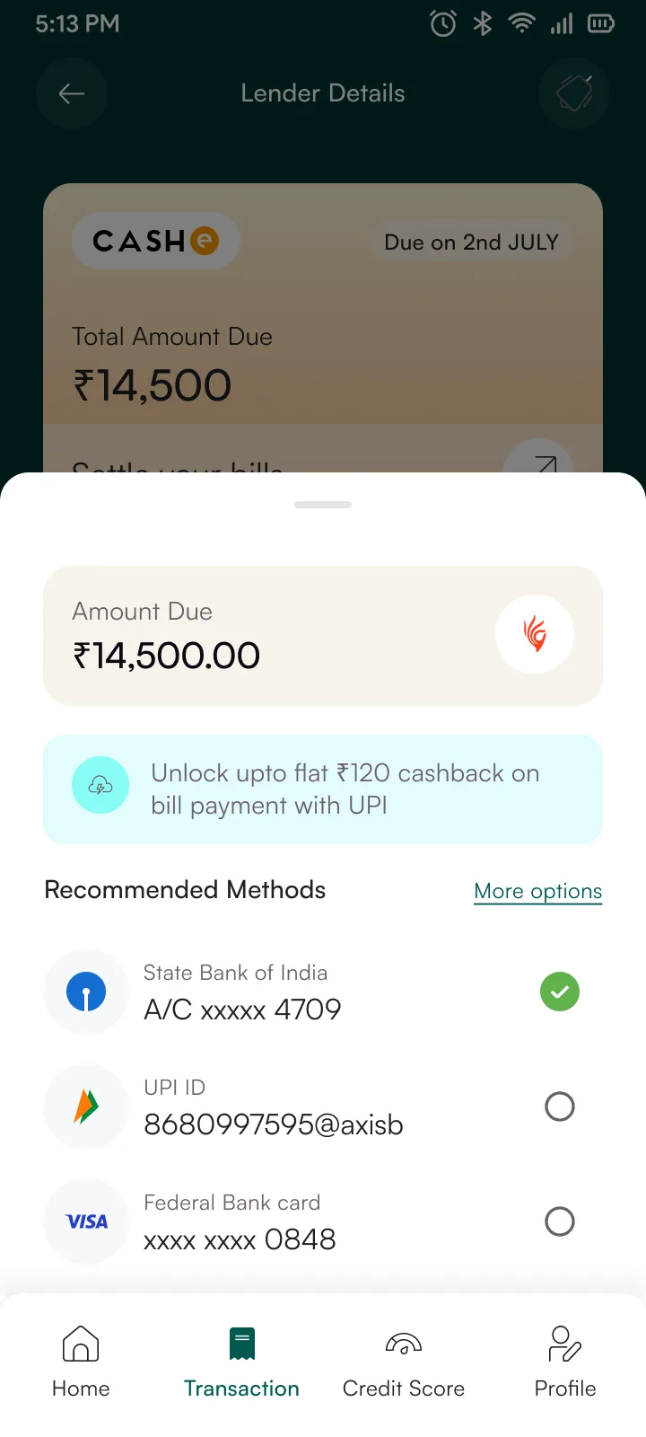
Lender Details
CASHe · ₹14,500 due · Credit stats visible

Constraint
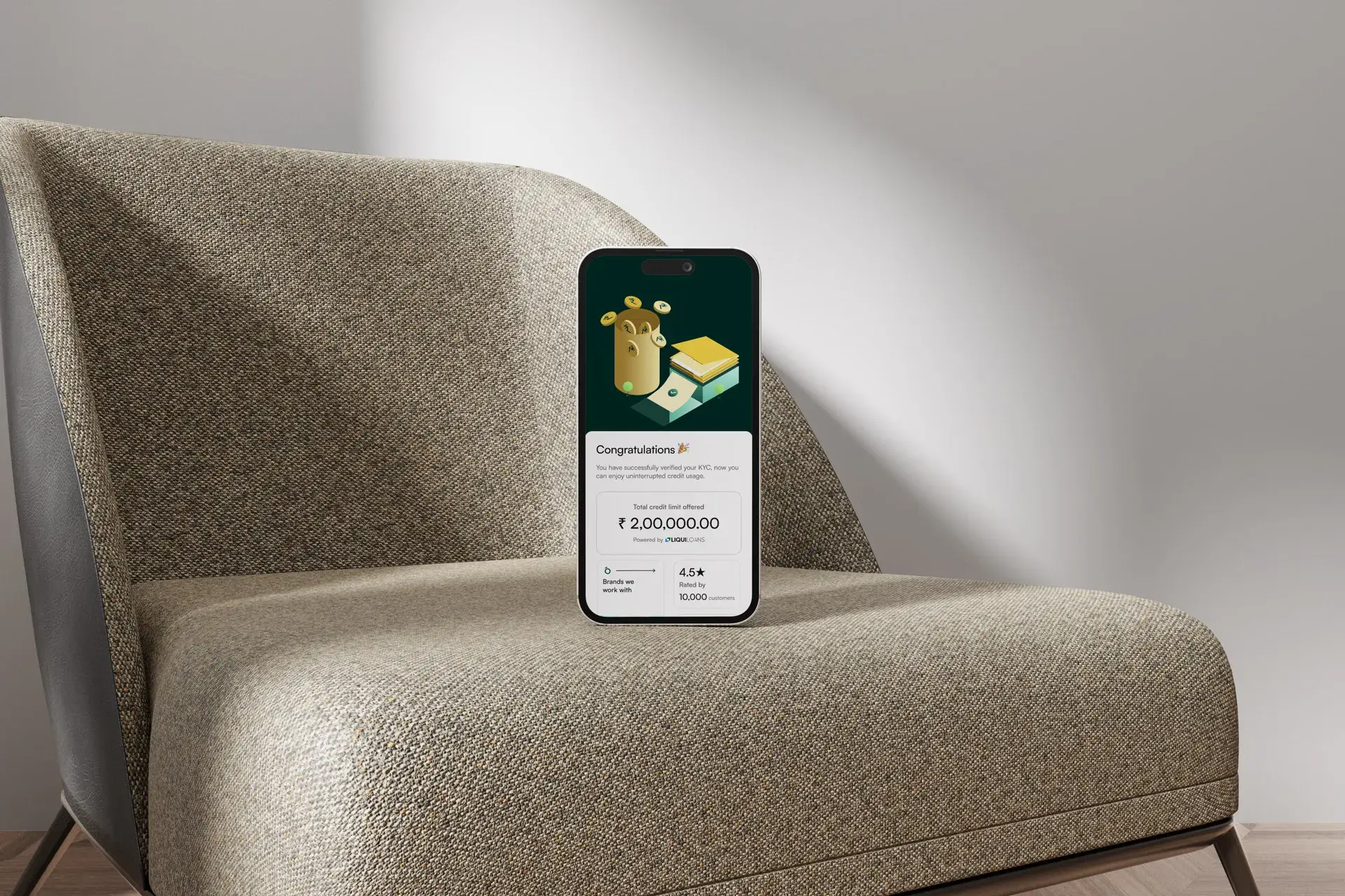
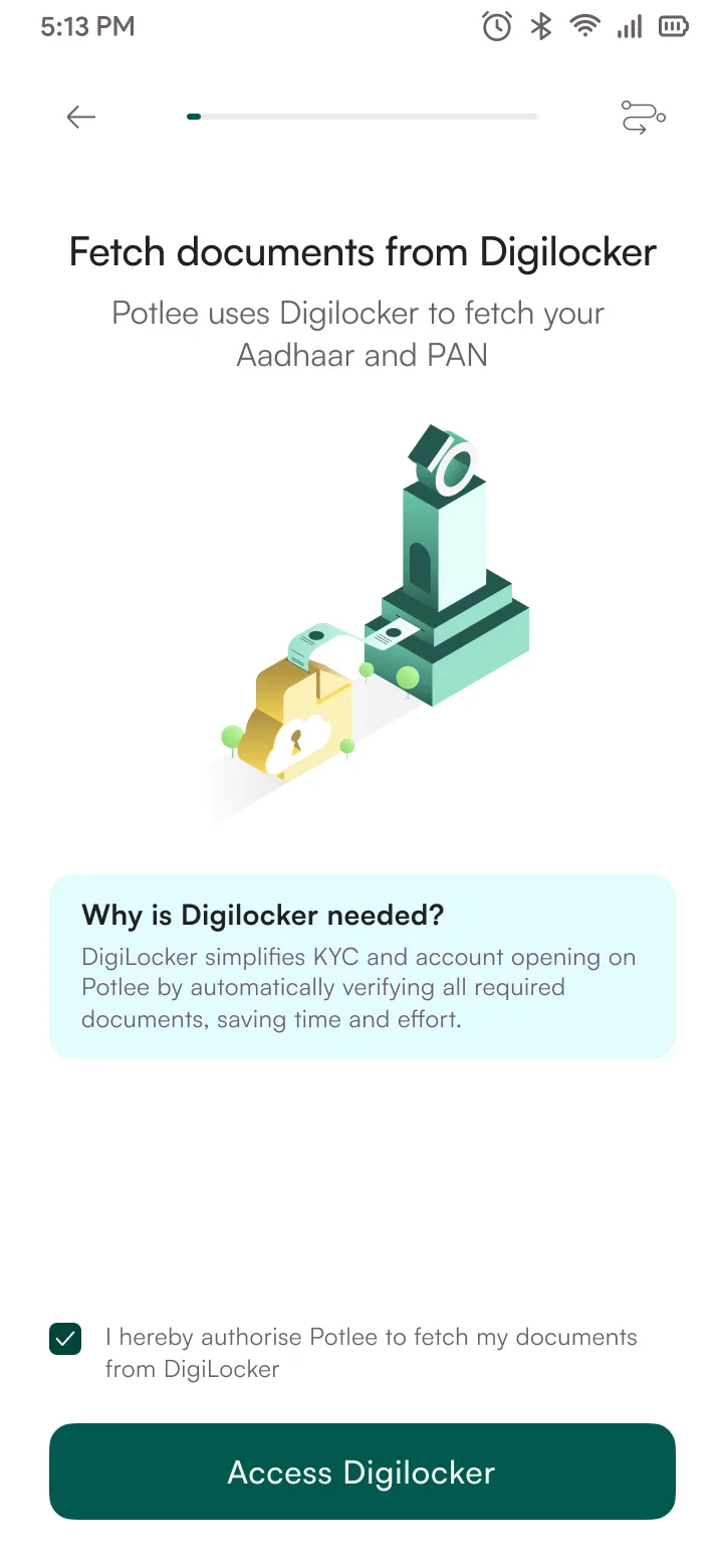
RBI requires KYC for all lending. Mid-flow document upload kills 45% of conversions. Users expect the speed of UPI, not a bank loan application.
Options considered
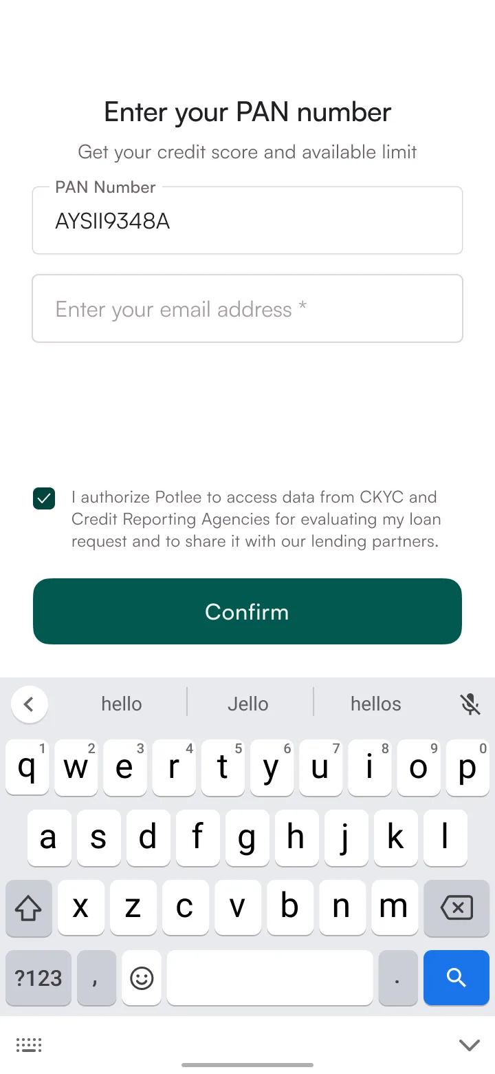 PAN + soft pull
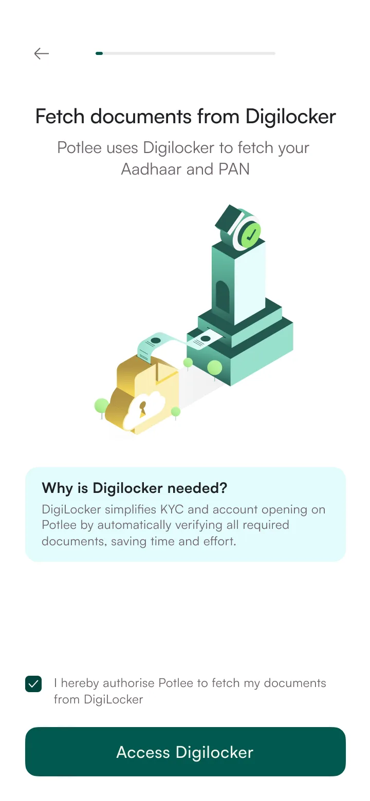 DigiLocker fetch
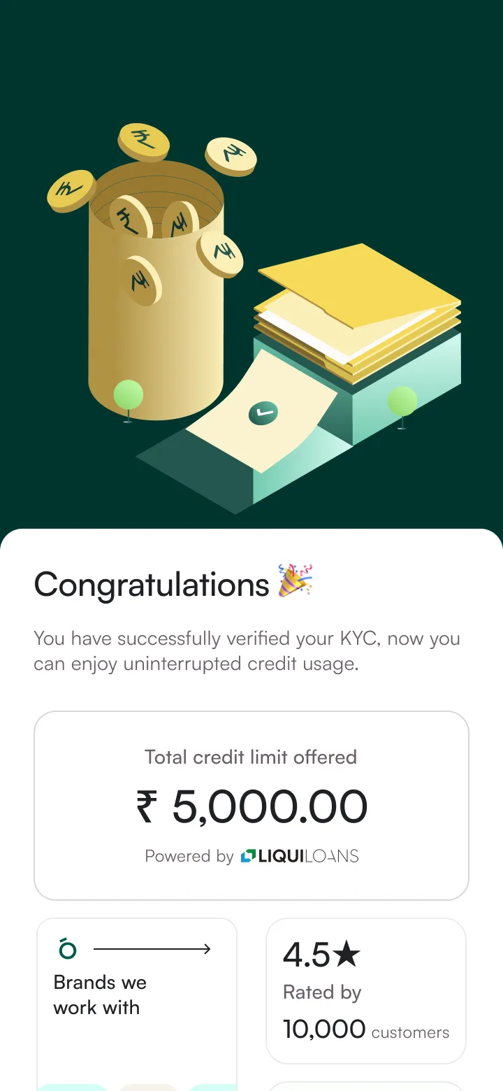 Approved · ₹5K limit
Who disagreed
Risk team pushed for full KYC before any credit exposure, and honestly, they had a point. Micro-limits without identity verification is a real fraud surface. We couldn't just dismiss that. The compromise: we kept the Rs 5,000 cap they wanted, but replaced upfront document collection with passive fraud signals (device fingerprinting, behavioral patterns during onboarding). Risk also insisted on a manual review trigger if any signal looked off, even on small amounts. We agreed. Two weeks of data showed <0.3% fraud on micro-limits, which got us the green light for tiered rollout, but the manual review trigger stayed in.
Constraint
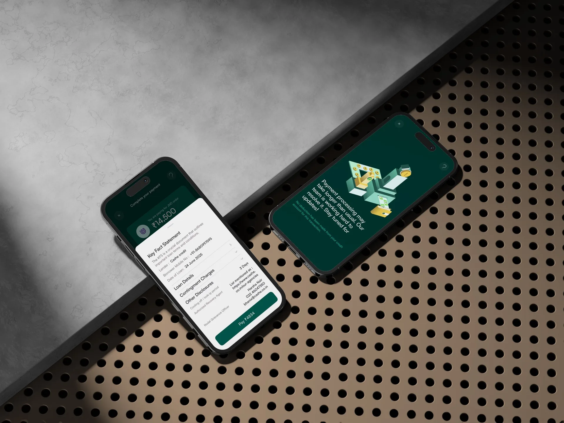
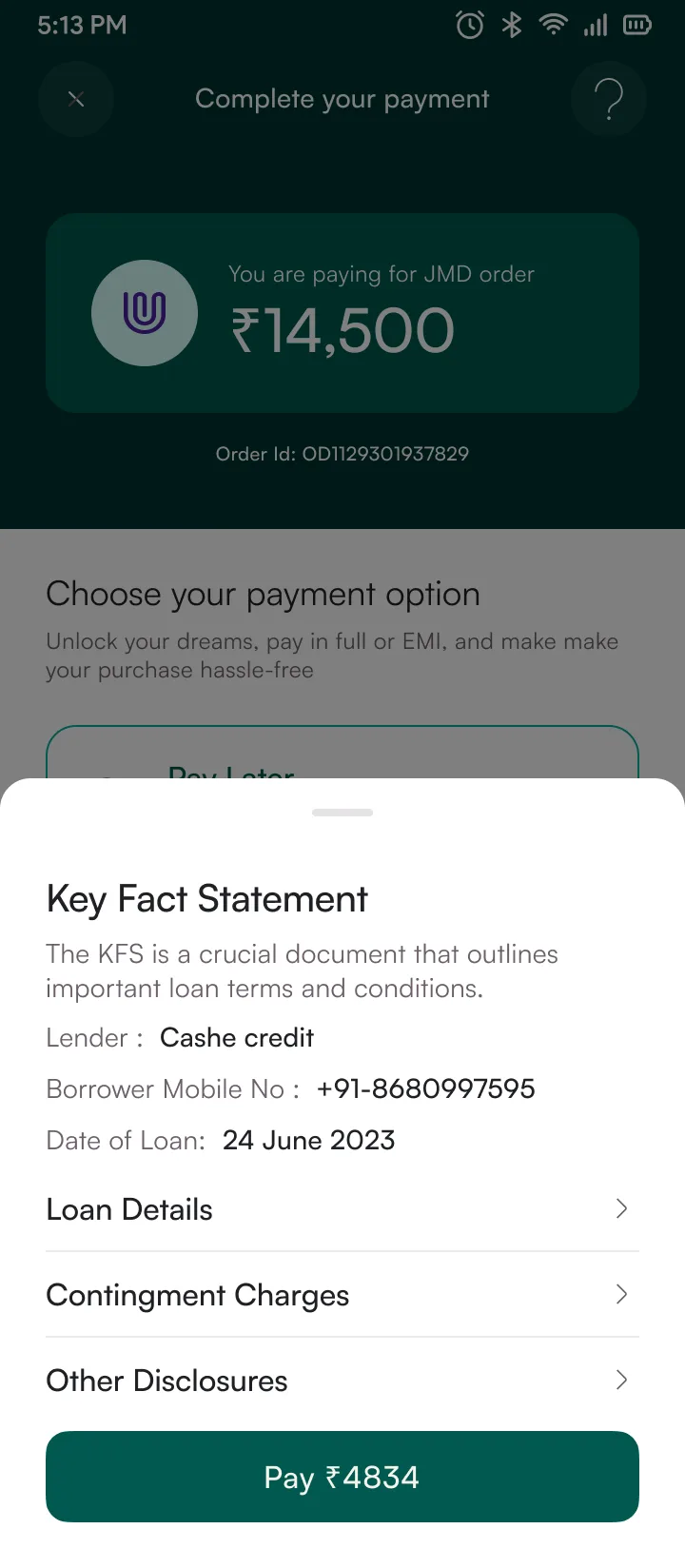
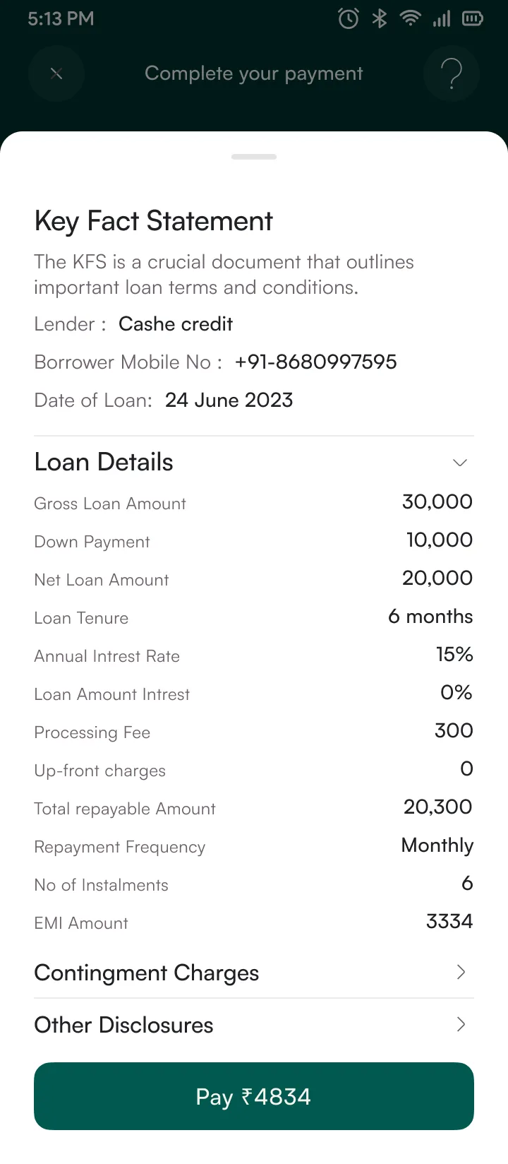
RBI mandates a Key Fact Statement showing APR, total cost, and cooling-off period before checkout consent. Legal team wanted the full regulatory text presented as-is.
Options considered
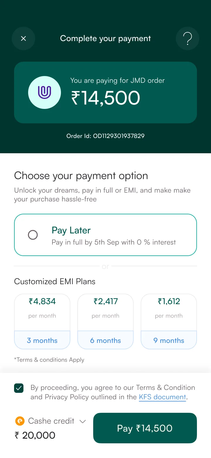 Checkout · ₹14,500
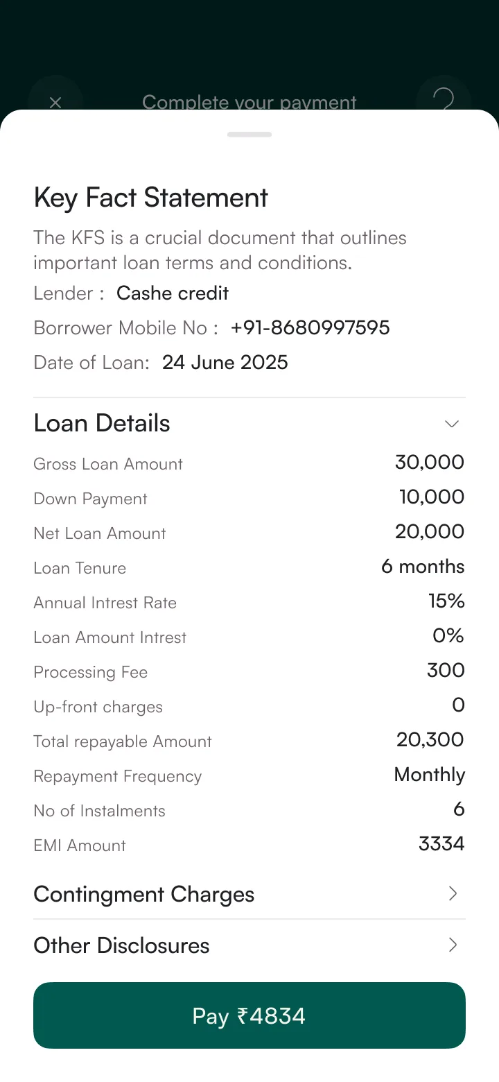 KFS drawer
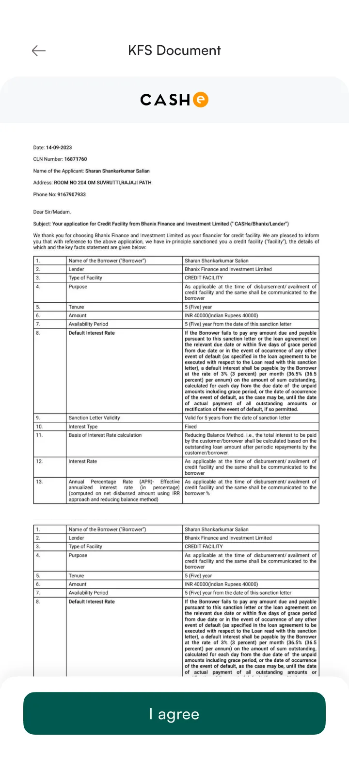 Sanction letter
Who disagreed
Legal wanted verbatim RBI language, unedited, on screen. Their concern was legitimate: if a regulator audits and the mandated text has been "summarized," that's a compliance risk the company bears. We showed them the usability data anyway. 0 of 8 test participants could find the APR in the legal wall. In the card format, 7 of 8 found it in under 5 seconds. That moved the conversation, but legal still wouldn't sign off on summaries alone. The middle ground: plain-language cards up front, with the full unedited regulatory text preserved word-for-word inside expandable sections. Legal reviewed every summary line before launch.
Constraint
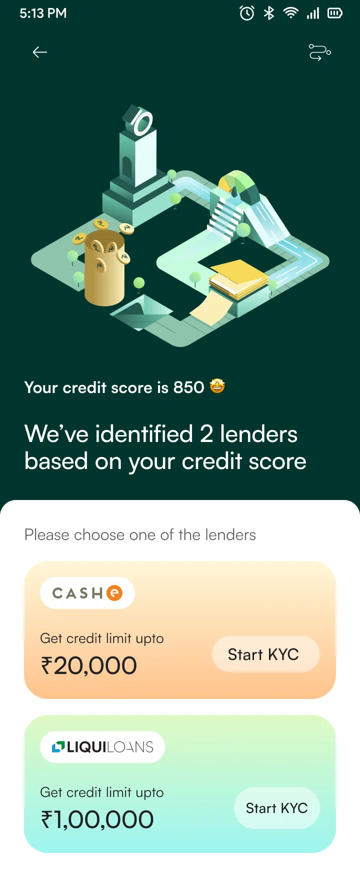
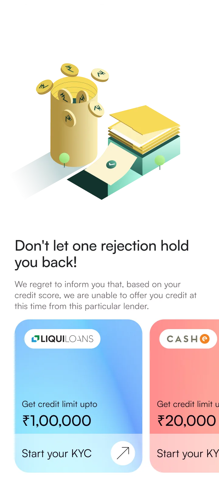
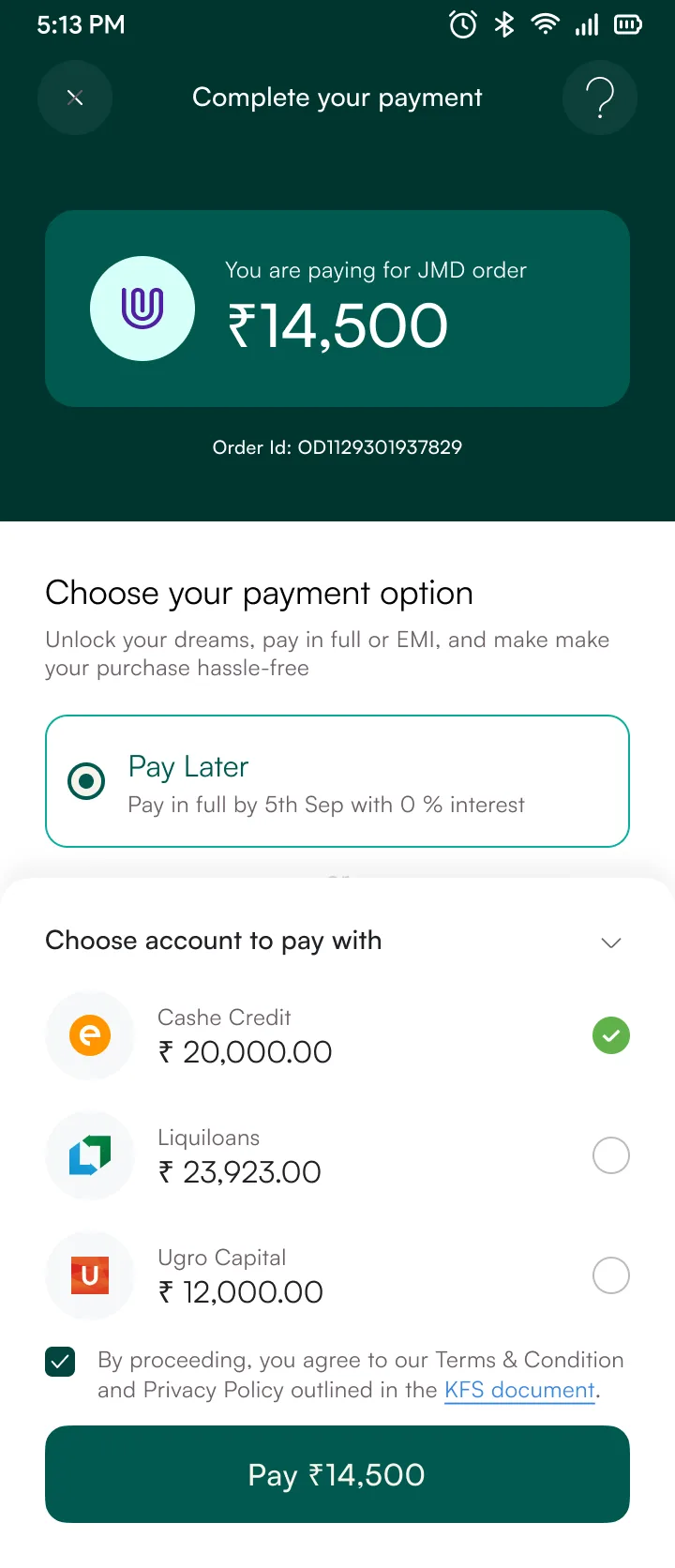
Three lending partners — CASHe, LiquiLoans, U GRO — each with different risk appetites, approval rates, and terms. Some users get approved by multiple lenders; some by none. The product must route to the best option without making the user feel auctioned.
Options considered
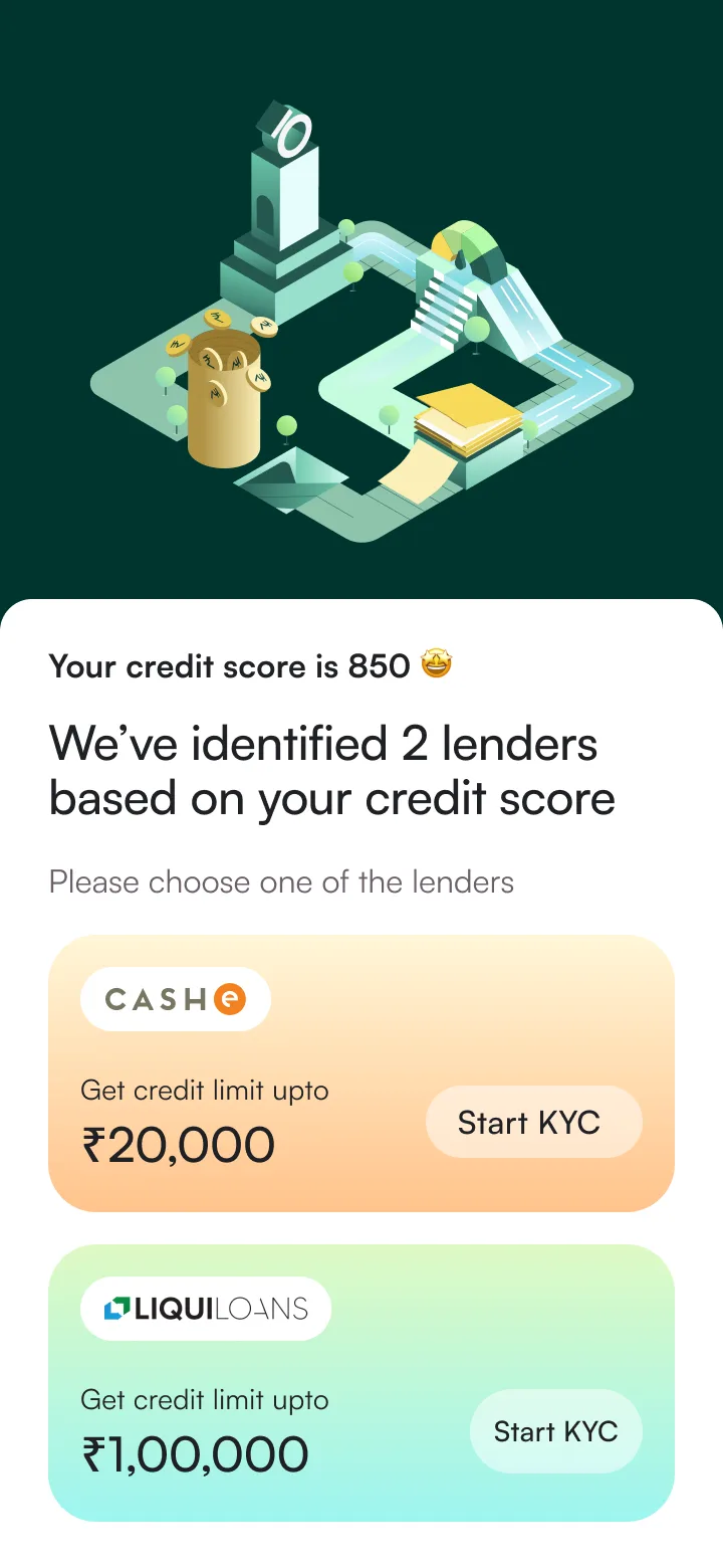 Lenders matched
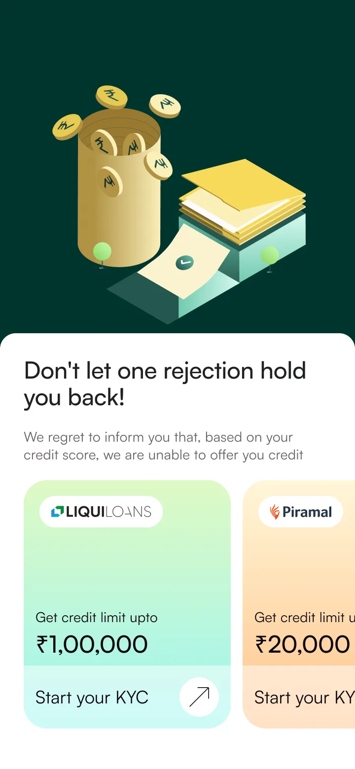 Rejection · alternatives
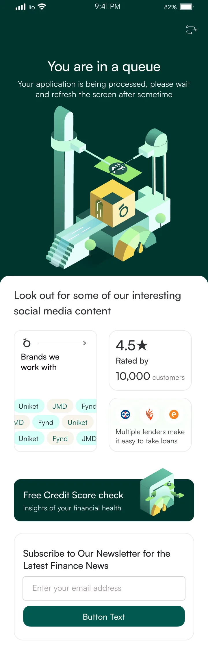
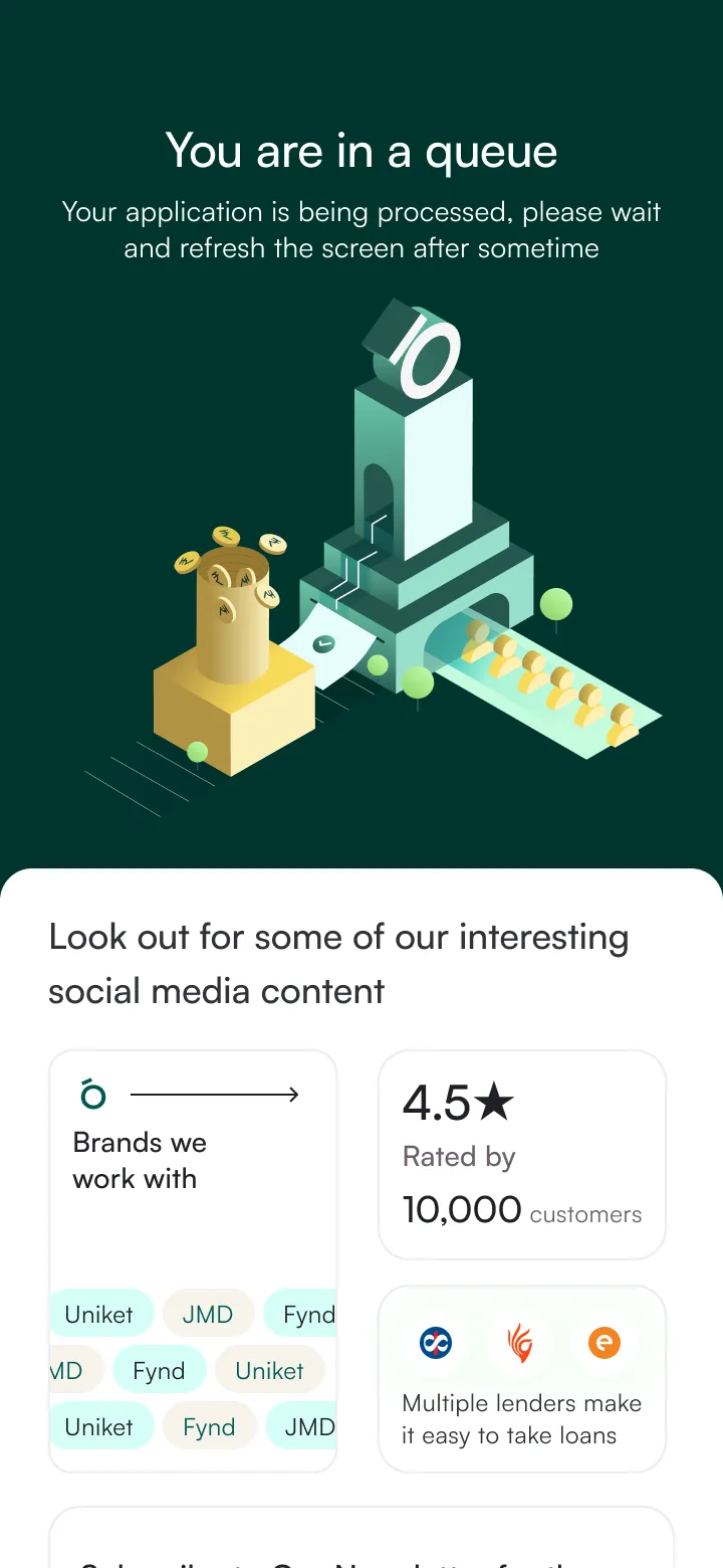 Queue · processing
Who disagreed
Business team wanted to own the customer relationship and hide lender branding. One of our own designers actually agreed with them. Her argument: showing three different lender brands makes the experience feel fragmented, like a marketplace instead of a product. She wasn't wrong. But RBI mandates lender disclosure, so hiding the name was never really an option. We tested both versions anyway. Users who saw lender names reported higher trust because they recognized CASHe and LiquiLoans. The fragmentation concern turned out to matter less than we expected. We did take her feedback and unified the visual treatment so lender cards feel like part of one system, even with different names on them.
Constraint
Must recover payments without being predatory. Users are often 22–25 year olds on their first credit product. The collections path is where lending products build or destroy trust.
Notification escalation
Each payment state triggers a specific notification. Language graduates from informational to protective as urgency increases.
"Your payment of Rs 1,250 is due on July 26th"
Neutral"Rs 1,250 is due in 3 days. Tap to pay now so you don't have to think about it later"
Warm"Rs 1,250 is due today. Paying on time helps keep your account in good standing"
Encouraging"Your payment was due yesterday. Here's how to get back on track"
Helpful"Your payment of Rs 1,250 is past due. Late payments affect your credit limit. Let's sort this out"
Serious"Your account is on hold. Here are your options:"
Paid transitions from every non-Frozen state. Partial payment stays in current tier. Frozen requires manual review + payment plan.
Who disagreed
PM wanted aggressive red banners from day 1, and to be fair, his instinct came from somewhere real. The previous product he worked on had a serious late-payment problem and harder language helped there. Different audience though. Our users are 22-25 year olds on their first credit product. We A/B tested graduated vs. aggressive with 20 participants per round. Graduated language had +27% higher self-serve resolution. But the PM was right that the very last stage (7+ days overdue) needed firmer language than our first draft had. We tightened that end of the ladder based on his pushback.
Results at launch
55%
Checkout Completion
n = 2,400 sessions
14-day post-launch window
Pre-redesign baseline: 41%. Industry avg for Indian BNPL: 38–44% (source: internal benchmark across 3 merchant partners).
68%
KYC Completion
n = 1,800 started flows
First 21 days
Pre-redesign: 34%. Tiered KYC (micro-limit at Rs 5K without Video KYC) accounted for 60% of the lift. 22% completed across two sessions via save-and-resume.
87%
KFS Comprehension
n = 8 usability participants
Moderated, in-person, Pune
Pre-redesign: 12% could state their APR. Small sample — directional, not statistically significant. Validated by 30-day post-launch support ticket analysis: cost-related queries dropped 41%.
+27%
Self-Serve Resolution
n = 20 participants per variant
A/B test, 2 rounds
Graduated tone vs. aggressive red banners. Resolution-first language drove higher self-serve payment. Caveat: unmoderated remote test — real-world effect may differ.
All metrics from first 30 days post-launch unless noted. Checkout and KYC are product analytics (Mixpanel). Comprehension is qualitative (moderated usability). Resolution is A/B (unmoderated, Maze).
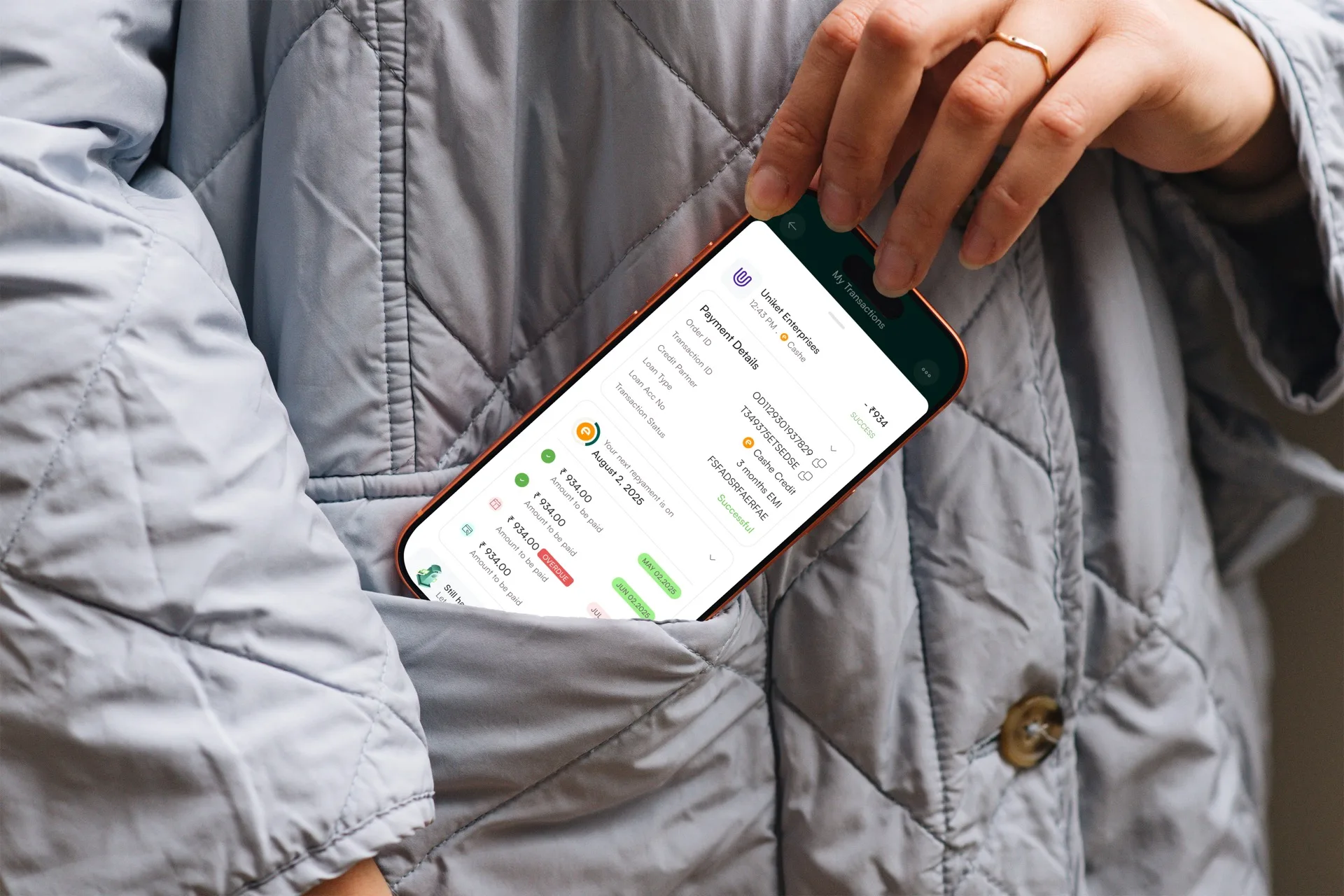
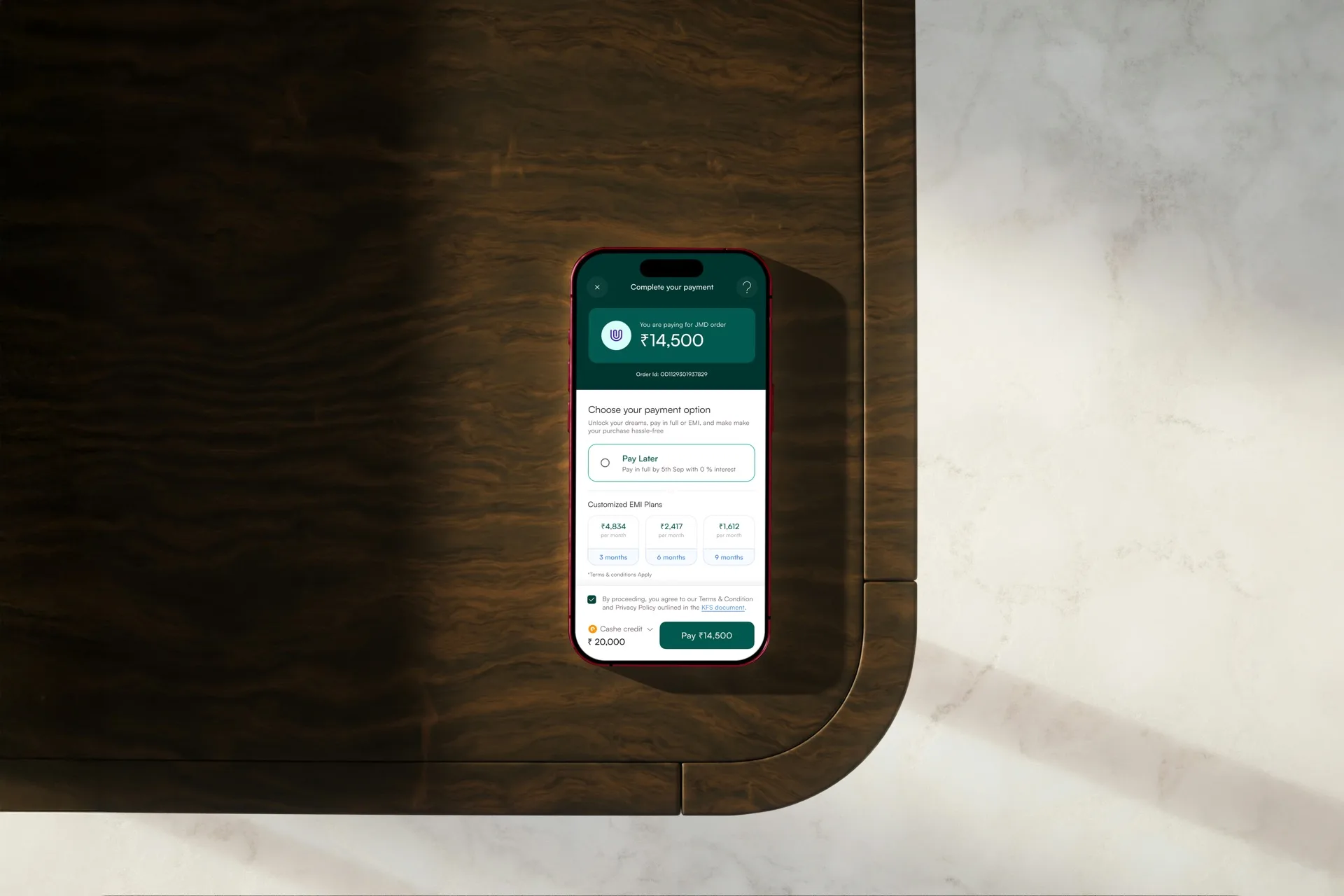
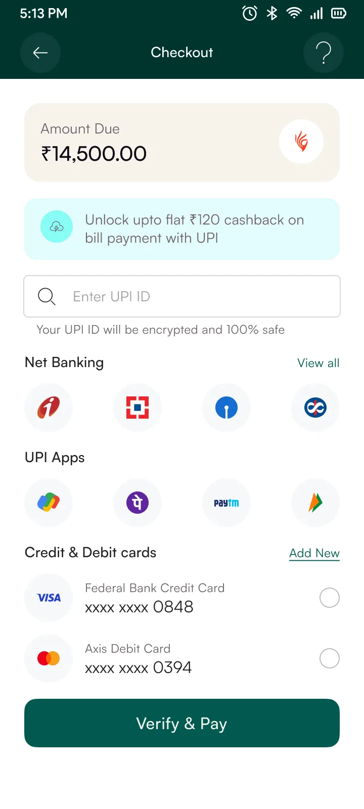
Checkout: Payment Selection
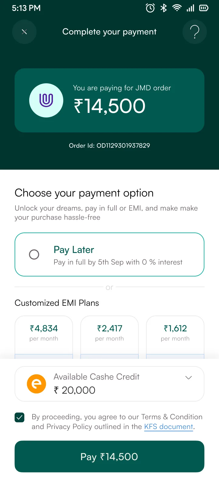
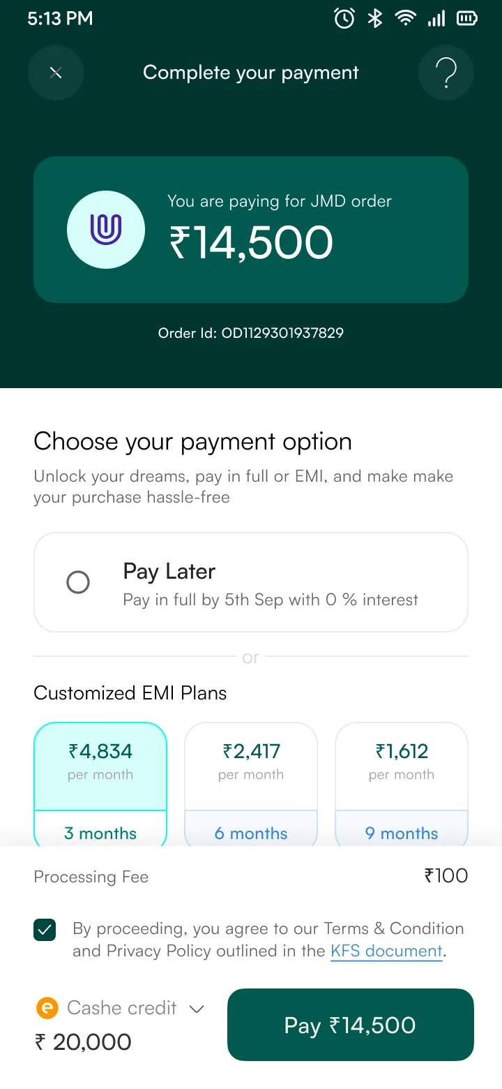
Pay in full or split into EMIs. Every option shows the exact rupee amount upfront, fees included. Instalment plans break out the total cost across 3, 6, or 9 months with processing fee and interest on separate lines.
/Work/Settle-Club
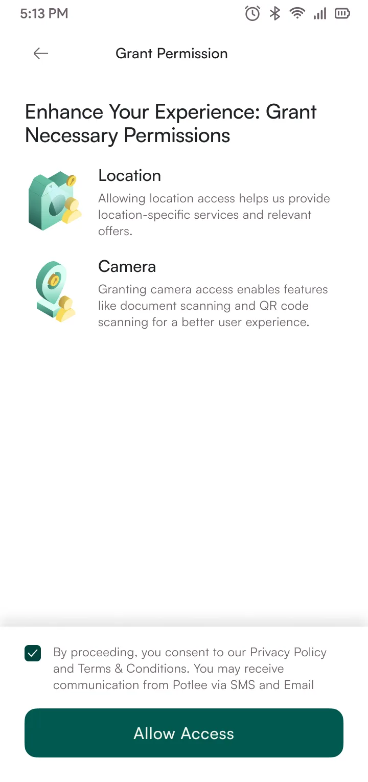
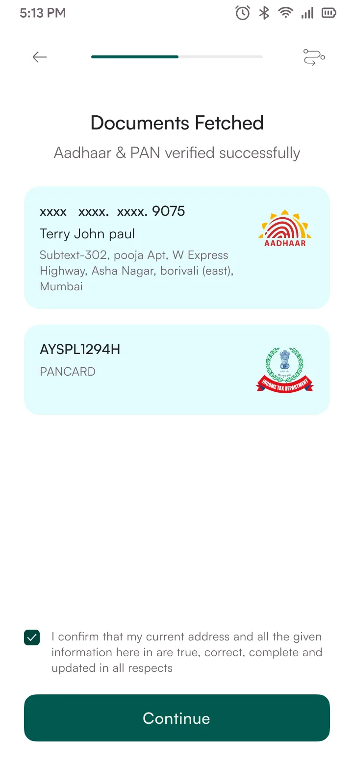
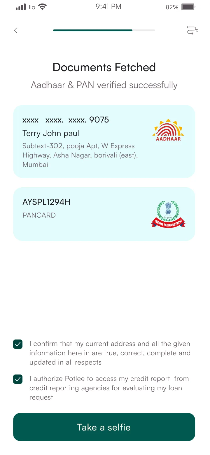
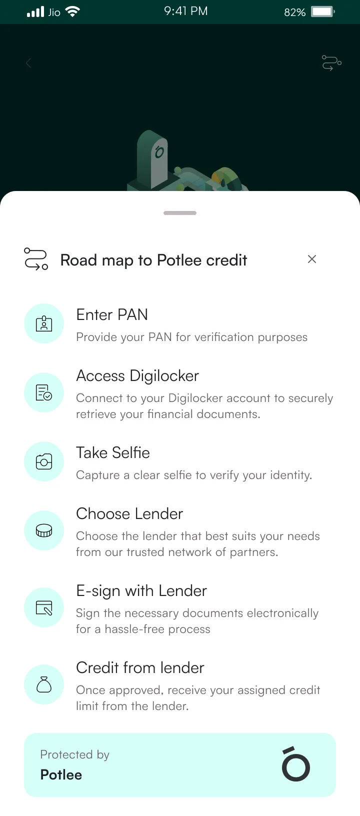
I designed three flows end to end: KYC onboarding (PAN, Aadhaar via DigiLocker, liveness check), checkout with EMI plan selection, and repayment tracking including overdue resolution. 24 screens, 48 components, 8 design tokens covering colour, type, spacing, and elevation.
The cost-display card carried across checkout, repayment, and overdue. A progress stepper tied together KYC and repayment timelines. The action sheet handled plan selection and payment confirmation. Those three did most of the heavy lifting.
API Scoping
Feasibility sessions before design
Feedback Loops
Engineer review after each round
Handoff
Figma Dev Mode, annotated props + states
Shared UI Logic
Core components reused across iOS + Android
Before designing anything, I sat with the engineers and walked through what was feasible: what APIs existed, what data we could get, what would need new backend work. Specs went through Figma Dev Mode with annotated props and states. Engineers reviewed every round of design, starting from sprint planning.
Built under RBI's Digital Lending Guidelines (Sep 2022, updated 2024). Compliance shaped how we structured consent flows and what information had to be visible at each step.
Systems thinking
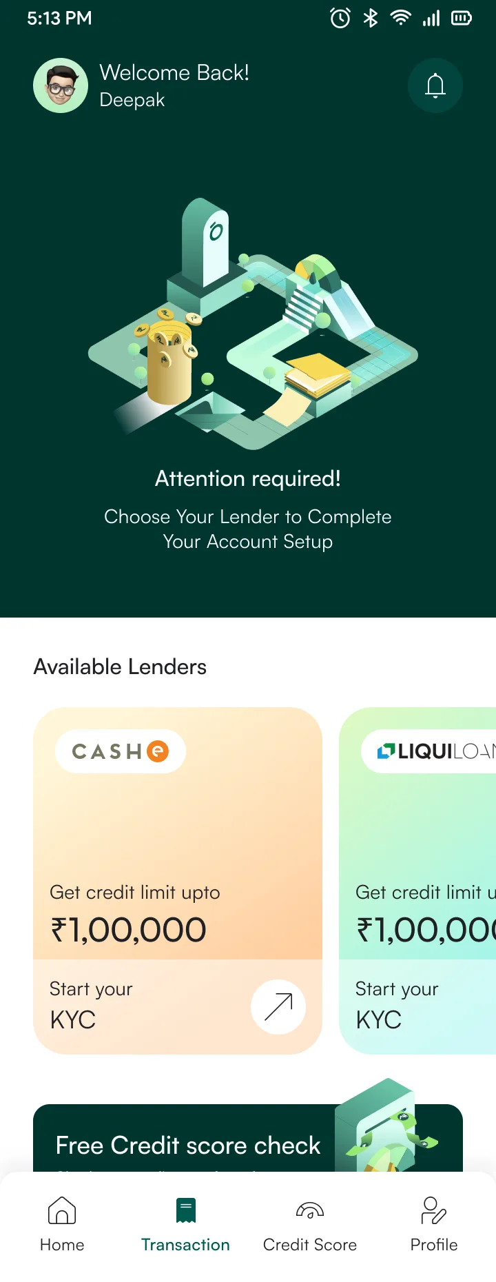
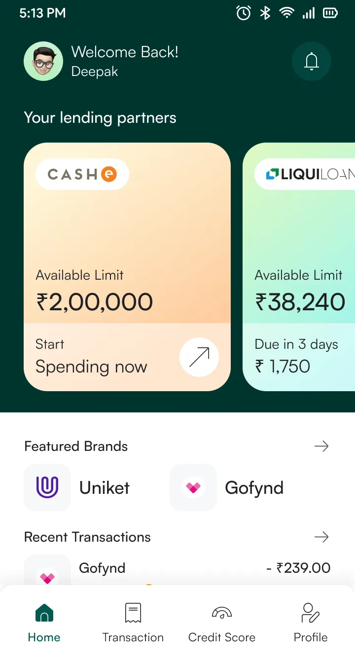
The lender card is the most reused component in the app. It shows credit limits, KYC progress, overdue alerts, and failure states. Instead of designing 10 separate screens, I designed one card that renders all 10 states from three props. The developer wrote one switch statement. When the third lender joined, nothing changed on the frontend.
State transitions
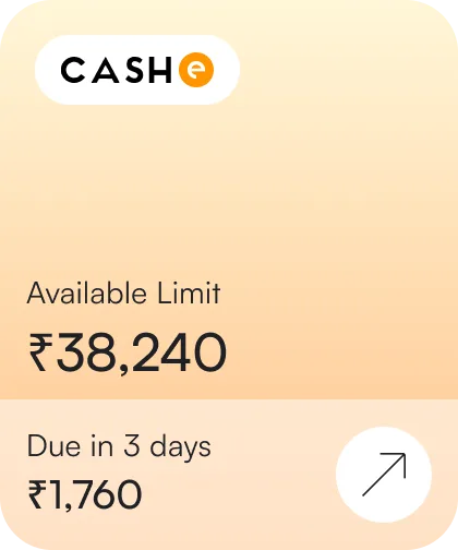
Default
Active account with available limit and next EMI due. The baseline layout every other state inherits from.
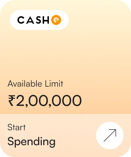
Spend
Fully approved. CTA shifts to "Start Spending". The user is ready to transact.
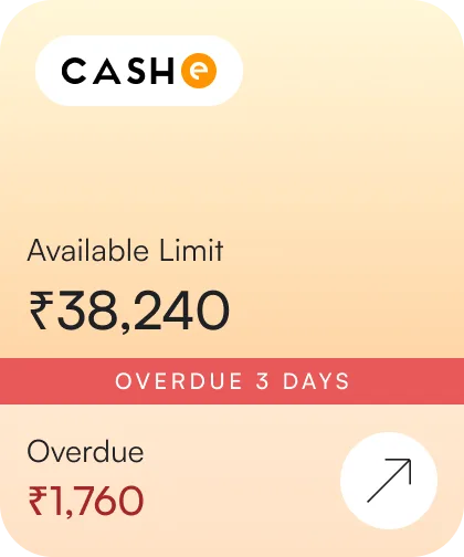
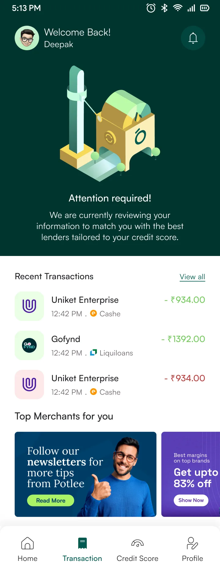
Overdue
Red banner with days past due. Amount turns red. Limit stays visible so users know what's at stake.
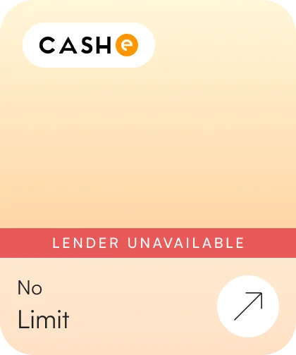
Unavailable
Lender can't offer credit. Card stays instead of vanishing. Shows "No Limit" and explains why.
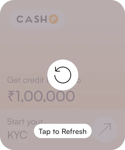
Loading
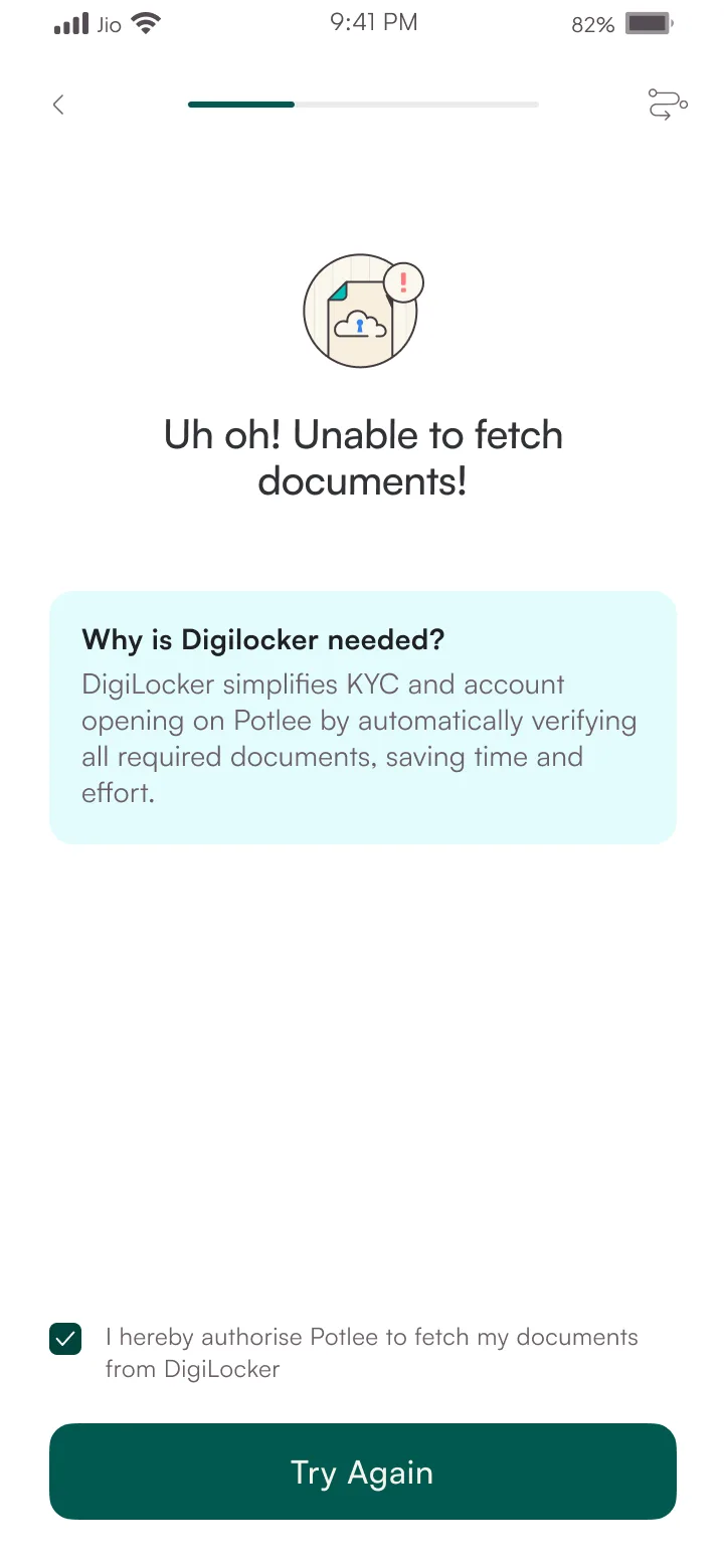
API timeout. Card grays out with a refresh spinner instead of a dead error screen.
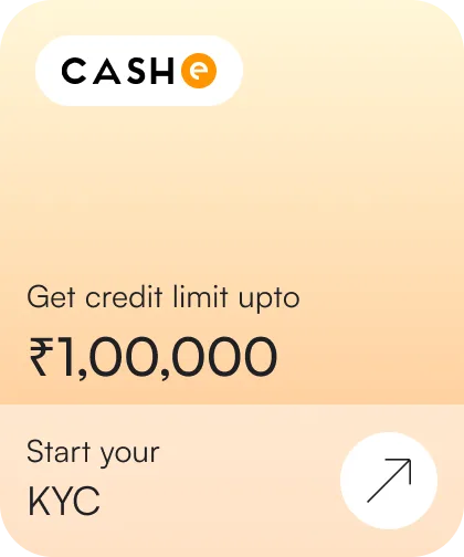
KYC Pending
Lender matched, KYC not started. Shows the limit they can unlock to motivate completion.
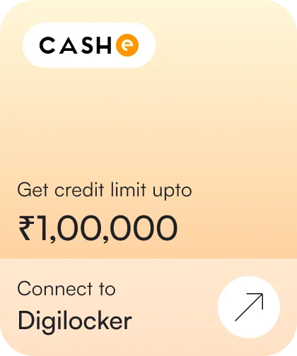
DigiLocker
First KYC step. CTA says "Connect to DigiLocker". Same card, only the action changes.
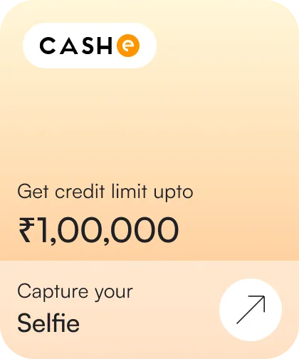
Selfie
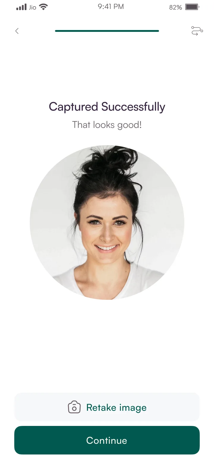
Second KYC step. "Capture your Selfie" replaces DigiLocker CTA. Limit stays the same throughout.
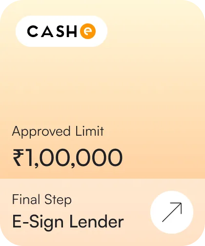
E-Sign
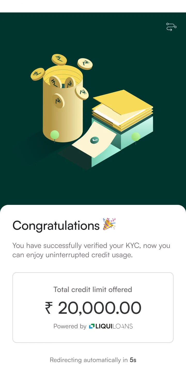
Final KYC step. Label changes to "Approved Limit". One tap to activate.
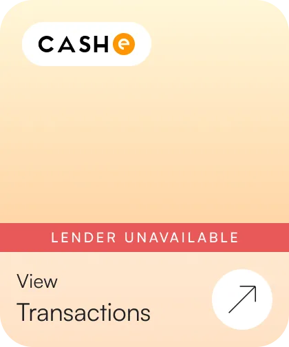
Transactions
Lender gone, but past transactions still accessible. Card persists so nothing disappears.
The developer wrote one LenderCard component with a switch on status, kyc_step, and has_history. When the third lender joined mid-project, the frontend needed zero changes. The API returns a lender, the card renders it.
12 weeks · 1 designer, 2 engineers, 1 PM
Key moments
14 interviews in 5 days. PM pulled field research forward because lender contracts were closing. Pre-recruited participants in Pune and Nagpur — no time for a second round.
CompressedEngineering idle — waiting on CASHe API specs. Lender hadn't finalized their sandbox environment. Engineers used the gap to set up CI/CD and write integration test scaffolding. Design continued without them.
BlockedLegal rejected the first KFS approach mid-sprint. Full-text disclosure was non-negotiable. Redesigned as a structured card format in 48 hours. Tested the next day — 7/8 participants found the APR in under 5 seconds.
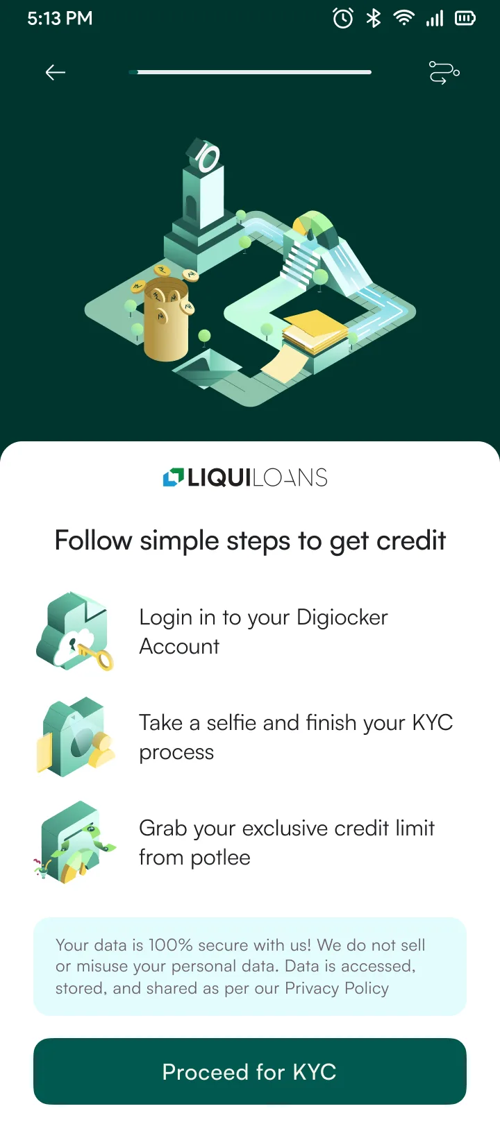
PivotEngineering started the KYC build while checkout design was still in progress. Possible because each KYC step mapped to one API call — engineers could build and test screens independently.
ParallelKYC shipped to production mid-project. Tiered model live with CASHe. Micro-limit (Rs 5K) without Video KYC. Checkout design continued in parallel — two workstreams, one designer.
ShippedA/B test squeezed into 3 days between releases. Graduated vs. aggressive overdue copy. 20 participants per variant, unmoderated (Maze). Had to run it before the checkout build locked the notification system.
CompressedDesign paused — waiting on legal sign-off for multi-lender disclosure language. Used the gap to document component specs and write handoff notes for the repayment flow. Resumed when legal approved the templated KFS approach.
BlockedFull launch across 3 merchant partners. 24 screens, 48 components. Adding a new lender required zero frontend changes — server-side routing meant the UI rendered whatever the API returned.
ShippedThe KFS component accepts locale-specific regulatory text, so adding a new market means updating the content, not the layout.
KFS Disclosure & Error Handling
Key Fact Statement · Lender terms · Cooling-off period
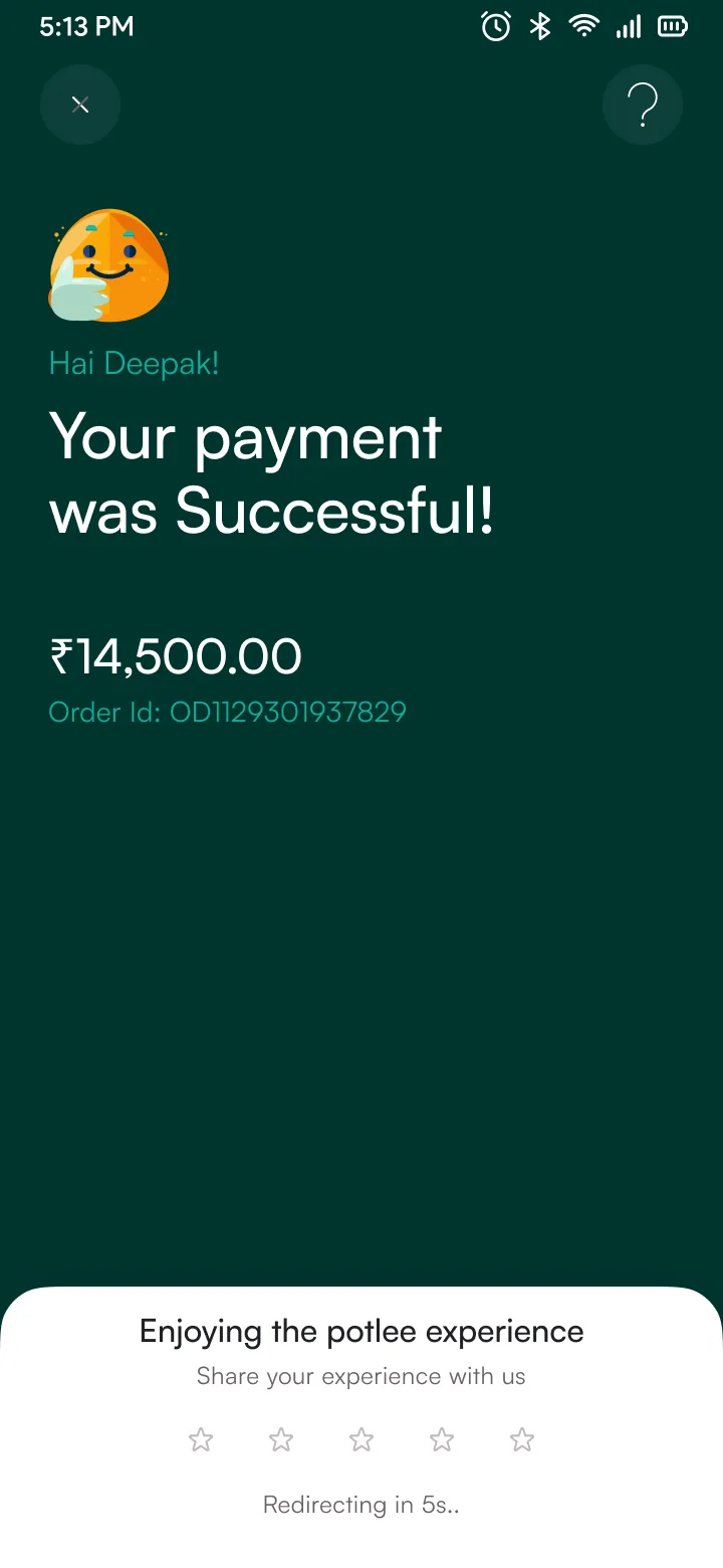
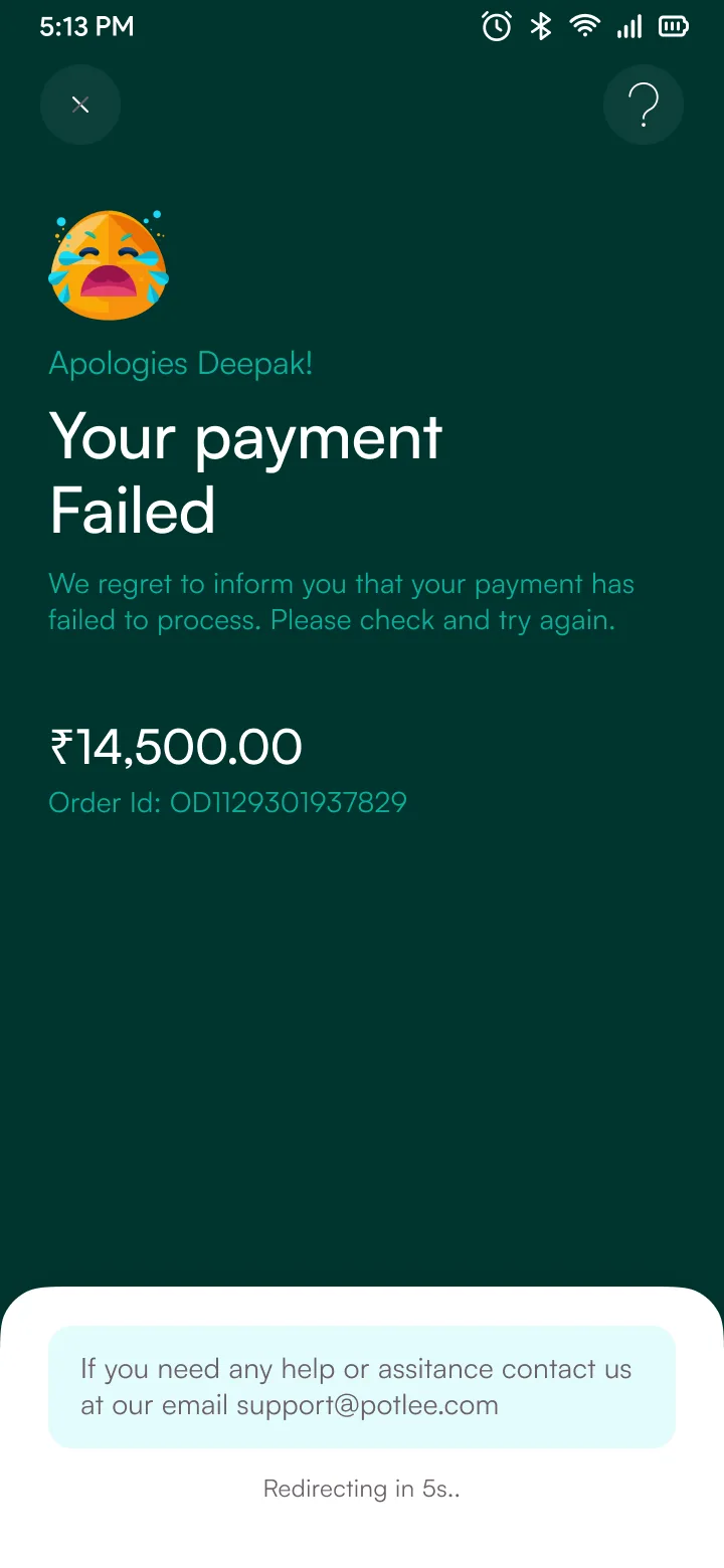
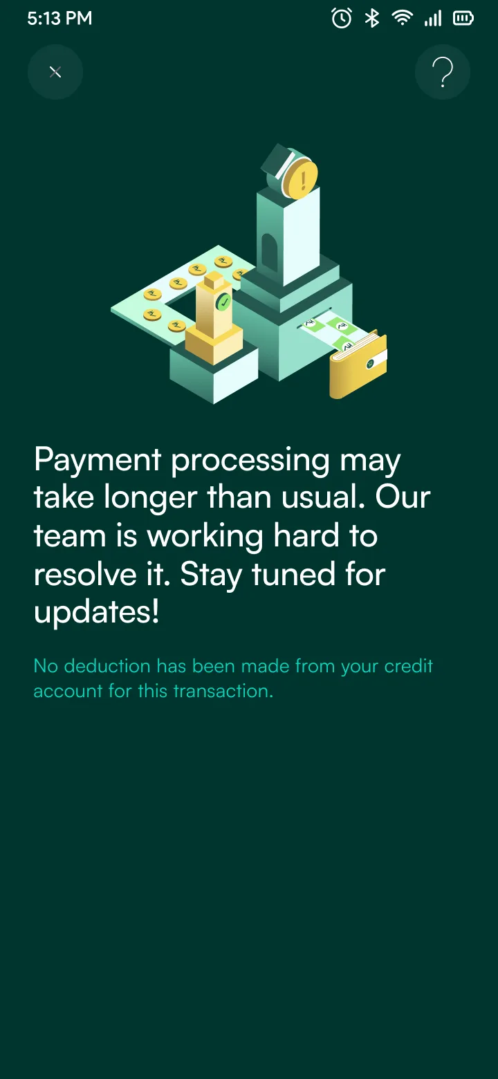
RBI mandates full cost disclosure before checkout. The KFS card shows lender name, APR, contingent charges, and grievance officer, all written to be understood on first read. When payments fail, the error state reassures users that no deduction was made.

Designing credit for first-time borrowers
settleclub.in
55% completion vs 41% avg
BNPL · Fintech
What we learned
Every BNPL app we benchmarked buried the real cost inside percentage rates and multi-page PDFs. 73% of users in our sample never opened the agreement. That told us the format was wrong, not the users.
So we made one rule for every screen in Settle Club: the total rupee amount you owe is always visible, in plain text, before you commit to anything. No APR math, no scrolling. If the number scares you off, good. That is the product working.
Flow 01
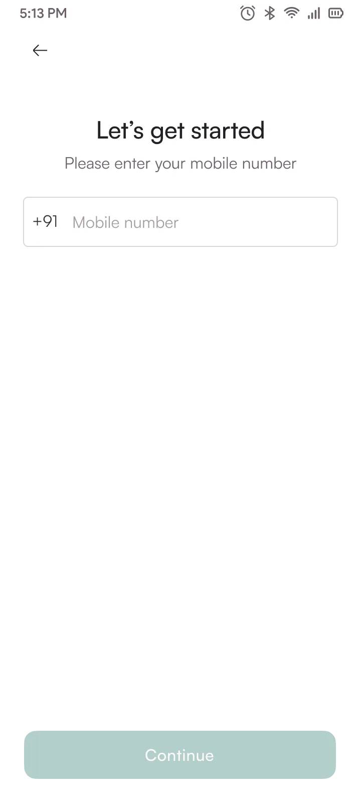
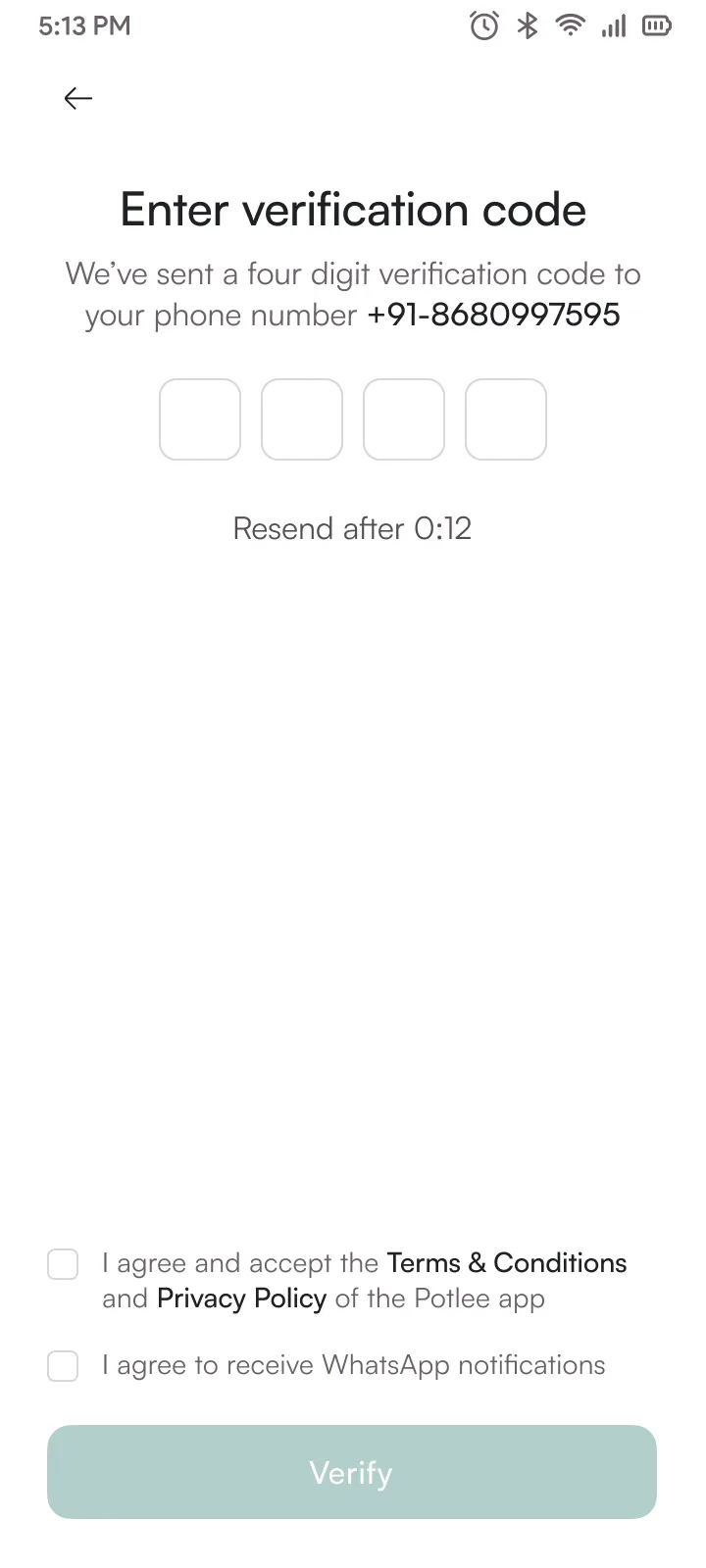
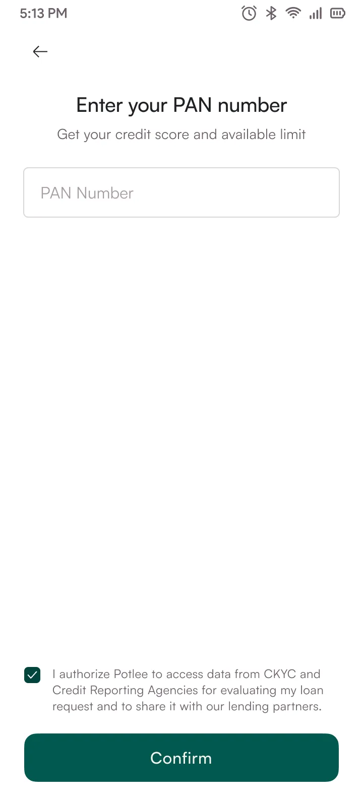
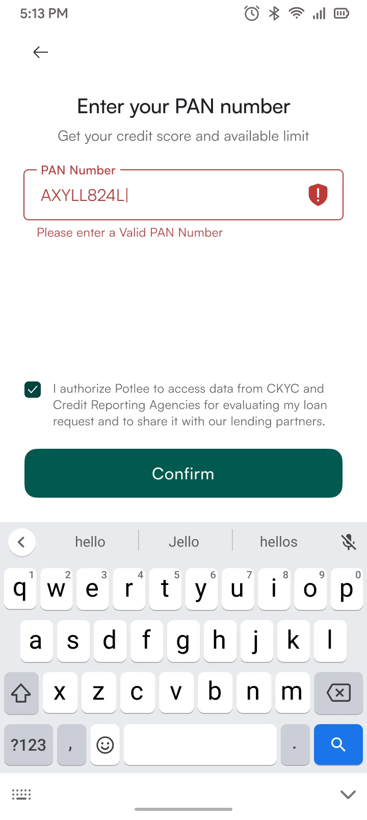
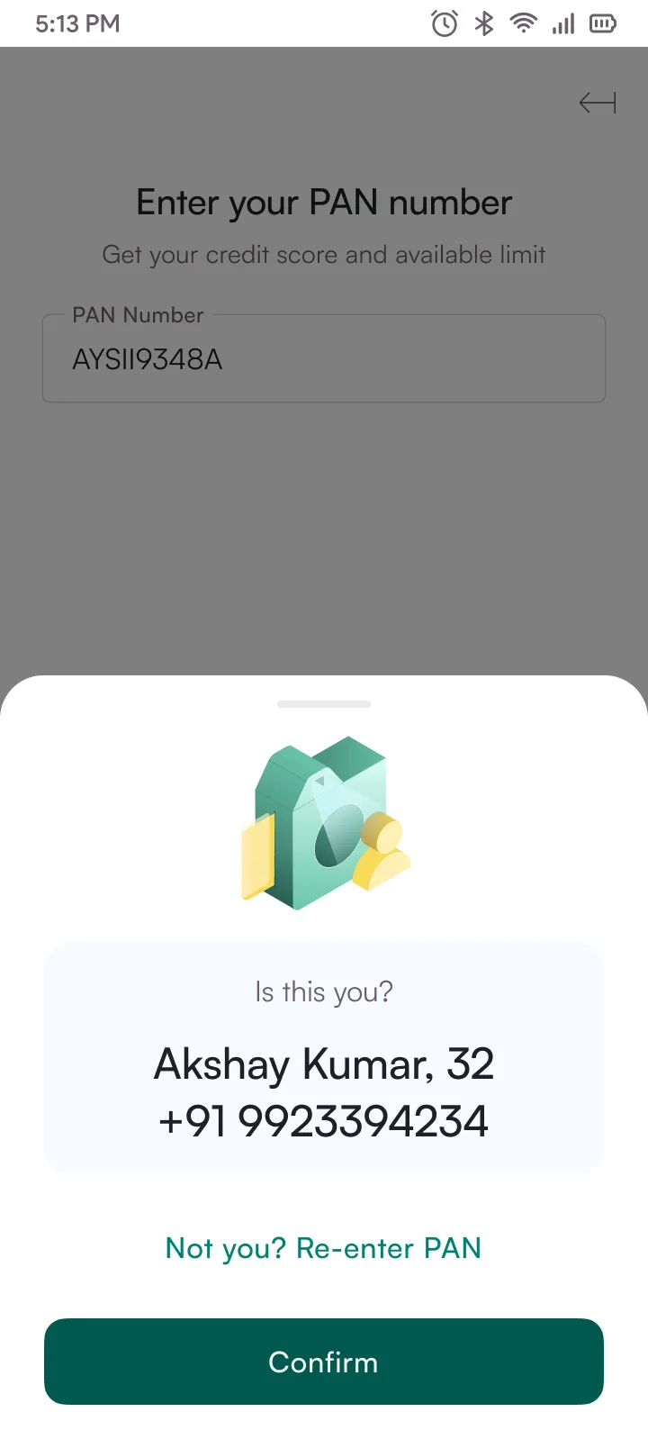
7-step KYC flow. Each step maps to one API call, so screens could be built and tested independently without waiting on the full pipeline. Progress stepper and save-and-resume meant 22% of users finished across two sessions. The stepper component got reused in repayment timelines later.
74%
KYC completion
vs 58% avg
22%
Completed across
two sessions
19 screens

Flow 02
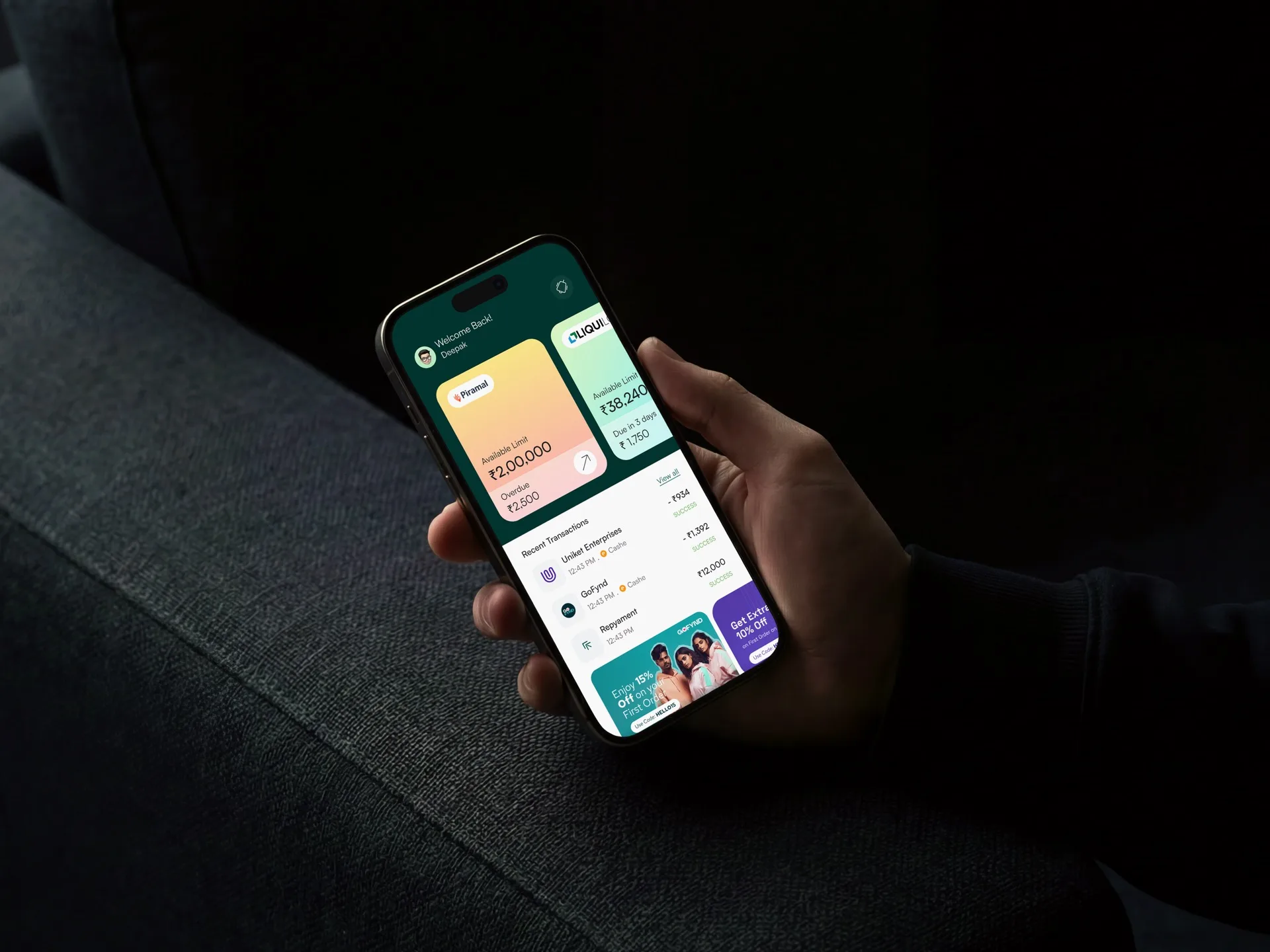
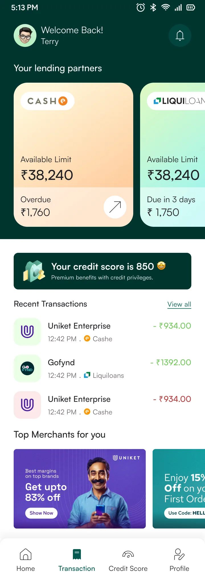
The main dashboard pulls from five data sources: active loans, credit limit, upcoming EMIs, credit score, and transactions. Each widget handles its own loading and error states so the page never feels stuck waiting. Empty states guide new users instead of showing blank cards.
5 screens
Flow 03
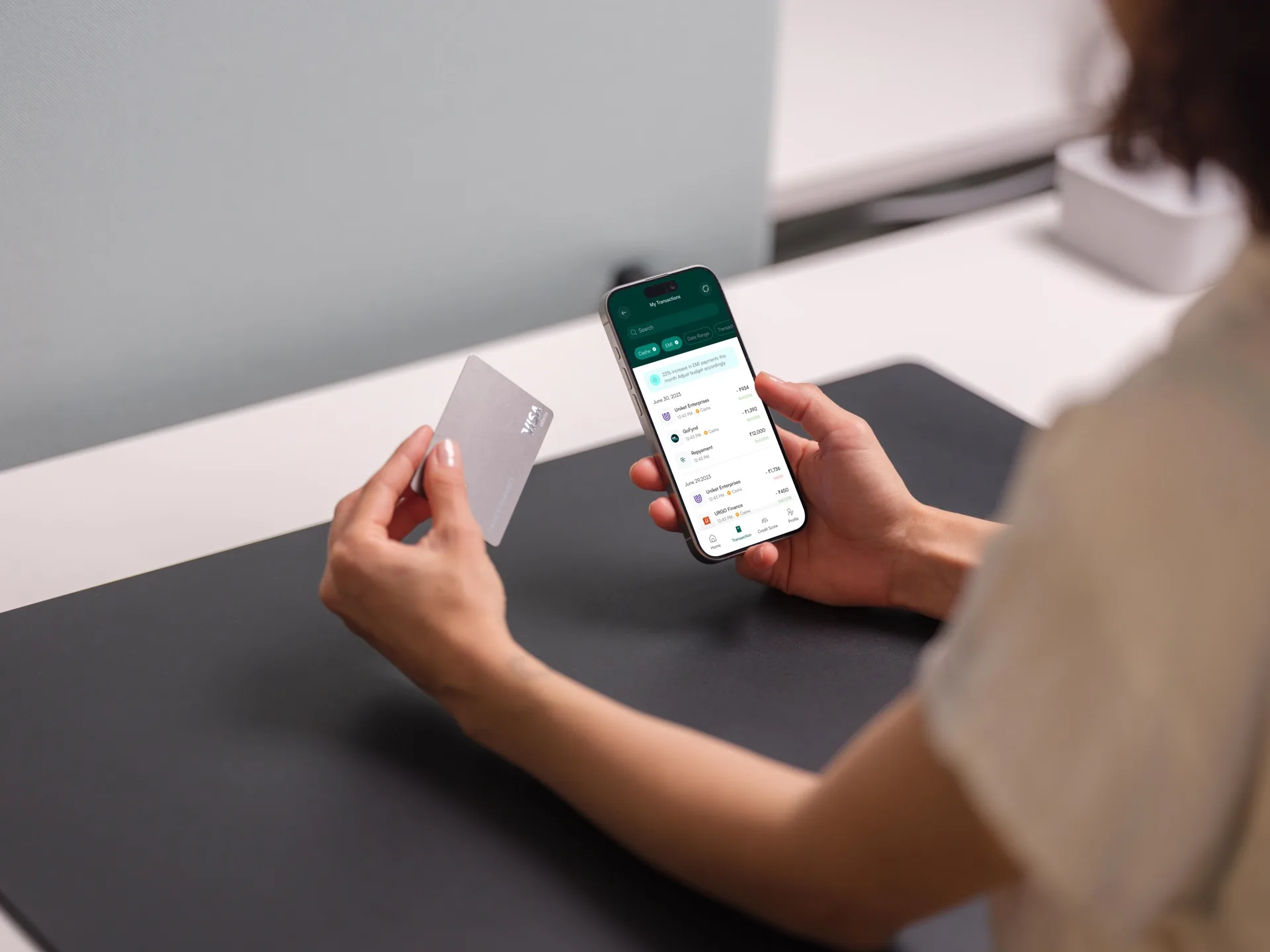
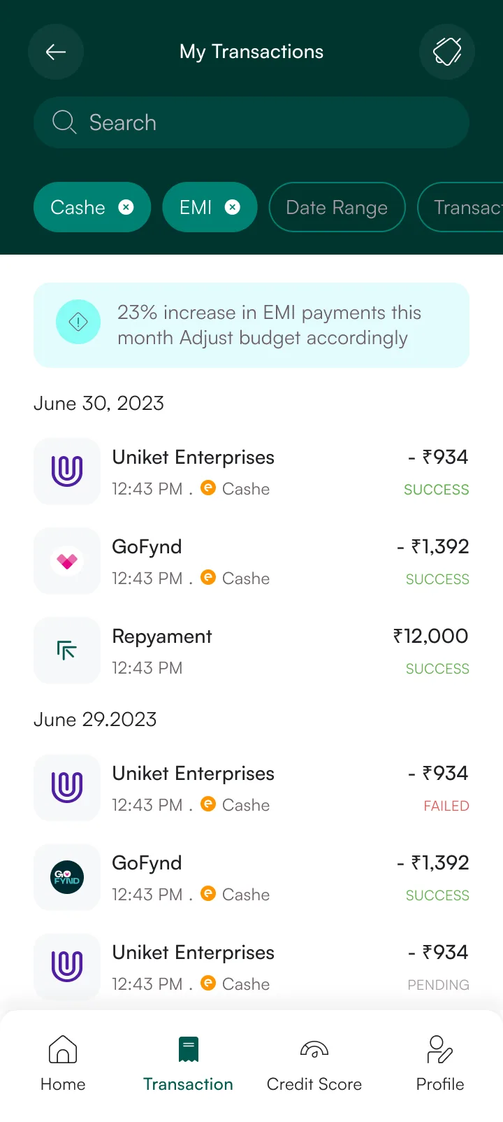
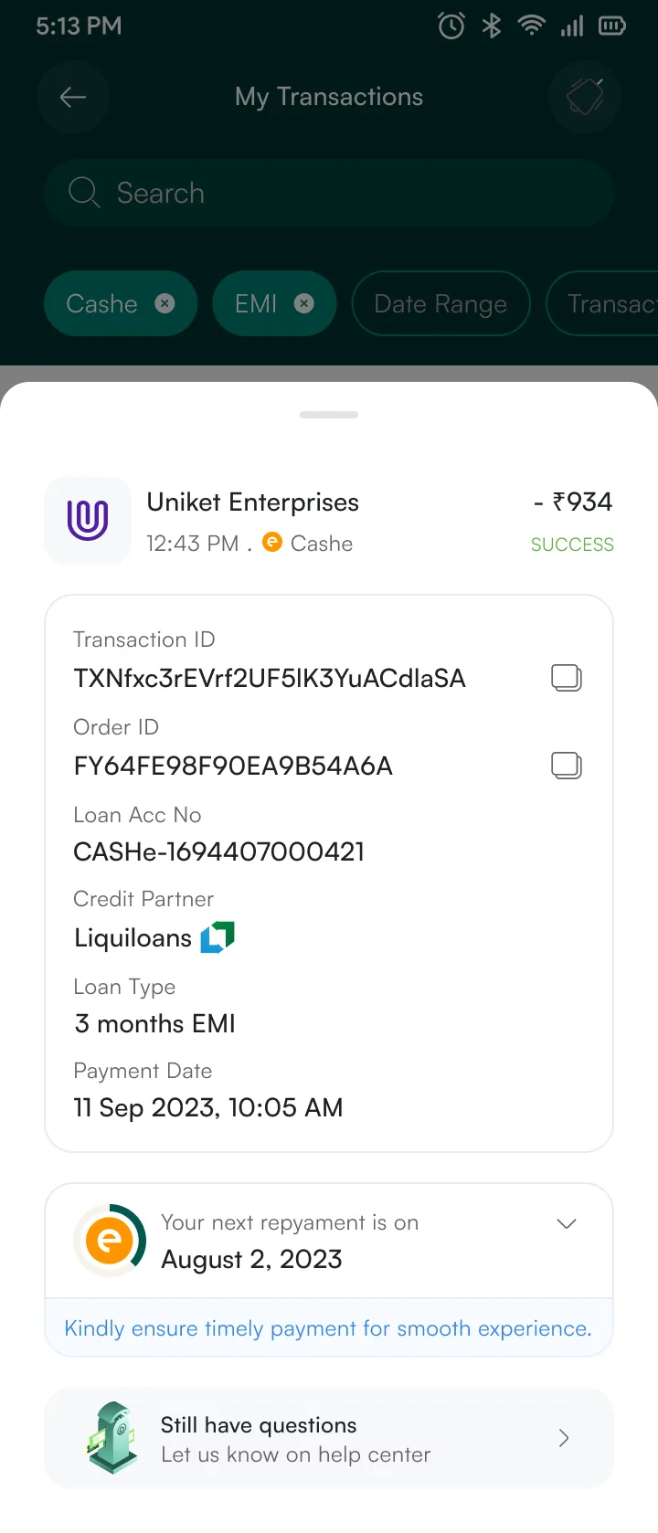
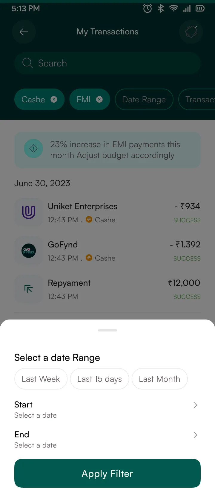
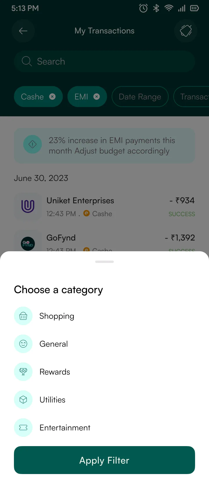
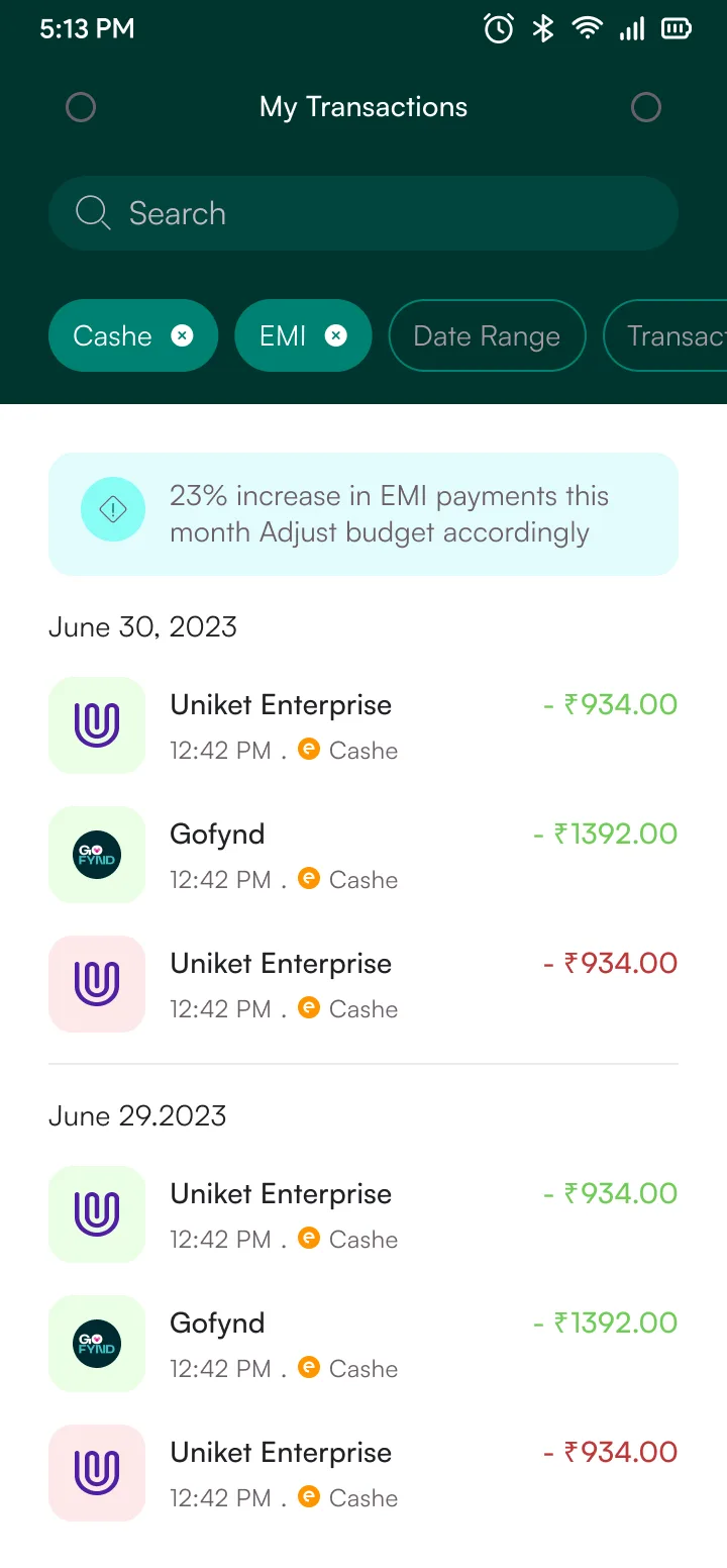
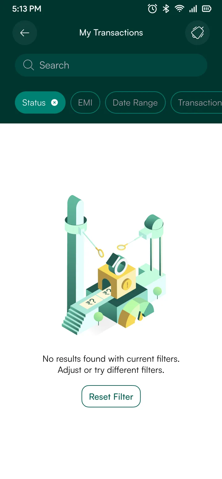
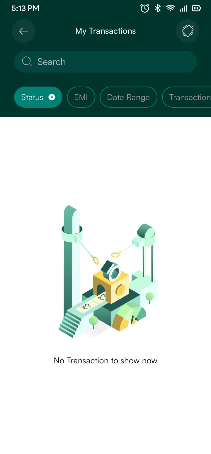
Full transaction history with search, date filters, and lender sorting. The tricky part was keeping filter combinations manageable. I spec'd them as query parameters against one endpoint instead of separate calls per combination. The detail view shares the same cost-display card from checkout, one component across both flows.
7 screens
Flow 04
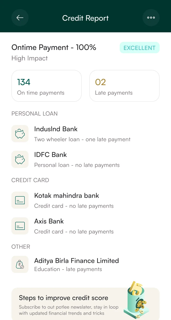
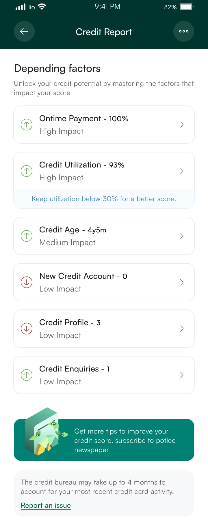
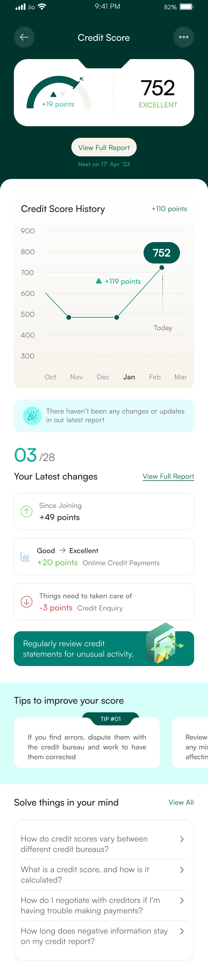
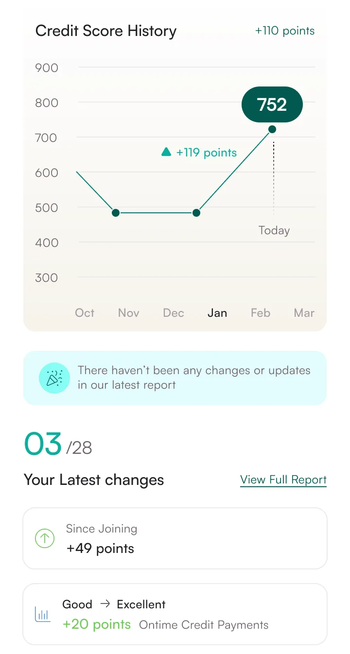
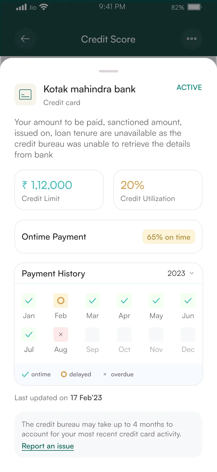
Credit score with factors breakdown and history graph. The bureau API returns raw data, so I shaped the factor cards to match that structure directly. Less work translating between design and API, fewer bugs in production. The score graph uses the same charting component across compact and full views. Contest flow lets users dispute errors without leaving the app.
752
Avg score of
active users
8 screens
Flow 05
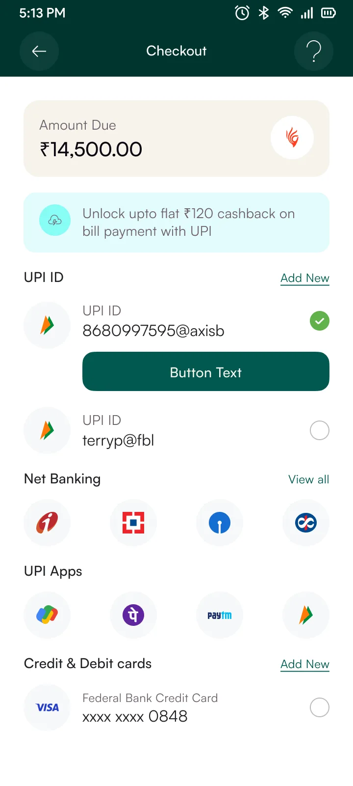
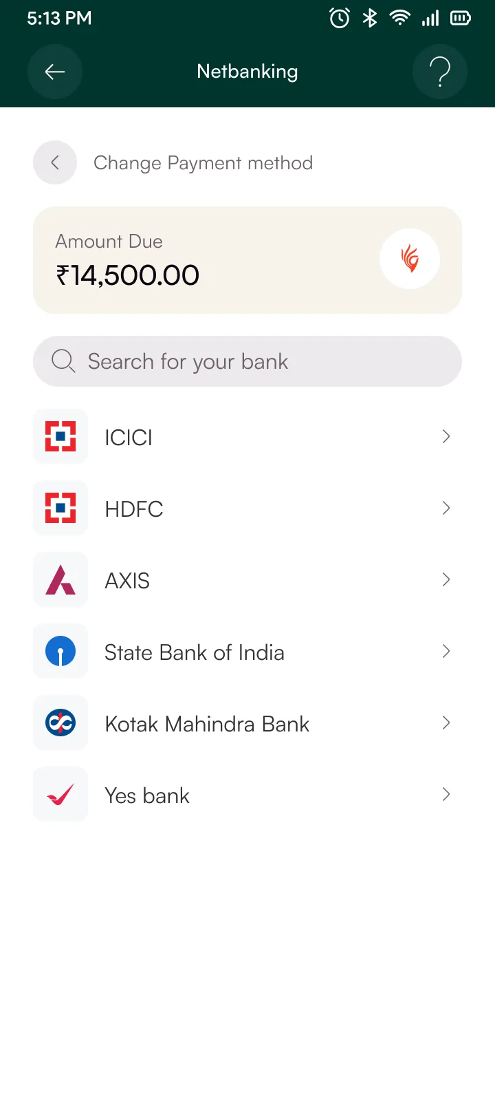
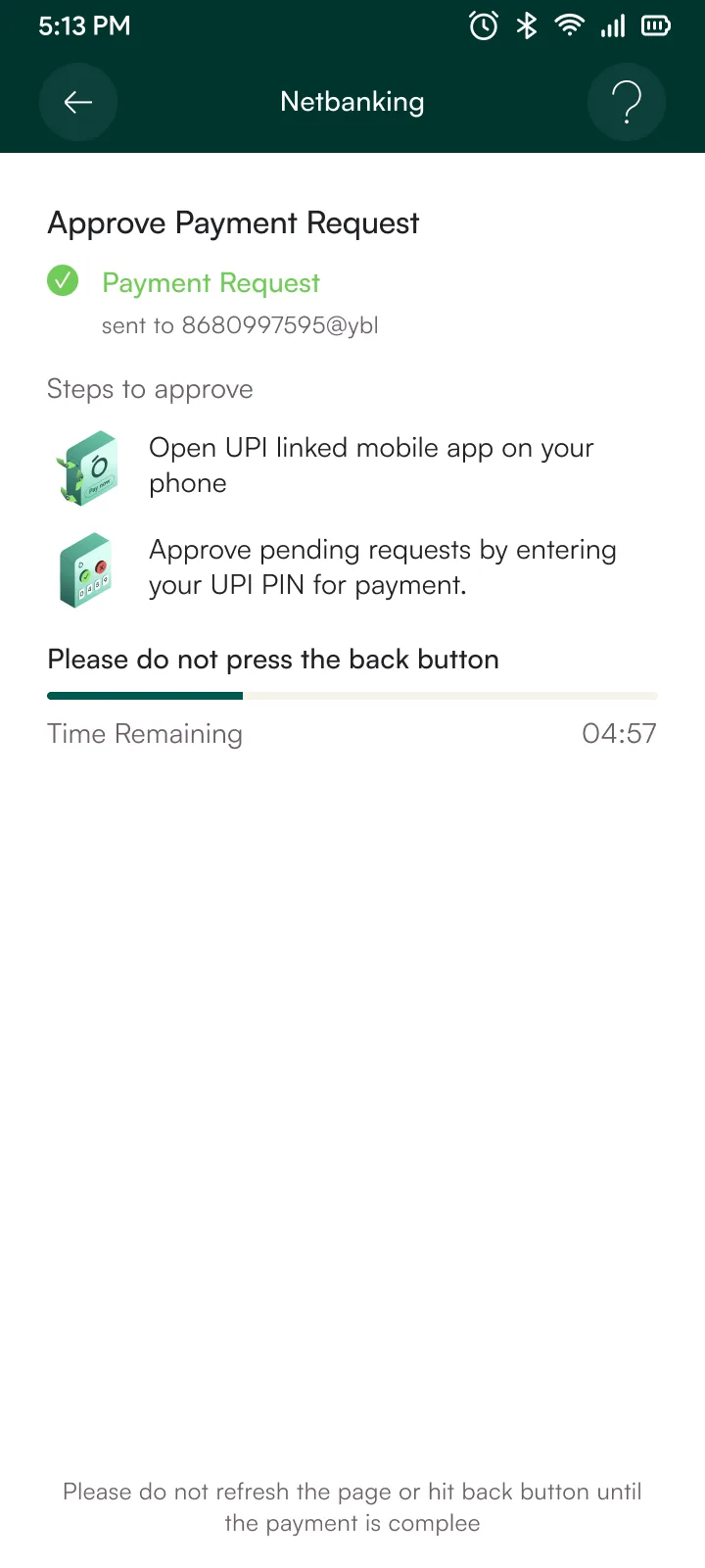
Same cost-display card from checkout appears here. Users see exactly the numbers they agreed to, no recalculation needed. The payment method selector (UPI, net banking, card) is a single action sheet with swappable content. First version had three separate screens for each method, which was a pain to keep consistent, so I collapsed them into one.
55%
Checkout
vs 41% avg
2.4x
Repeat
in 90 days
7 screens
Flow 06
Merchant-facing checkout widget. EMI plan selector, lender switching, and KFS disclosure all live in one embedded flow that drops into any merchant app via SDK. Lender routing happens server-side. The UI just renders whatever lender comes back, so new lending partners don't require frontend work.
8 screens
Flow 07
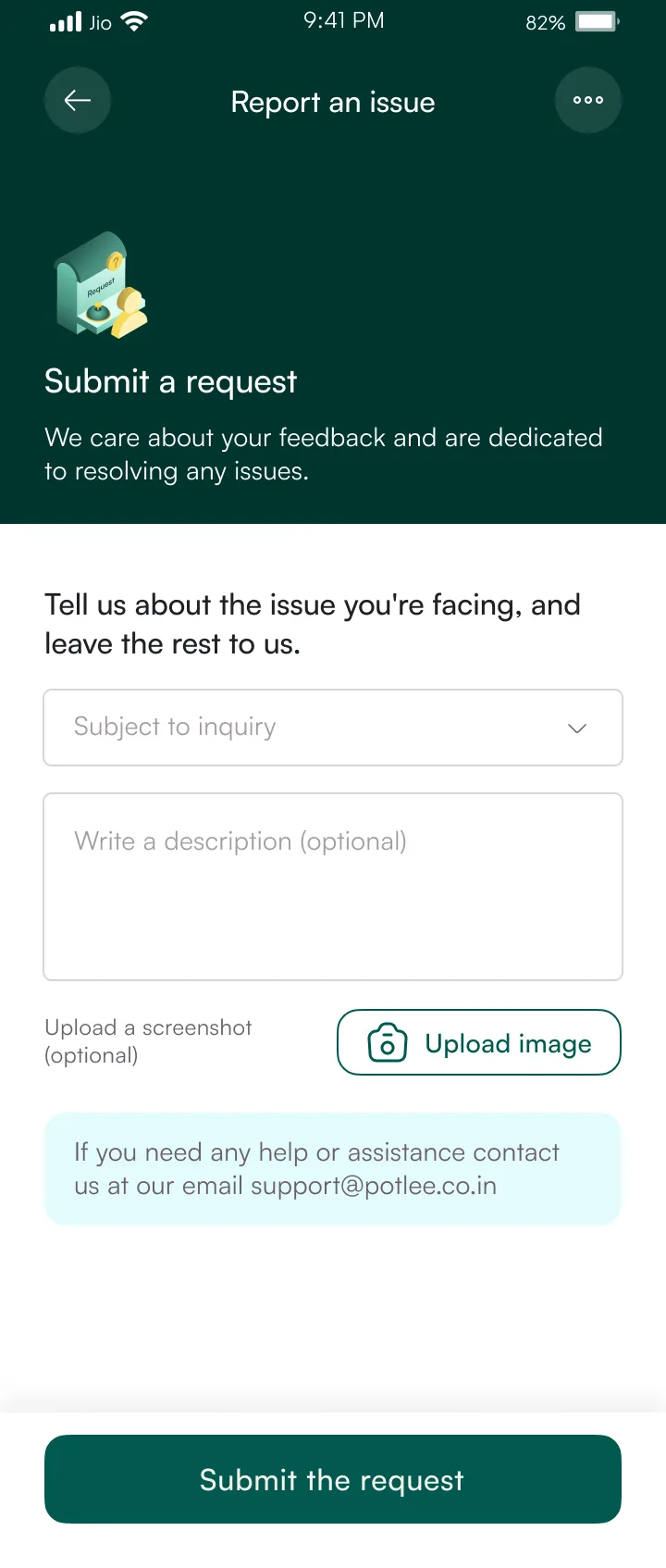
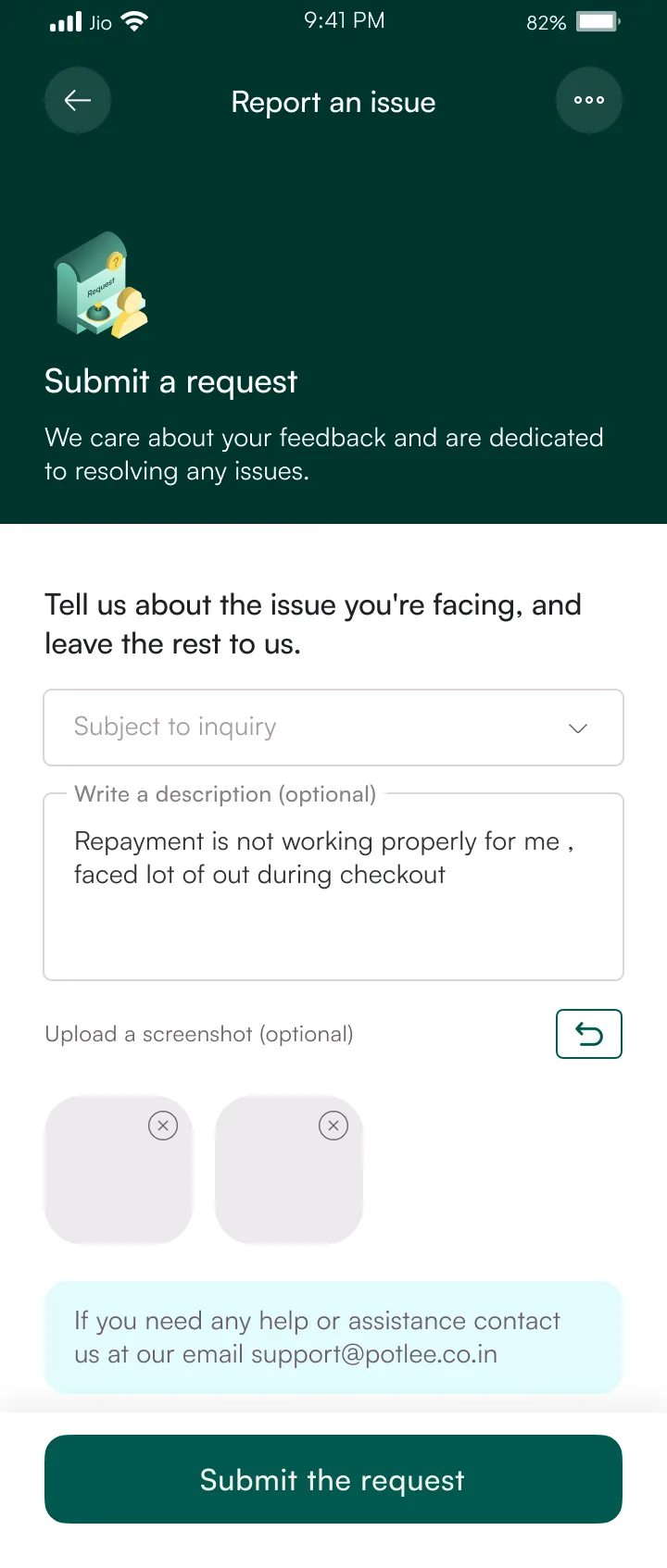
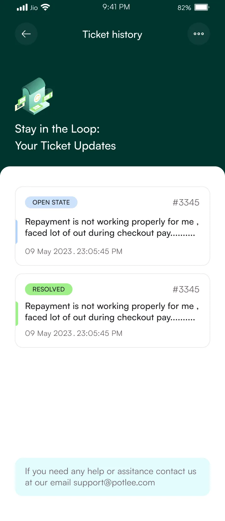
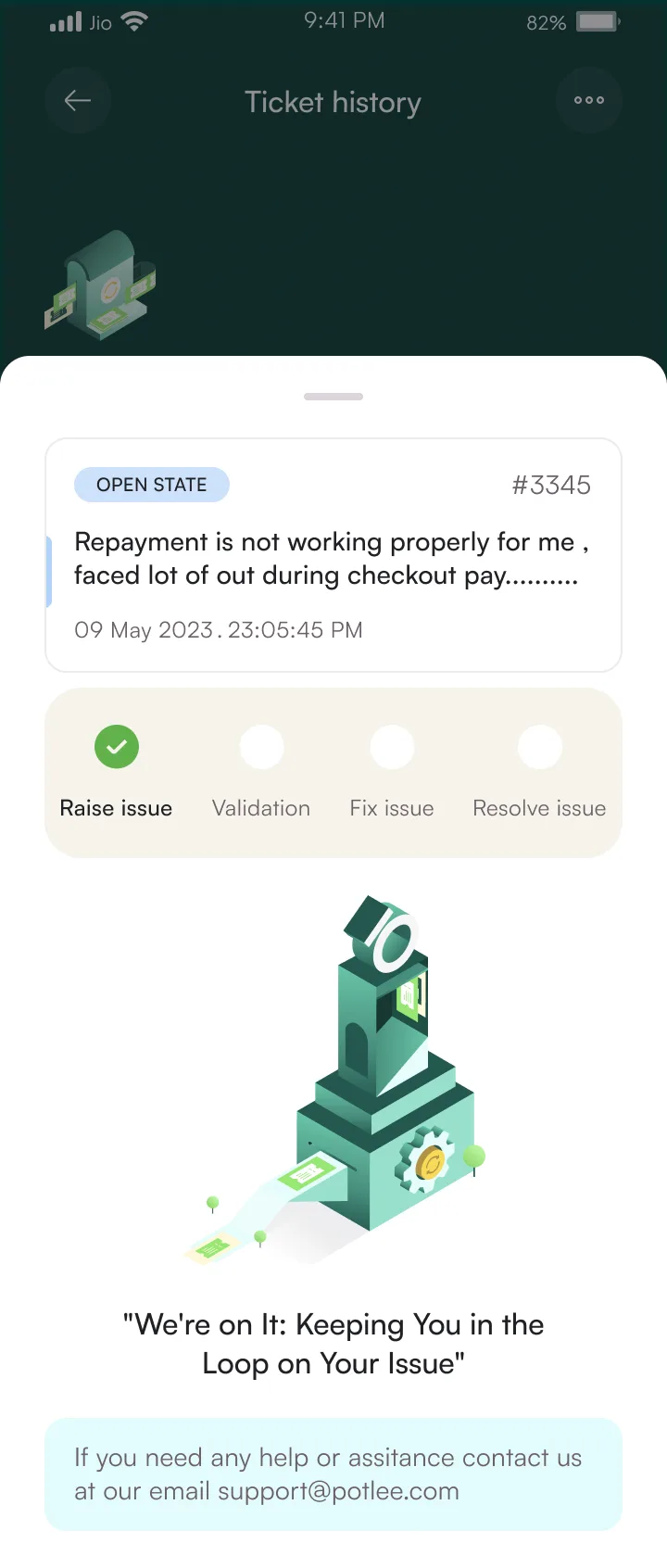
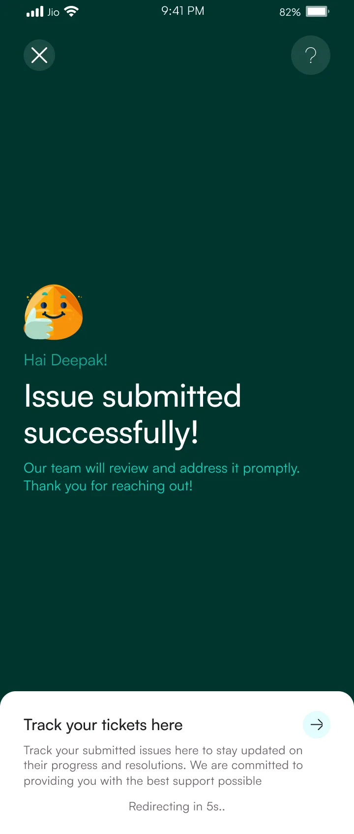
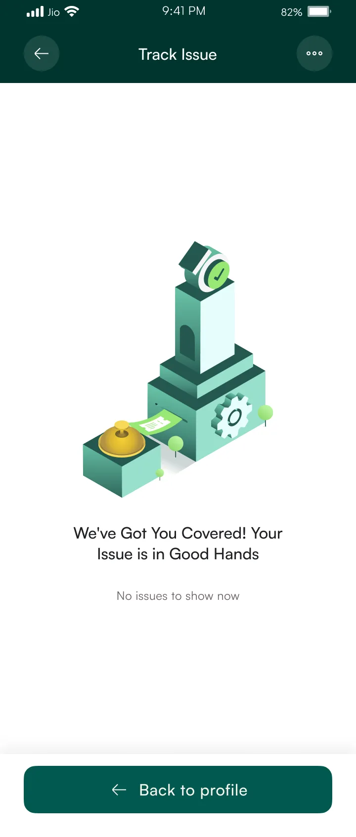
Issue reporting with evidence upload and ticket tracking. Every screen has one primary action. No branching, no decision fatigue for the user. The upload component compresses images client-side before sending, which mattered since most users are on slow mobile connections. Status screens pull from the same ticket object, so one endpoint serves the entire flow.
61%
Self-serve
vs 34% avg
6 screens
Flow 08
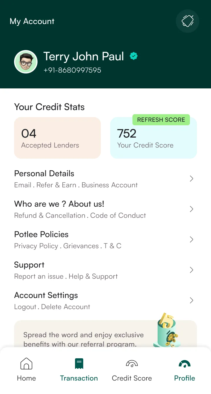
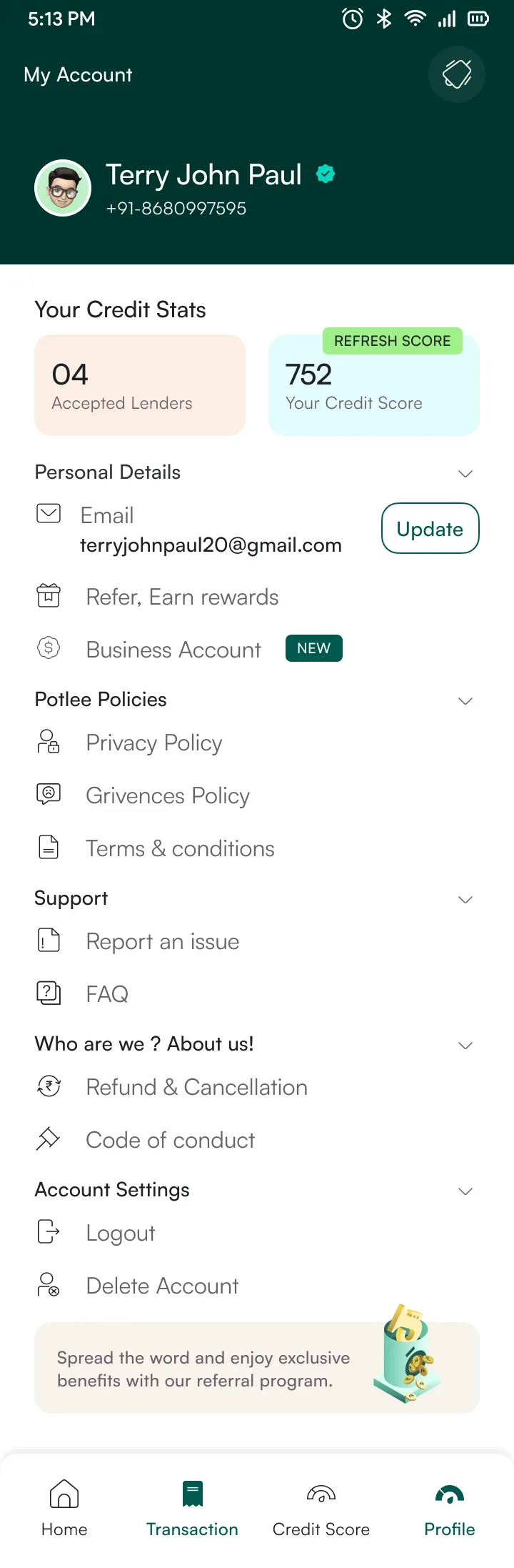
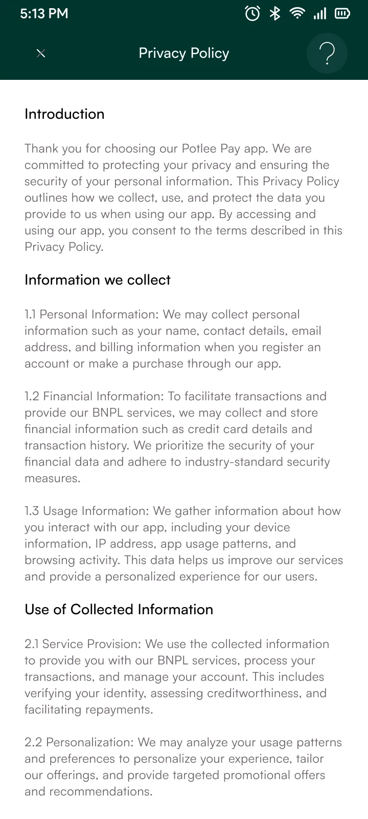
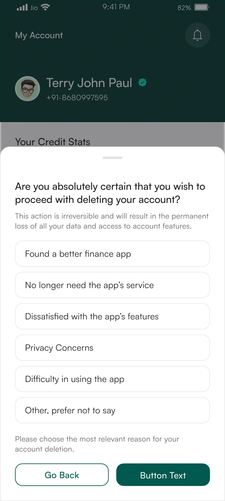
Account settings, personal details, and policy documents. Flat list of action rows, same pattern as the KYC settings screens. The account deletion flow follows RBI data retention rules. I designed a two-step confirmation that meets compliance without needing a custom modal.
6 screens

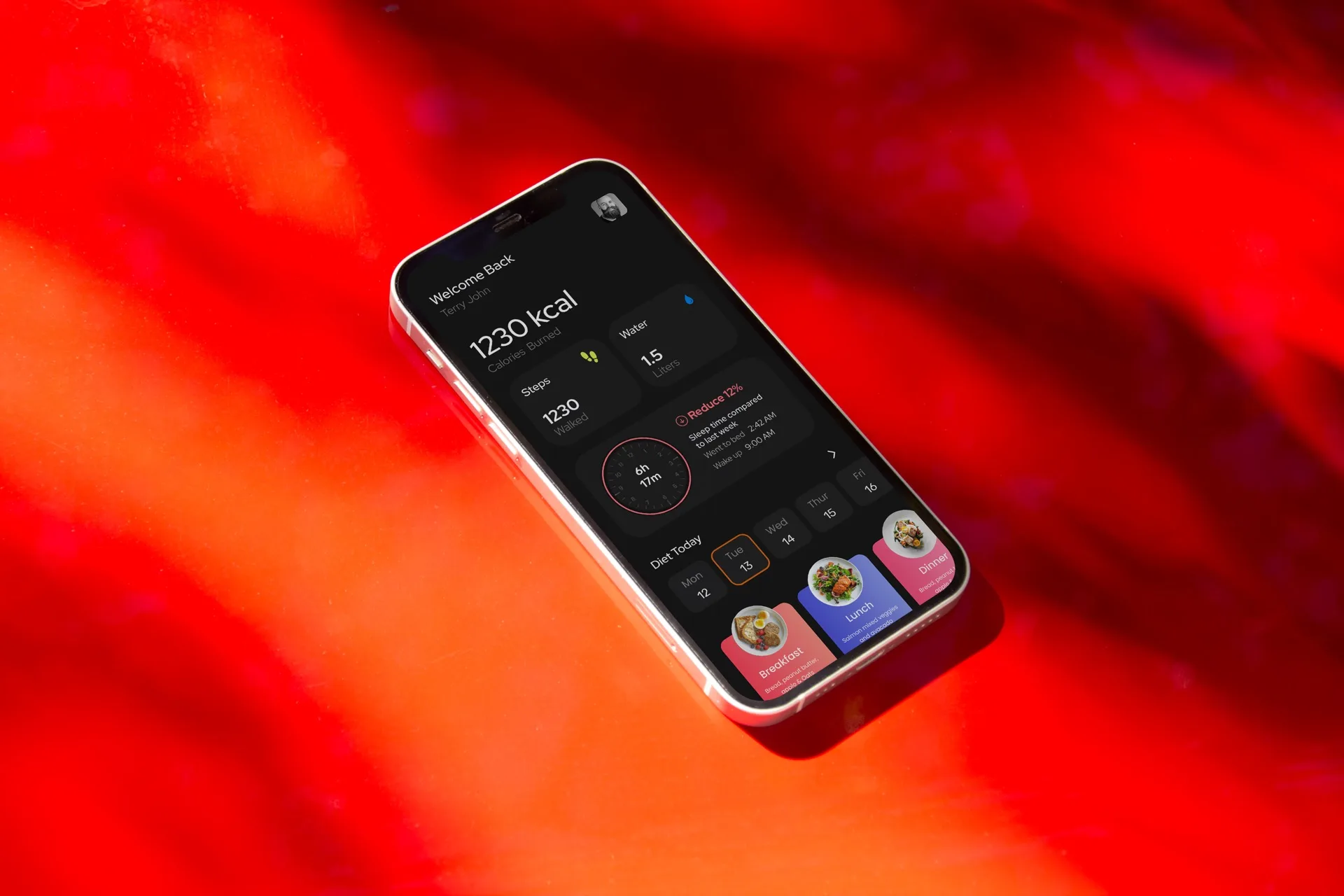
Fitness app for personalised workouts
tips4fit.com

Design system for commerce
Jio Commerce
Available for projects and open to senior roles in the UK.
Get in touch