/Work/Swadesh
Swadesh Design System
From Brand Book
to Product System

01 / The Starting Point
The brand had been imagined.
The digital product had not.
Swadesh had a luxury brand identity — warm saffron palette, serif typography, cultural motifs from Pichwai and Thangka traditions — all designed for print and physical retail. When six product categories went digital, each was designed independently. Jewellery had one card layout, Furniture had another, Home Linen used a third. A customer browsing a Kundan necklace and switching to bedsheets felt like they had left the site.
What I built
35
Components
510
Variants
99
Colours
26
Type styles
4
Grids
6
Categories
02 / The Design Challenge
Consistency
without
sameness.
The problem was not simply "make everything consistent." A jewellery close-up and a landscape furniture photograph do not need different card components — but they need the same component to give each product room to breathe.
The challenge: how do you standardise a multi-category luxury platform without making jewellery, furniture, apparel, art, home and wellness feel generic?
8
Shared Platform Behaviour
Components · Colour tokens · Typography · Grid · Spacing · Interaction patterns · Motion · Cart and checkout
5
Flexible
Photography · Aspect ratio · Editorial composition · Card density · Merchandising
03 / Luxury Principles
The strongest luxury platforms don't decorate — they get out of the way. Warm palettes, generous spacing, and photography-first components so the product speaks before the interface does.
Warmth.
Warm neutrals signal craft. Cold grays signal mass production.
Space.
Luxury needs negative space. Density signals discount.
Restraint.
Components frame the product — they don't compete with it.

04 / The Hard Decision
In luxury, cropping
destroys value.
The Constraint
I started with a fixed 3:4 portrait ratio. It worked for jewellery — Kundan necklaces and chandbali earrings looked right in a tall frame.
Then Furniture pushed back. A carved walnut bookstand cropped at 3:4 lost half the piece. Instead of building category-specific cards, I made the ratio configurable.
Forced 3:4

Craftsmanship lost
Natural 3:2
Full product
The Solution — One Component, Four Ratios
The card has no knowledge of whether it is displaying a necklace or a bookstand.
Category identity lives in the photography and the editorial choice of ratio — not in the component.
The proof
When Wellness launched as a seventh category, the existing card system handled it without needing a new variant or any engineering changes.

Jewellery, Apparel
05 / Foundations
Tokens that
carry the brand.
Colour
99 colour tokens organised into five tiers: Primary (Saffron scale), Secondary (12 nature-derived families — Ocean & Sky, Marine, Rouge, Magenta, Emerald, Leaf, Moss, Forest, Clay, Terra, Earth, Gold — each with a consistent six-step scale), Neutral, Surface (a warm Sand scale from cream to mid-tone, never cold gray), and System (success, alert, error).

Typography
Two typefaces. Begum — a serif supporting Devanagari, Latin, and Tamil — for all headings. JioType Var for all body text and functional UI. Five heading sizes across three responsive breakpoints. Four body sizes with weight variants. 26 text styles total.

Spacing
I built the initial spacing scale with 4px increments up to 24px. It worked inside components. It fell apart at page-level composition.
The Furniture category landing page was what broke it. Nothing looked right with only small increments. Luxury needs breathing room between sections, and 24px is not breathing room.
I added semantic spacing tokens for section-level composition: 40, 56, 84, 120px. The jumps are irregular because they were born from real layout testing, not mathematical elegance.
Grid
Four responsive breakpoints.
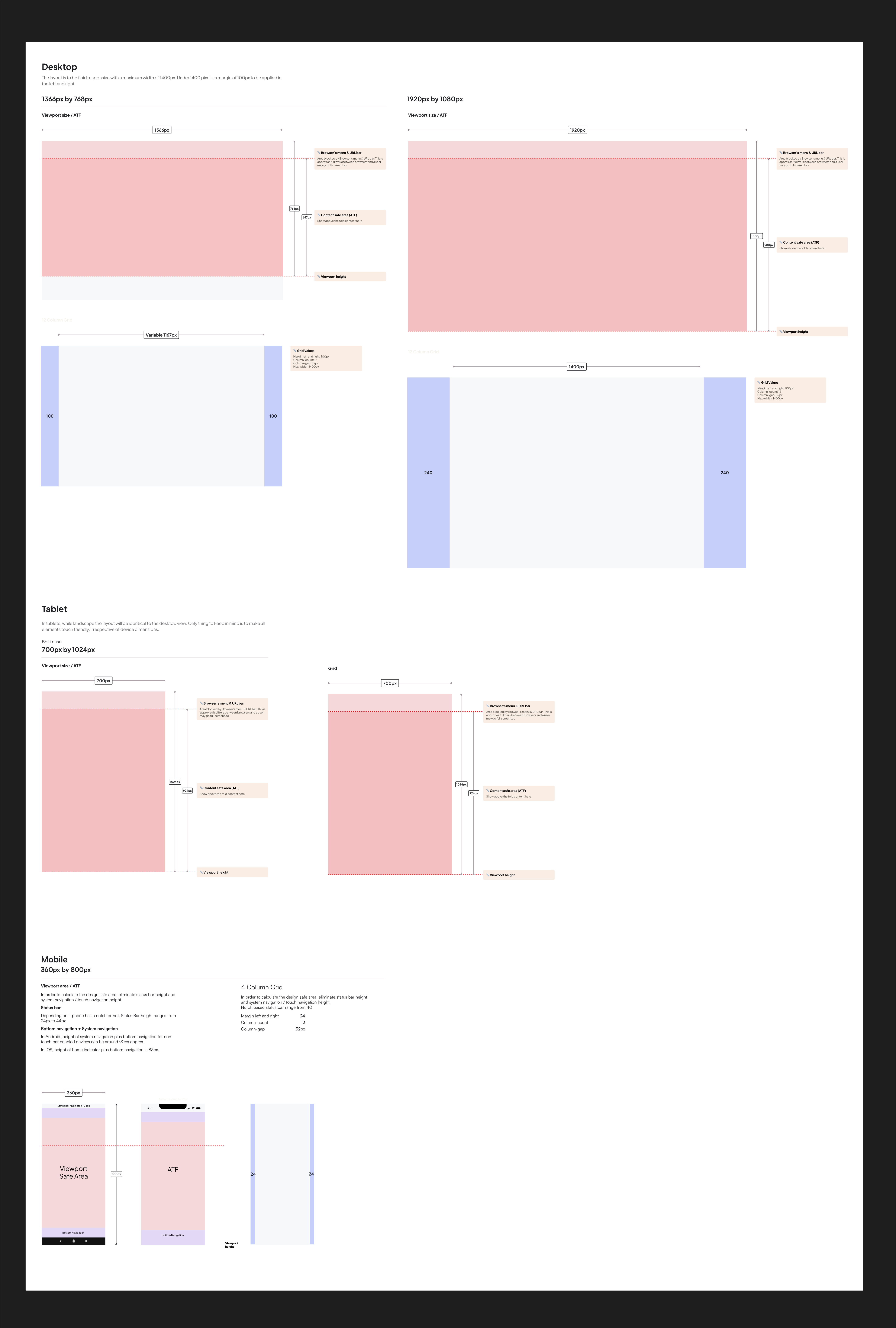 Click to explore
06 / Brand into Component
Most luxury brands use
rectangles for their CTA.
Why Not a Rectangle?
Hermès, Cartier, and Tiffany use rectangles because their identity lives in colour, material, or one iconic object. Swadesh is different — a marketplace spanning six categories, thousands of artisans, products from Rs 1,690 to Rs 11,99,990. There is no single iconic product. What unifies everything is India itself and the tradition behind its making.
The brand book's "Shapes of India" uses Indian architecture as the unifying visual principle — arches, jharokha windows, scalloped doorways. These forms are pan-Indian. They belong to no single region, religion, or dynasty. For products, rectangles only. For buttons, a subtle touch of India.

Wing Curve
Patta scroll endpoints
Gold
3 conic gradients per surface
Label
JioType 12px uppercase
Arrows
Custom bezier echoing wings
The Patta Reference
The wing endpoints reference the patta — a form from Indian manuscript and textile tradition. In palm-leaf manuscripts, the leaves curl inward at binding points. Over centuries, this natural curl was stylised into a deliberate visual signature across Banarasi brocades, Kanchipuram silks, and Phulkari embroidery.
The patta references craft itself — manuscripts (knowledge, tradition) and textiles (what Swadesh actually sells). A lotus would reference religion. A peacock would reference the state. The patta references the act of making.
What Was Rejected
Lotus shape
Too religious, too literal
Peacock motif
Too decorative, can't contain text
Full arch
Reads as container, not button
Rounded corners
Too generic, every app does this
Patta/scroll ✓
Horizontally extensible, bilateral symmetry, degrades across 3 tiers, pan-Indian, references craft
Full Expression
Commitment moments

Restraint
Shape kept, fill removed

Silence
Brand steps back
Why Three Gradients?
The brand book says gold honours the craft. On real gold-embroidered work, light catches each surface at a different angle. A single gradient looks like cheap digital decoration. Three independent conic gradients simulate how light rotates across compound metalwork, so the gold reads as material rather than a Photoshop layer effect.
Why the Silence?
The brand book's own design pillar: "We allow the essence of the craft to take centre stage. Indian beauty is used only as highlights." The tertiary tier is that principle implemented at the component level. Decorative elements lose power through repetition, so the brand shape appears only at moments of commitment — not on every link.
Buttons trigger actions. The Swadesh button uses a unique ribbon shape with decorative wing vectors and a gold gradient border stroke.
Controls
| Name | Description | Default | Control |
|---|---|---|---|
| type | Visual type union | "primary" | |
| size | Height variant union | "medium" | |
| disabled | Non-interactive boolean | false | |
| loading | Loading spinner boolean | false | |
| label | Button text string | "ADD TO BAG" | |
| fullWidth | Fill container boolean | false |
When to use
- Primary: One per screen. Add to bag, Checkout, Submit order.
- Secondary: Supporting actions alongside primary. Add to wishlist, Continue shopping.
- Tertiary: Low-emphasis inline actions. View details, Learn more.
Guidelines
✓ Do
- Use verb-first labels: "Add to bag", not "Bag"
- Pair secondary with a primary for clear hierarchy
- Provide a disabled reason via helper text
✗ Don't
- Use more than one primary per screen
- Disable without explaining why
- Override the gold gradient border
Anatomy
1
2
3
4
5
6
7
Colour tokens
Primary
Sizing
Keyboard interaction
| Tab | Move focus to the button |
| Enter | Activate the button |
| Space | Activate the button |
ARIA attributes
| role="button" | Applied automatically by the native <button> element. |
| aria-label | Required for icon-only buttons. Must describe the action. |
| aria-disabled | Use instead of native disabled when the button should remain focusable. |
| aria-busy | Auto-applied during loading state. |
Design considerations
- Disabled buttons retain focus so screen readers can announce why the action is unavailable
- The 48px and 56px sizes exceed the 44×44px touch target minimum. The 40px size relies on surrounding padding for touch compliance.
- Focus ring: 2px solid #C45434, 3px offset
07 / The Component Library
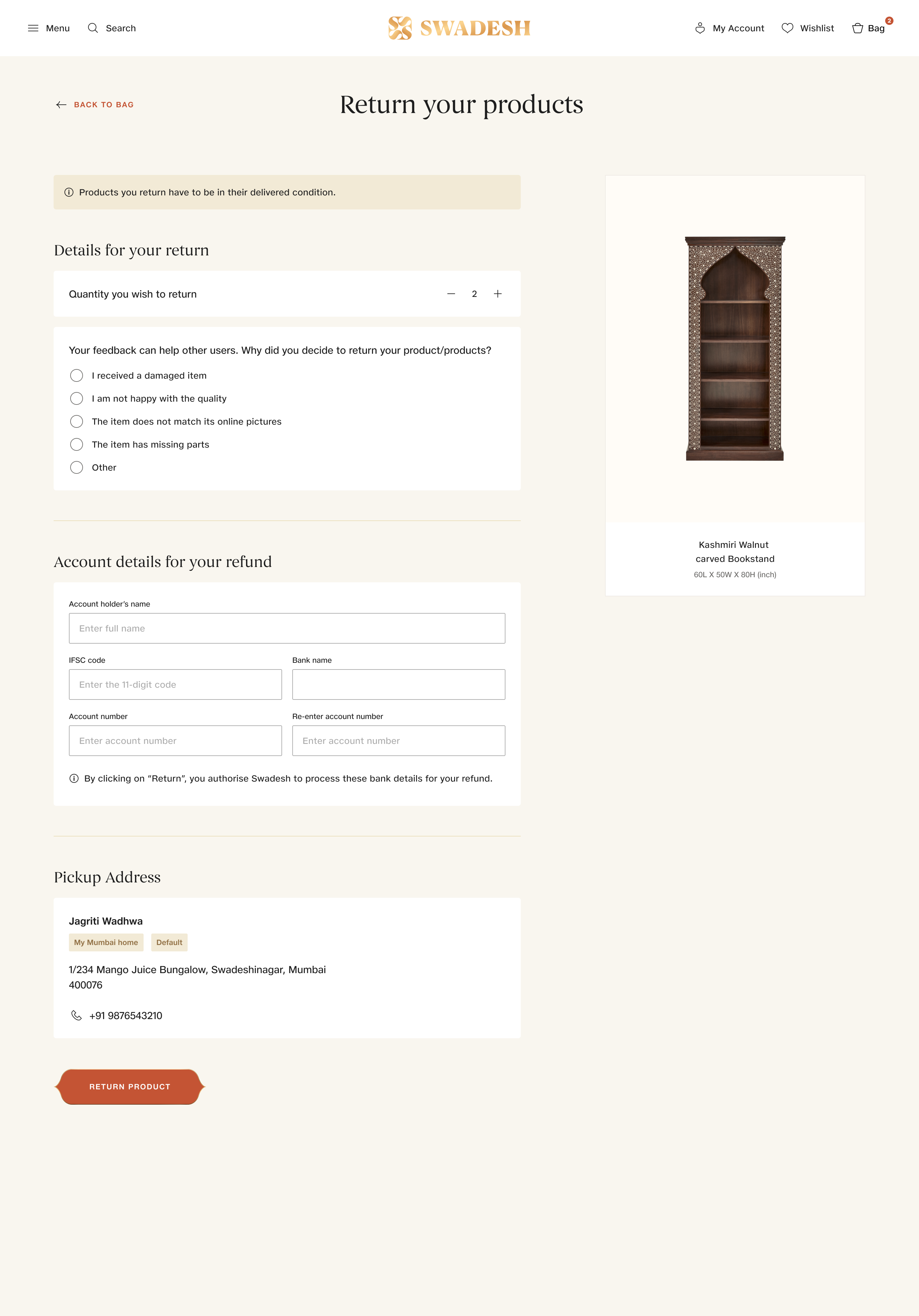
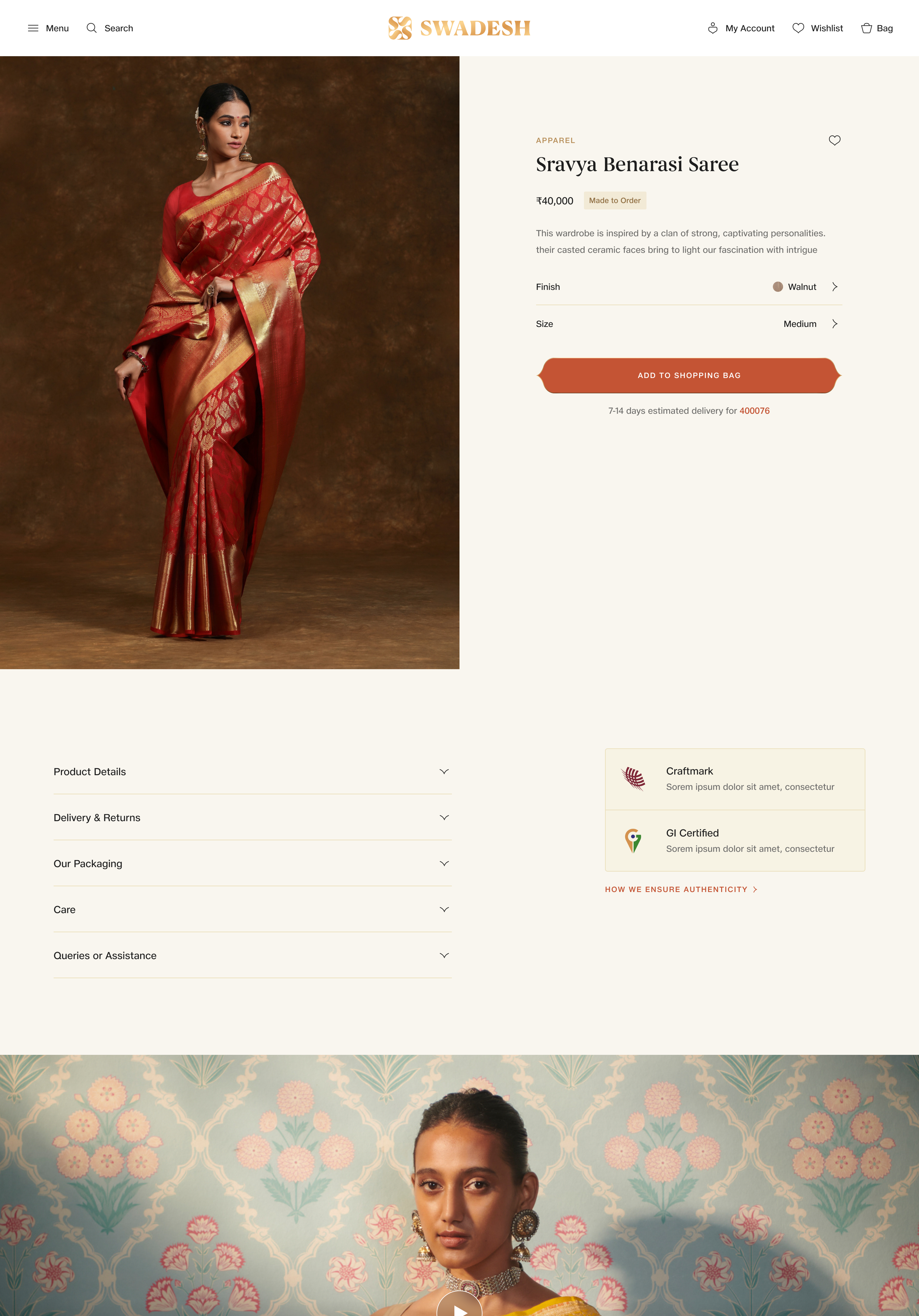
35 shared components. 510 variants. Every screen assembled from the same library.
No category-specific components. A customer browsing jewellery and switching to furniture encounters the same interactions, the same spatial logic — a shared language across every category.
Shopping Bag — Furniture products
Checkout — shared form components
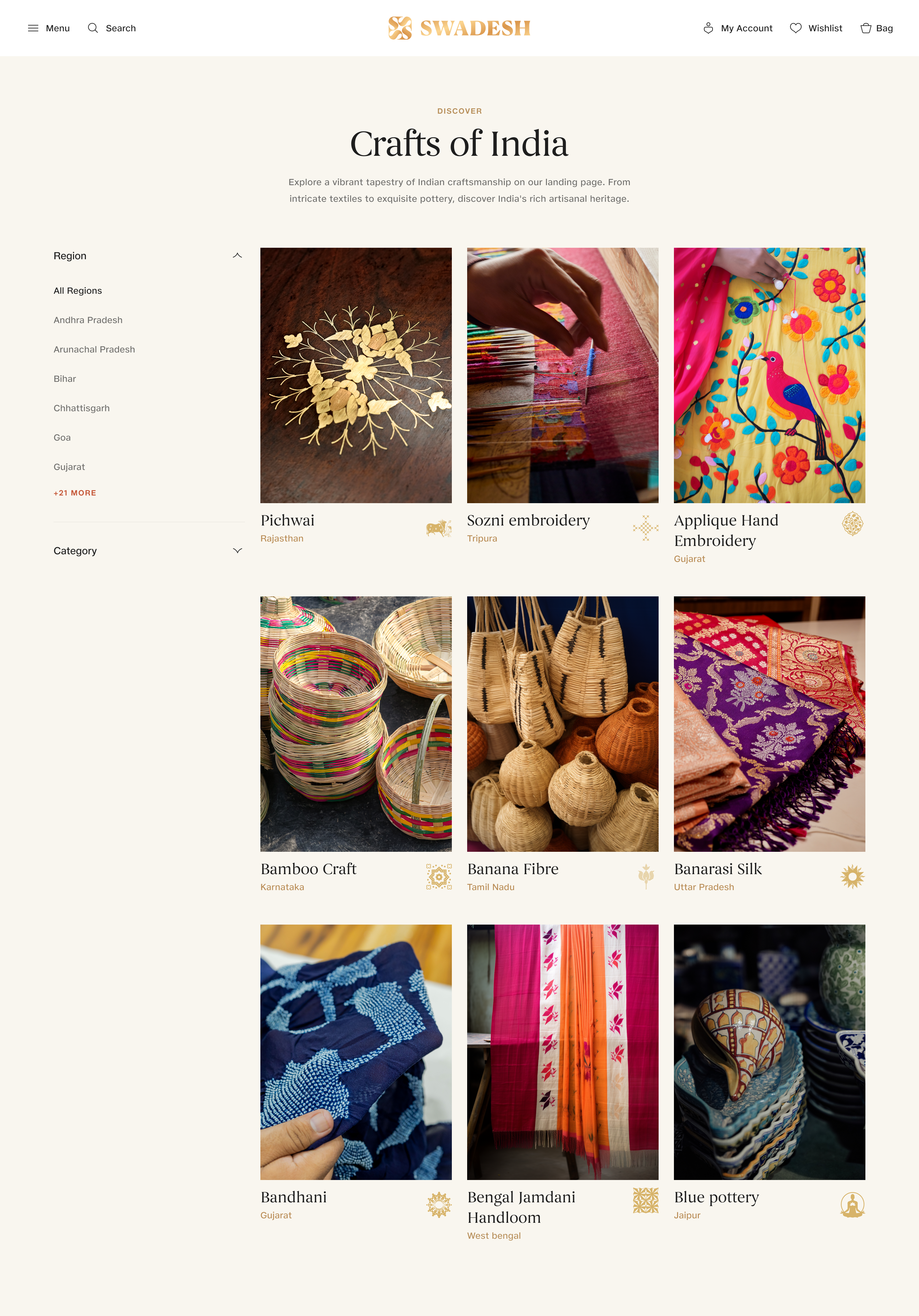
Customer Care — accordion, cards, buttons
Not every component carries the brand equally.
The library ranges from functionally neutral to fully brand-encoded. Where each component sits on that range depends on its role.
Neutral

Checkbox, Radio, Input, Dropdown, Search — functional, universal, no brand decoration
Token-Branded

Navigation, Toast, Cards, Tabs, Footer — branded through saffron accent, sand surfaces, Begum type
Brand-Encoded

Buttons, Sutras, Patterns — cultural motifs, gold gradient, architectural shapes
08 / Engineering Handoff
Most design handoffs
stop at static screens.
Every interaction specified
I built this table because the same argument happened three sprints in a row. A developer would implement an animation, I would say it felt too slow, they would ask for a number, and I would guess. The table was the answer to the question every engineer eventually asks: what exact value do you want?
Figma Dev Mode has no fields for entry easing, exit easing, entry direction, exit direction, duration, or animation sequencing. This table does.
Dev impact: Animation review rounds dropped from three to one. Instead of "this feels wrong," the feedback became "this doesn't match row 14."

Motion tokenised
Figma lets you define colour variables and spacing variables. It has zero support for motion variables. Without tokens, each engineer picks their own timing — 200ms ease-in-out on the accordion, 400ms linear on the dropdown, 560ms ease-out on the checkbox. The platform starts feeling incoherent.
Four easing curves, each named by what it's for. A duration scale from 100ms to 1000ms. I treated motion the same way we treated colour and spacing: as a shared set of named values.
Dev impact: Engineers reference a token name in code instead of reverse-engineering values from a prototype video. And if a timing needs to change, updating the token updates every animation that uses it.

Sequences choreographed
Figma Dev Mode shows Frame A and Frame B. It doesn't show the journey between them. For the PDP scroll, there are six distinct states as the user scrolls — the states between start and finish mattered just as much as the two endpoints.
For someone configuring a bespoke piece of jewellery, how each form step transitions into the next changes whether the experience feels like a checkout or a consultation.
Dev impact: The sequences gave engineering enough detail to build the scroll behaviour and multi-step flows without needing another walkthrough.

Components specified
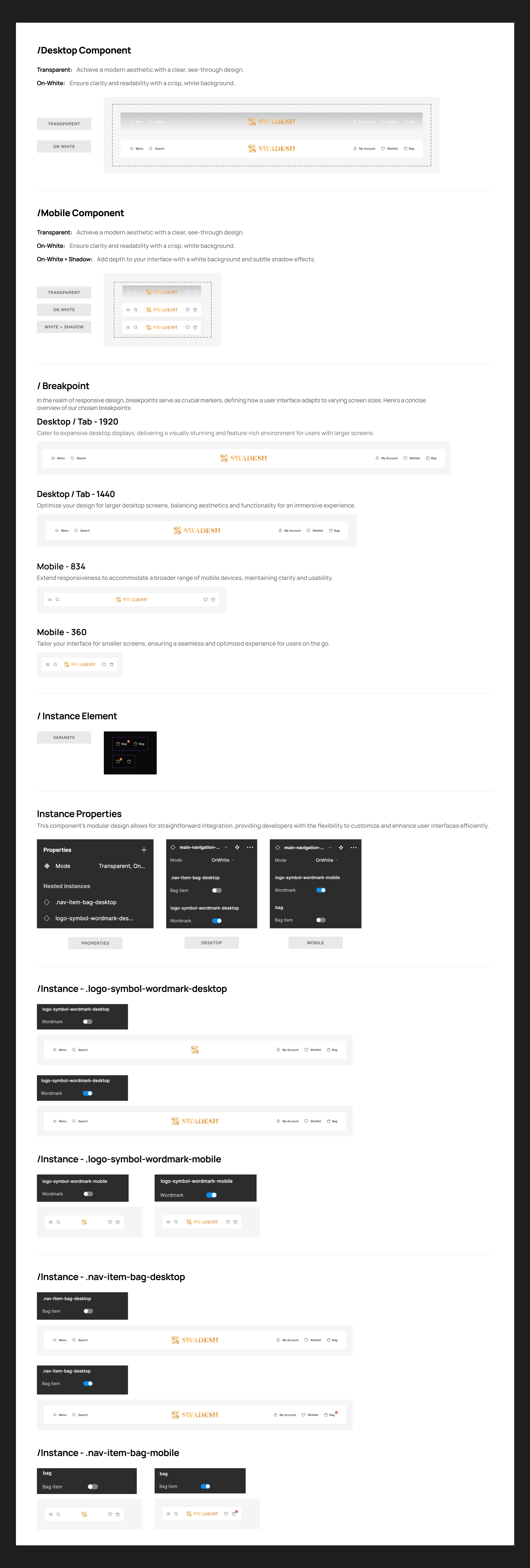
Beyond motion, I also documented component structure: how each component adapts across breakpoints, which states it needs, and how variants relate to each other. Writing it down once was faster than explaining it repeatedly.
Figma Dev Mode shows individual element properties. It doesn't show how a component adapts across breakpoints, which states are required, or how variants compose.
Dev impact: Engineering built the responsive navigation from this document. No follow-up questions about breakpoint behaviour.
 Click to explore

09 / Governance & Adoption
Publishing a Figma library
is not the same as having
a design system.
The system
A Slack channel, a heuristic, and a removal date.
I set up a dedicated Slack channel where anyone — designer or engineer — could raise a request for a missing component. We reviewed every request against one heuristic: is this a one-off need or a repeating pattern? If only one screen needed it, it stayed local. If it kept appearing across category surfaces, it earned a place in the library.
When a component was replaced, it got a removal date. The original category header broke at tablet widths, so I replaced it with a configurable full-width text component. Six screens migrated in one sprint, and the old component came out of the library two weeks later.
That discipline is how the library stayed at 35 component sets instead of ballooning past a hundred.
The reality
Building took three months. Adoption took four more.
The first four teams adopted within weeks. They saw the library, tried it, and stopped rebuilding. The last two teams were different. They had working components. Their patterns were established. Switching meant rework with no visible user benefit.
I spent four months in pairing sessions — opening their Figma files, sitting with them, migrating screens one at a time. It would have been easier to mandate adoption from a distance, but that doesn't actually work.
If I did this again, I would start adoption from week one instead of waiting until the library felt "complete." A system that's 70% done but people are actually using is more valuable than one that's polished but sitting untouched in Figma.
10 / Structured for What Comes Next
One file an agent reads
before generating UI.
Implemented
The architecture is already agent-ready.
Semantic token naming (Primary/Saffron, not red-500). Category-agnostic components that carry no business domain knowledge. The invariant/flexible separation — 8 things an agent generates from, 5 things a human controls. None of this was designed with AI in mind, but the structure turns out to be exactly what an agent would need to generate on-brand UI.
Structured
Context documents for agent consumption.
Design.md and Agents.md — structured files describing brand rules, token values, and component constraints. An AI agent reading these files gets enough context to generate brand-compliant UI without needing to dig through source code.
Primary/Saffron Base: #C45434
Primary/Gold: #EBB872
Surface/sand: #F9F6EF — never pure white
Neutral/100: #1E1E1E

# Rules
One product card for all categories.
Product images are the visual focus. UI chrome stays minimal.
Decisions for humans
Semantic naming
Primary/Saffron, not red-500. Designers understand the palette through the brand language.
Category-agnostic components
No JewelleryCard, no FurnitureNav. One library for all six categories.
Invariant / flexible split
8 standardised behaviours. 5 flexible properties. The boundary is explicit.
Why agents benefit
An agent reading "Primary/Saffron" understands intent. "red-500" is meaningless without context.
Agent doesn't need to understand business taxonomy. One API surface.
Agents generate from the invariant layer. Humans control the flexible layer. No ambiguity.
How an agent uses this
An AI coding agent reads Design.md before generating any component. The primary colour is saffron, not generic red. Surfaces use sand, never white. One product card for all categories. The agent applies these constraints directly — no design context required.
The next step: DTCG-compliant token export and an MCP server that lets agents query the system as tools, not just read a file.
Key moments
Brand book received. Audit started. Reviewed existing brand guidelines. Mapped what existed digitally vs what needed to be built from scratch.
Foundation29 of 35 components built in one month. Buttons first. Then layout, forms, navigation, cards, swatches, tabs. 99 colour tokens, 26 text styles, 4 responsive grids.
SprintFurniture broke the card. Fixed 3:4 ratio failed. Evaluated four ratios. One configurable component instead of forking.
PivotSpacing scale failed at page level. 4-24px broke at luxury composition. Added 40-120px semantic section spacing.
PivotFirst four teams adopted. Saw the library, tried it, stopped rebuilding. Slack channel opened for requests.
ShippedLast two teams resisted — four months of pairing. Migrated screens one at a time, sitting with each team.
BlockedWellness launched on existing system. Seventh category. Zero new components. Zero engineering work.
Shipped