/Work/Pixelbin/App
PixelBin App
How Do You Put an AI
Creative Studio in
Someone's Pocket?

The Evolution
Three Versions,
Three Identities
V1 existed before I joined. I designed V2, V3 and V4 as the sole product designer, working with one PM, two engineers and a junior graphic designer.
V2 inherited its design system from the SaaS product. The main goal was getting the app live with limited AI features. V3 was a full rebuild — I created a new design system, expanded into AR and tutorials, and introduced a light theme. V4 moved the prompt bar to the Home screen and made AI the primary interaction.

V2 · The Platform
Credits + batch
V3 · The Ecosystem
AR + tutorials + light theme
V4 · The AI
Prompt-firstThe Constraint
Desktop Patterns
Don't Survive Mobile
Desktop AI tools rely on hover tooltips, keyboard shortcuts, multi-window workflows and sidebar panels. None of these work on a phone. Core editing controls needed to stay within easy thumb reach, particularly for one-handed use.
The editor needed six tools accessible without covering the image. Video generation takes 2–5 minutes, and users may leave the app before it finishes. Every workflow had to survive being interrupted.
The Product Question
If AI Can Already Generate Images,
Why Build PixelBin?
Image generation is becoming widely available. A prompt box alone is not enough reason for a dedicated product to exist.
PixelBin was designed around the work that happens before and after generation: editing specific regions, processing images in batch, resizing for different platforms, generating video, handling jobs that take minutes to finish, and letting people return to past work or discover new prompts.
What the data showed
after 8,069 sessions
All metrics from Microsoft Clarity · 8,069 sessions · Last 200 days
scroll depth. Users are reaching the bottom of the screen.

Clarity · Scroll depth trend
active time per session. Generation runs in the background, so leaving the app doesn't lose progress.

Clarity · Active time trend
rage clicks on the editor tool-switching flow.

Clarity · Rage clicks → 0%
Onboarding
5 → 3 CardsV3 had five onboarding cards. By step three, users were swiping past without reading. I cut it to three cards, each introducing one capability: image generation, batch editing, and video.


What Should the
First Screen Show?
Home
The Trade-off
The Home screen changed with every version. V2 led with tools and batch mode. V3 added an AI-tools grid, suggestion pills and use-case galleries. For V4, I tested a tool-first Home — a grid of all 10 AI tools as the primary UI — but it forced users to choose a tool before they knew what they wanted to make.


The Prompt Bar
I designed one prompt bar shared between image and video generation. Image mode gets suggestion pills and an enhance button. Video mode gets model selection, aspect ratio, duration and resolution as tags. The "Enhance prompt" feature rewrites vague inputs before generation starts.


AI Tools
10 Tools, Two TiersI gave the four most-used tools (Video Generator, Image Generator, AI Editor, Batch Editor) hero cards at the top. The remaining six sit in a secondary grid below. One-tap actions for common tasks like background removal.


How Do You Fit
6 Editing Tools on
a 6-Inch Screen?
AI Image Editor
The Constraint
The editor has six tools: Prompt editing, Smart Select, Brush Select, Upscale, Watermark Removal and Adjust. On desktop, these live in a sidebar. On mobile, there is no sidebar. Every tool needs to be reachable with one thumb without covering the image being edited.


What I Built
I used one reusable bottom-sheet pattern across all six editing tools. The image stays visible above while controls sit underneath. Adding a new tool means adding a new bottom-sheet panel, not redesigning the editor.
Two selection modes, same editing workflow
Smart Select uses AI to identify objects — tap one to select it and describe the change. Brush Select gives manual precision — paint over any area, then describe the edit. From the prompt step onward, both use the same workflow.


Chat-Based Editing
Describe changes in natural language

Watermark +
Resize
Utility Tools
Watermark removal and resizing reuse the same bottom-sheet pattern as the main editor. Watermark runs in auto or manual mode. Resize has presets for social media, marketplaces and custom aspect ratios.


Designing for a
Task That Takes
Minutes
Video Generator
The Constraint
Video generation takes 2–5 minutes. On desktop, the user switches tabs. On mobile, they put the phone in their pocket. I needed to design for a task that outlasts the session.


What I Built
I designed the generation flow around background processing and push notifications. The generation screen shows time remaining, a progress bar, the original prompt and settings as tags — so users can confirm the right job is running before they put the phone away.
No image needed — generate start frames from text


Batch Editor
Multi-Image EditingI reused the same bottom-sheet pattern from single-image editing. A two-column grid shows the batch, the prompt bar sits at the bottom. If someone has used the single-image editor, they already know how batch works.


Upload + Chat
Conversational EditingStart from a generated image or upload one. Describe what you want changed, see the result and keep going. Each edit stacks as a conversation with full history.


Explore
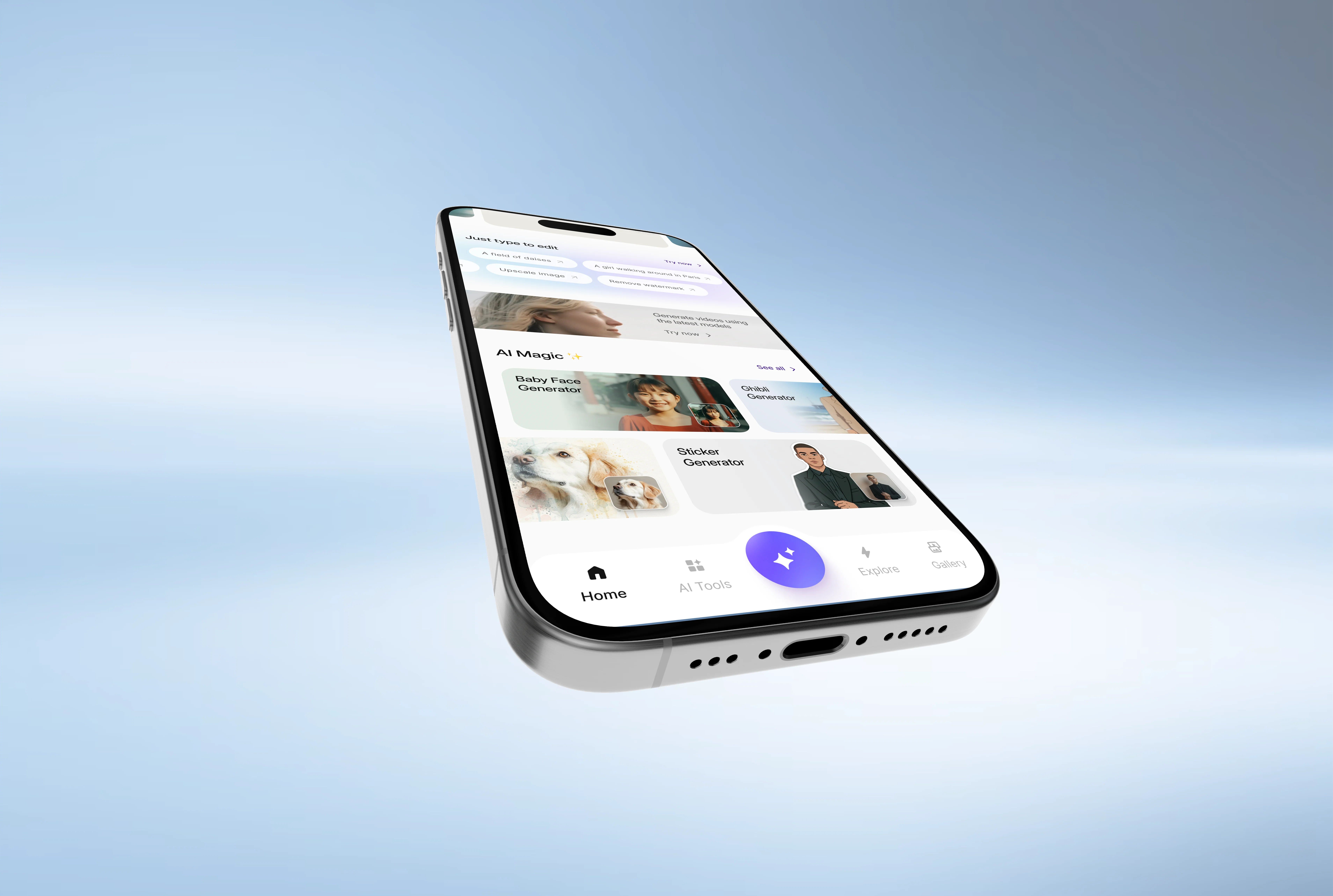
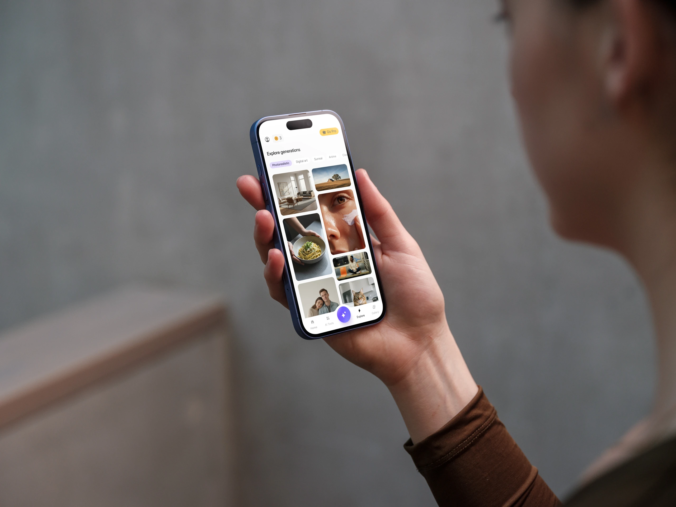
Discovery FeedI made Explore a primary tab, equal to Home, AI Tools and Gallery. Users who don't know what to create can browse real generations from other users, see their prompts and reuse them. Category filters let you browse by visual style.


The System
How It All
Connects
Gallery and Explore create a loop between discovering prompts, creating something, reviewing it and returning to browse more. This diagram shows how the flows connect.
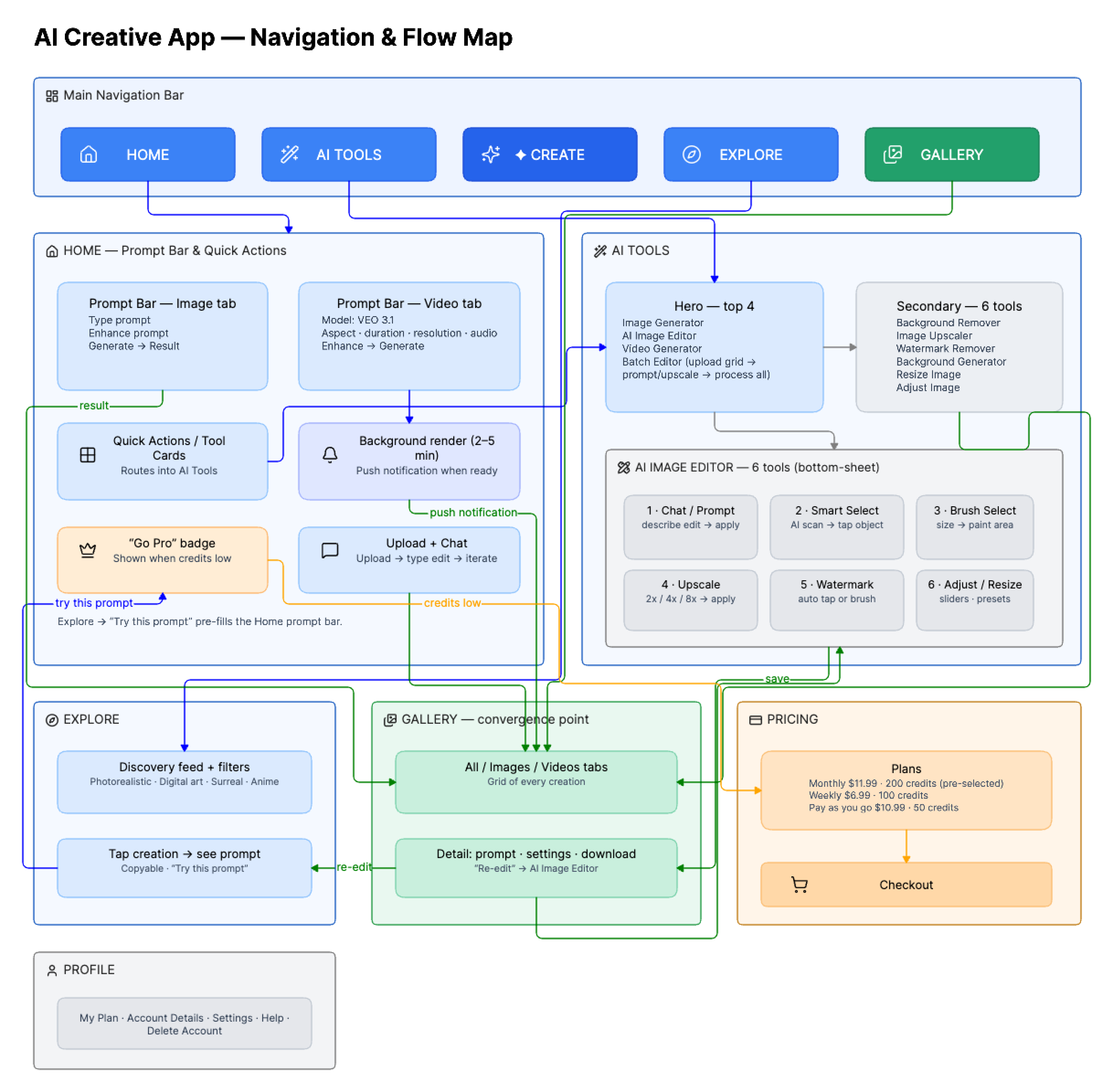
Architecture · 11 flows · All cross-connections

The Blank Prompt Problem
What If You Don't Know
What to Make?
V4 launched with a prompt-first Home. Some users opened the app, saw a blinking cursor and left. The Home screen needed to help people who didn't know what to type.
Annotations listed here ↓
Intent-first, not tool-first. The heading asks what the user wants — not which tool to use. Credits badge and Go Pro sit in the top bar — monetisation visible but never blocking creation.
Natural language as primary input. Users describe what they want instead of picking tools. The + button uploads images into the prompt context. The sparkle enhances vague prompts using AI.
Before/after thumbnails for users who know the task but can't describe it. Tap the transformation, skip the typing.
Large visual cards showing AI outputs — not feature lists. The user sees what's possible before deciding what to make.
Pre-written prompt examples. Users learn AI interaction by seeing real prompts. The fix for the V4 blank-canvas failure.
Users who came for images discover video generation without navigating away. Cross-selling within context.
Viral AI effects — Baby Face, Ghibli, Sticker Generator. Low-commitment entry points riding cultural trends.
Category-driven discovery — Product shots, Social media, Ad creatives. Users find their use case, not a tool.
Five tabs, five intents. The floating ✦ button is visible on every tab — creation is a global action, not a destination.
The Home Screen · Full Scroll

What Users Actually Did
We reviewed around 50 session recordings in Microsoft Clarity. Users regularly scrolled past the tool cards and paused at the prompt bar. Most either typed a prompt or left — very few browsed tools or opened settings first.
This supported the prompt-first direction. The content above the prompt bar gives context; the content below it gives discovery for users who need help starting.

Clarity · Session recordings · Real user behaviour
Later Clarity Snapshot
92.94% scroll depth. 0.60% rage clicks across the overall app. 0% excessive scrolling.
4.8 minutes average active time per session.

Clarity · Dashboard · 8,891 sessions (later snapshot) · Last 200 days
1 / 3 · Above the fold

2 / 3 · Mid-scroll

3 / 3 · Bottom scroll

Microsoft Clarity · Live interaction data · PixelBin Home Screen
Business Context
11.3K Users
Over 200 Days
11.3K app users and 183.4K usage events across 200 days. After V4 launched, 96% of revenue was product-led — users converting through the app itself rather than through a sales process.

Geckoboard → PixelBin Apps · 11.3K users · 183.4K usage events · 200 days
Pricing
5 Options
Down to 3
What the Recordings Showed
Session recordings showed that most users had already decided whether to pay before reaching the pricing screen. They weren't comparing plans — they were looking for confirmation.


What Changed
I simplified the screen from five options to three: Monthly pre-selected, Weekly as a lower-commitment option, and Pay-as-you-go for power users. The PM owned the pricing model itself.
Honest Assessment
What Didn't Work
Coins
Confused the payment model
Credits felt like a game mechanic. Users completed edits but abandoned at the credit-deduction moment. They understood the tool but not the cost. V4 replaced it with straightforward monthly and weekly plans.
5 Steps
Too many onboarding cards
Five carousel cards. By step 3, users were swiping past without reading. The content was accurate but the format was wrong. V4 cut it to 3 cards, each showing one capability with a single visual.
Blank
No suggestion pills on launch
The prompt bar was the primary UI, but users who didn't know what to type stared at an empty input box. Adding pre-written suggestion pills gave hesitant users a starting point without cluttering the interface.

Reflection
The Hardest
Part
What I Learned
Moving the product to mobile meant rethinking desktop patterns rather than shrinking them. The sidebar became a bottom sheet. Tool-first navigation became a prompt bar with suggestions. Long-running generation became a background flow with progress and push notifications. Each of those translations required its own design work.
What I'd Do Differently
I'd move intent detection into onboarding. The suggestion pills already route users to the right tool — "Remove background" opens the editor, "Generate product photo" opens the generator. But they appear after onboarding, not during it. Asking "What do you want to create?" on the first screen would let the Home screen pre-configure around the user's goal. The routing logic exists. The sequencing doesn't.
Still here
Good. Let's talk about what you're building. I'm Terry — a Senior Product Designer working across AI, commerce and fintech products. I'm looking for a permanent Product Design role in the UK and would require Skilled Worker sponsorship to relocate.
Open to permanent UK opportunities
Get in touch